 |
VOOZH | about |
|
VOOZH | about |
Bootstrap Navigation Bar provides a responsive, customizable, and pre-styled navigation component for web applications. It incorporates features like branding, navigation links, dropdowns, and responsiveness, enabling developers to create effective and visually appealing navigation menus effortlessly.
Navbar: Bootstrap provides various types of navigation bars:
| Navbar Type | Description |
|---|---|
| Basic Navbar | Standard navigation bar layout. |
| Inverted Navbar | Navbar with inverted colors for a different look. |
| Coloured Navigation Bar | Navbar with customized colors for visual appeal. |
| Right-Aligned Navbar | The navbar is aligned to the right side of the page. |
| Fixed Navigation Bar | Navbar that remains fixed at the top of the page. |
| Drop-Down menu Navbar | Navbar with drop-down menu options for navigation. |
| Collapsible Navbar | Navbar with collapsible menu for space efficiency. |
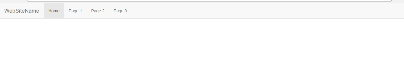
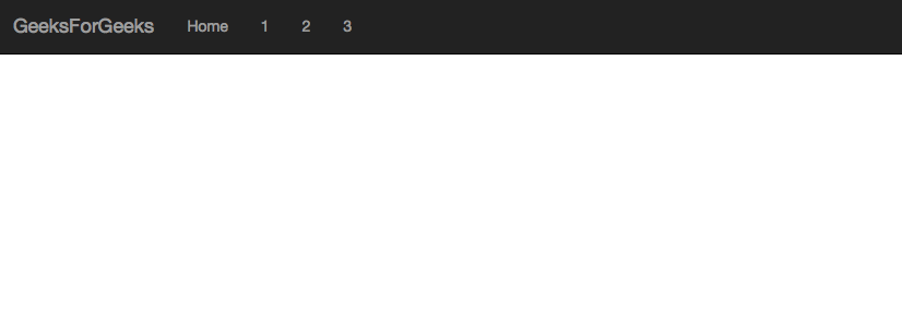
The basic navbar, styled with the navbar class, includes a logo, navigation links, and dropdown menus. It's created using the <nav> tag and initialized with the navbar navbar-default classes.
Example: In this example we creates a basic Bootstrap navbar with a brand name and navigation links. It's styled using Bootstrap's default navbar classes for a simple layout.
Output:
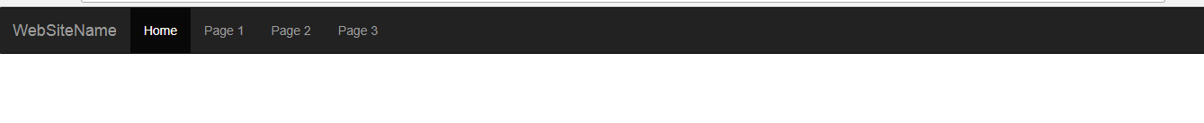
An inverted navbar is styled with dark colors and light text. It's created using the navbar-inverse class in Bootstrap, providing a sleek and modern appearance for navigation menus.
Example:
Output:
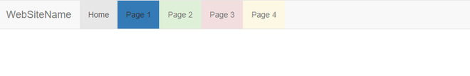
A colored navigation bar is styled using custom CSS or Bootstrap classes to have a background color different from the default. It enhances visual appeal and branding consistency.
Use .bg-color class to change the color of the navbar to the above-listed colors.
Example: In this example we creates a Bootstrap navbar with a colored background for each navigation link, using Bootstrap's background color classes like bg-primary, bg-success, bg-danger, and bg-warning.
Output:
👁 Bootstrap Coloured navigation Bar
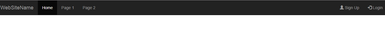
A Bootstrap right-aligned navbar is created using the navbar-right class on the <ul> element, aligning navigation items to the right side of the navbar container.
Example: In this example we creates a Bootstrap navbar with a dark background and right-aligned navigation items, including registration and login links with corresponding icons.
Output:
👁 Bootstrap Right-Aligned Navbar
A Bootstrap fixed navigation bar remains visible at the top of the viewport while scrolling. It's created using the navbar-fixed-top class for a persistent navigation experience.
Example: In this example we creates a Bootstrap navbar with a dark background and fixed positioning at the top of the viewport, ensuring it remains visible while scrolling.
Output:
👁 Bootstrap Fixed Navigation Bar
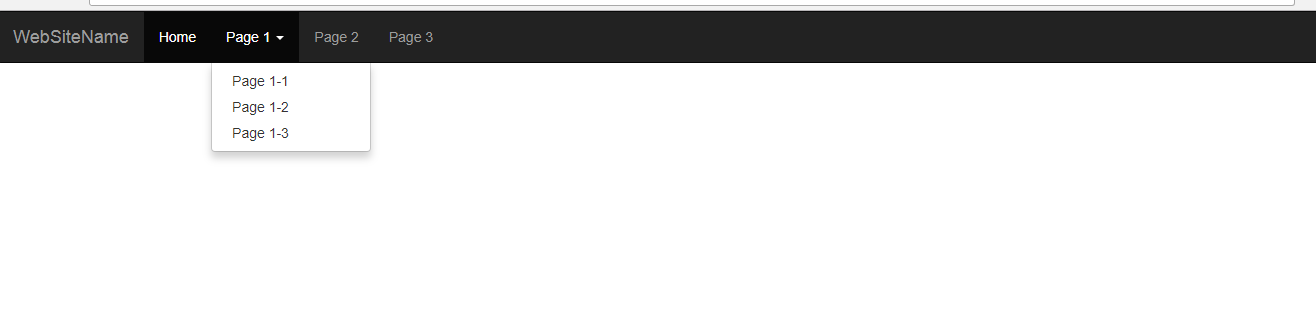
A Bootstrap dropdown menu navbar features navigation links that expand into dropdown menus when clicked, providing a compact and organized navigation structure for web applications.
Example: In this example creates a Bootstrap navbar with dropdown menus, providing compact navigation. Dropdowns expand on clicking parent items, enhancing navigation options and organization.
Output:
👁 Bootstrap Drop-Down Menu Navbar
A Bootstrap collapsible navigation bar collapses into a hamburger icon on smaller screens, conserving space. It expands to reveal navigation links when toggled, ensuring accessibility and responsiveness.
Example: In this example creates a Bootstrap navbar with a collapsible feature. On smaller screens, it collapses into a hamburger icon, conserving space while ensuring accessibility.
Output:
👁 Bootstrap Collapsible Navigation Bar
Supported Browser: