Bootstrap 5 Form controls can be used to change the default values provided for the Form controls by customizing scss file of bootstrap 5.
SASS variables of Form controls:
$input-color: This variable provides the cursor color and the font color of the text typed into the input fields. By default, it is gray.
$input-border-width: This variable provides the border width of the input field. By default, it is 1px.
$input-border-color: This variable provides the border color of the input field. By default, it is gray.
$input-disabled-bg: This variable provides the background color of the input field when in a disabled state. By default, it is gray.
$input-bg: This variable provides the background color of the input field. By default, it is white.
$input-disabled-border-color: This variable provides the border color of the input field when in a disabled state. By default, it is null.
$input-border-radius-*: This variable provides the border radius of the input field. By default, it is 0.375rem.
$input-padding-y-*: This variable provides the top and bottom padding of the input field. By default, it is 0.375rem.
$input-padding-x-*: This variable provides the left and right padding of the input field. By default, it is 0.75rem.
$input-font-family: This variable provides the font family of the input field. By default, it is null.
$input-font-size-*: This variable provides the font size of the input field. By default, it is 1rem.
$input-focus-bg: This provides the background color of the input field when in focus. By default, it is white.
$input-focus-color: This provides the font color in the input field when in focus. By default, it is gray.
$input-focus-border-color: This provides the border color of the input field when in focus. By default, it is blue.
$input-focus-box-shadow: This provides the box shadow of the input field when in focus. By default, it is 0px with blue color.
$input-placeholder-color: This provides the color of the placeholder. By default, it is gray.
$form-label-font-**: This variable provides values to change the font size, style, or weight of the form label.
$form-label-color: This variable provides the font color of the form label. By default, it is null.
$form-text-font-**: This variable provides values to change font size, style, or weight of form text
$form-text-color: This variable provides the font color of the form text. By default, it is gray.
$form-file-button-color: This variable provides the font color of the button in form file. By default, it is gray.
$form-file-button-bg: This variable provides the background color of the button in form file. By default, it is gray.
$form-file-button-hover-bg: This variable provides the background color of the button in form file when hovering on it. By default, it is gray.
The '*' can be replaced sm/lg to make the page responsive for different views. The '**' can be replaced by size/style/weight to make changes to format different values of font
Steps to override scss of Bootstrap:
Step 1: Install bootstrap using following command:
npm i bootstrap
Step 2: Create your custom scss file and write the variable you want to override. Then include the bootstrap scss file using import.
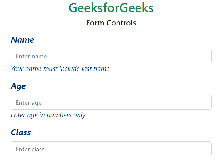
Example 2: In this example, we make use of the $form-label-font-size, $form-label-font-weight, $form-label-font-style, $form-label-color, $form-text-color, $form-text-font-size, $form-text-font-style variables and change their values as shown in the example.
Example 3: In this example, making use of the $form-file-button-color, $form-file-button-bg and $form-file-button-hover-bg variables. Here in the scss file, the text color, the background of form file button and the background of form file button on hover is changed.
