 |
VOOZH | about |
|
VOOZH | about |
The Flexible Box Layout Module in bootstrap is used for designing the flexible and responsive layout structure. It is used in Bootstrap 4.
Syntax:
<div class="d-flex p-2"></div>
Syntax:
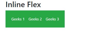
<div class="d-inline-flex p-2"></div>
Syntax:
<div class="d-sm-flex p-2"></div>
<div class="d-sm-inline-flex p-2"></div>
Example 1:
Output:
👁 Image
Example 2:
Output:
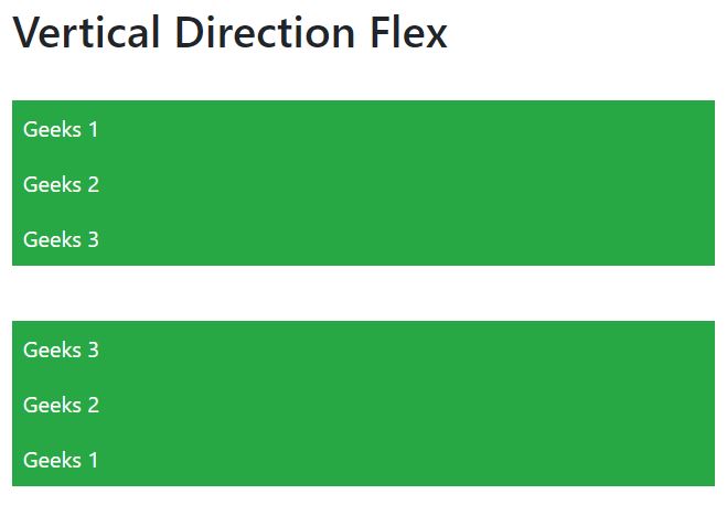
Horizontal And Vertical Direction of Flexbox: The direction of flex items can be positioned in a flex container.
Syntax:
<div class="d-flex flex-row"></div>
Syntax:
<div class="d-flex flex-row-reverse"></div>
Syntax:
<div class="d-flex flex-column"></div>
Syntax:
<div class="d-flex flex-column-reverse"></div>
Syntax:
<div class="d-flex flex-column-reverse"></div>
<div class="d-flex flex-column"></div>
Example 3:
Output:
👁 Image
Example 4:
Output:
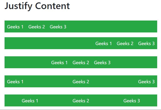
Justify Content: In order to change the alignment of flex items, one can use the .justify-content-* classes.
* can be any one of them start (default), end, center, between, or around.
Similarly, justify-content can be used for all breakpoints(sm, md, lg, xl) like .justify-content-sm-start, .justify-content-sm-end, etc.
Syntax:
<div class="d-flex justify-content-start"></div>
Example 5:
Output:
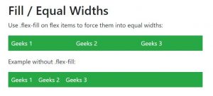
Filling of Widths of flex items:
Flex items can be forced into equal widths by using the .flex-fill class.
.flex-fill can be used for all breakpoints(sm, md, lg, xl) like .flex-sm-fill, etc.
Syntax:
<div class="p-2 flex-fill"></div>
Example 6:
Output:
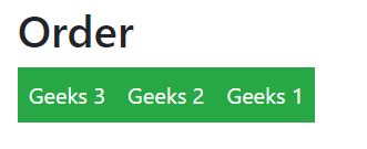
Order:
.order classes are used for changing the visualization order of a flex item.
Ordering is done on a number basis from 0 to 12.
0 has highest priority.
.order can be used for all breakpoints(sm, md, lg, xl) like .order-sm-0 to .order-sm-12, etc.
Syntax:
<div class="p-2 order-4"></div>
Example 7:
Output:
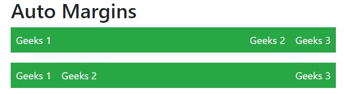
Automation of margins:
Syntax:
<div class="p-2 mr-auto"></div>
Example 8:
Output:
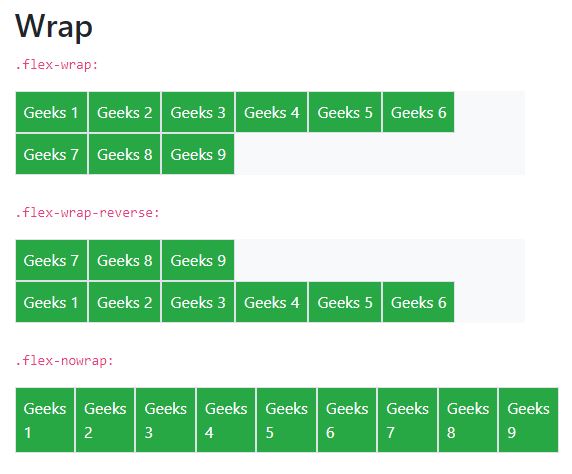
Wrapping of flex item:
.flex-nowrap (default), .flex-wrap and .flex-wrap-reverse are used for wrapping the flex items in a flex container.
.flex-wrap can be used for all breakpoints(sm, md, lg, xl) like .flex-sm-nowrap, .flex-sm-wrap, etc.
Syntax:
<div class="p-2 border"></div>
Example 9:
Output:
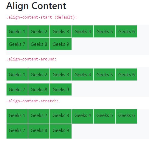
Align Content:
Basically, it is used for the vertical alignment of flex items.
align-content can be implemented in various ways.
Syntax:
<div class="p-2 align-content-start"></div>
Example 10:
Output:
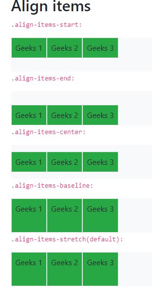
Align items:
Use the align-items class to change the alignment of flex items on the cross axis.
align-items can be implemented in various ways.
Syntax:
<div class="p-2 align-items-start"></div>
Example 11:
Output:
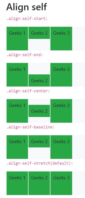
Align self:
align-self class can be used to change the alignment on the cross axis.
align-self can be implemented in various ways.
Syntax:
<div class="p-2 align-self-center"></div>
Example 12:
Output:
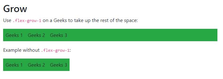
Growing and Shrinking of available space:
.flex-grow-* is used to grow flex items to fill available space.
.flex-shrink-* is used to shrink the flex item.
flex-grow and flex-shrink can be implemented as follows.
Similarly for sm, md, lg, xl
Syntax:
<div class="p-2 flex grow-1"></div>
Example 13:
Output:
👁 Image
Supported Browser: