 |
VOOZH | about |
|
VOOZH | about |
Aligning navbar items to the center using Bootstrap refers to the practice of positioning navigation links in the middle of the navigation bar for a balanced and aesthetic design. Bootstrap's utility classes make it easy to implement this alignment responsively and efficiently.
There are some common approaches to aligning items to the center which are as follows:
Table of Content
The mx-auto utility class in Bootstrap automatically applies equal margins on the left and right of the selected element. By placing mx-auto on a container wrapping the navbar items, it centers them horizontally within the navbar, ensuring balanced alignment.
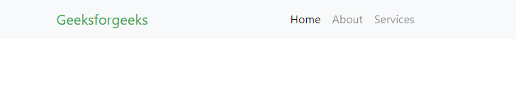
Example: In this example, we create a responsive navigation bar using Bootstrap. It centers navigation items like "Home," "About," and "Services," with the brand name "Geeksforgeeks" displayed prominently.
Output:
The justify-content-center class in Bootstrap is a flexbox utility that centers flex items horizontally. Applying this class to the container holding the navbar items ensures that they are centered within the navbar, making the approach simple and effective.
Example: In this example we sets up a Bootstrap navigation bar titled "Geeksforgeeks," featuring centered links for "Home," "About," and "Contact." It ensures responsiveness with a toggler for smaller screens.
Output:👁 Image