 |
VOOZH | about |
|
VOOZH | about |
In order to make oblique lines with CSS, there are two main approaches. The first approach involves the clip-path property of CSS and in the second approach, we use transform property with skew() of CSS.
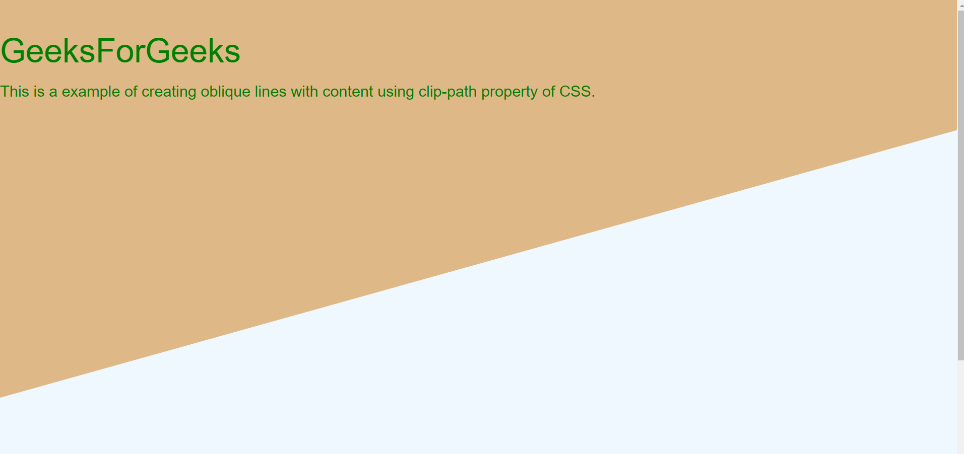
Approach 1: Using clip-path property: The clip-path property is generally used to clip an element to a basic shape. But it can also be used to create oblique lines with tweaking property of polygon shape of clip-path. The main disadvantage of this property is its implementation and since many changes are needed to be observed and changed for converting it into oblique lines.
Output:
The output image contains two oblique lines this is the zoomed output of the above part.
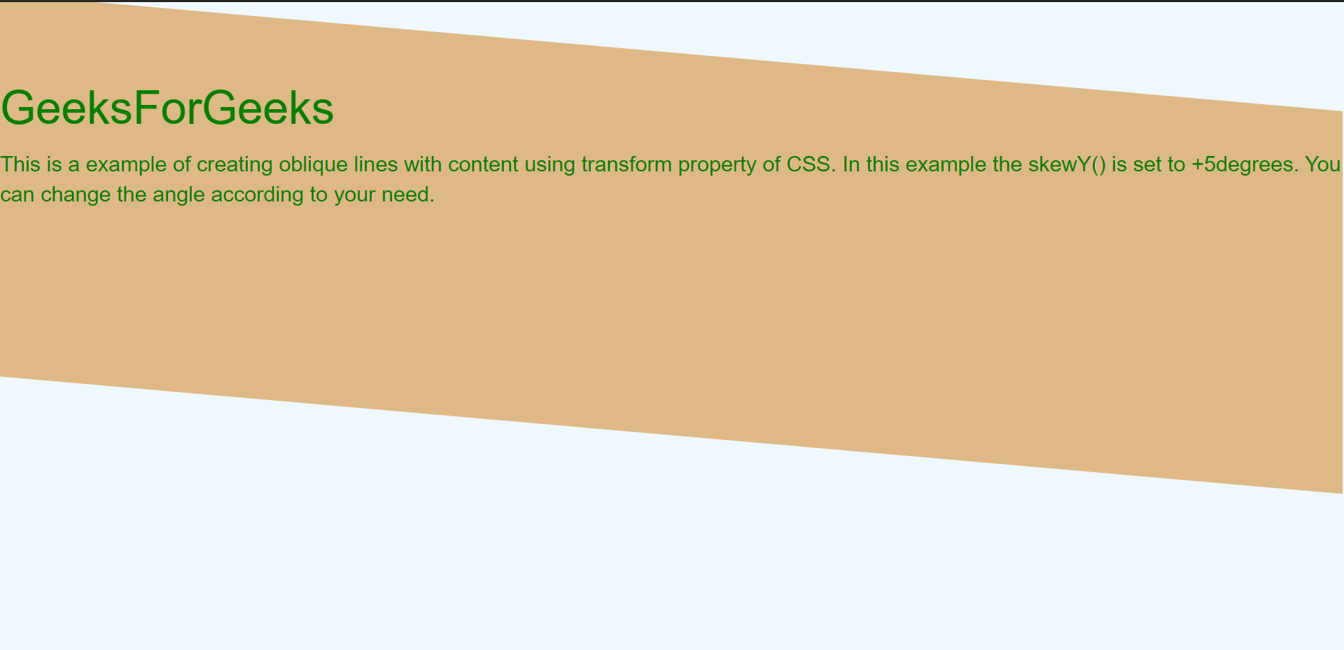
Approach 2: Using transform property: The transform skew property of CSS helps in rotating the division along x and y-axis. The skewX() and skewY() takes degrees of rotation as input. This property implementation is simple as compared to clip-path. Also, if you don't want to rotate the content then we need to rotate in the reverse direction of division.
Output:
Here the rotation is around the y-axis and skew angle is +5(deg) whereas the text angle is at -5(deg) to make the text straight.
👁 Image