 |
VOOZH | about |
|
VOOZH | about |
A confusion matrix is a table used to evaluate the performance of a classification algorithm. It compares the actual target values with those predicted by the model.. This article will explain us how to plot a labeled confusion matrix using Scikit-Learn. Before go to the implementation let's understand the components of a confusion matrix:
This matrix is useful for calculating performance metrics like accuracy, precision, recall and F1-score
To get started, we need to have Python installed on your system along with the necessary libraries. We can install Scikit-Learn and Matplotlib using pip:
pip install scikit-learn matplotlib
Let's start by building a simple classification model. For this example, we'll use the Iris dataset which is included in Scikit-Learn. We load the Iris dataset split it into training and testing sets then train a Random Forest classifier on the training data.
Next we'll use the trained model to make predictions on the test set.
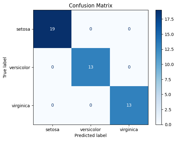
We create the confusion matrix and plot it using Scikit-Learn’s ConfusionMatrixDisplay with class names and a blue color map.
Output:
We can customize the confusion matrix plot to make it more informative and visually appealing.
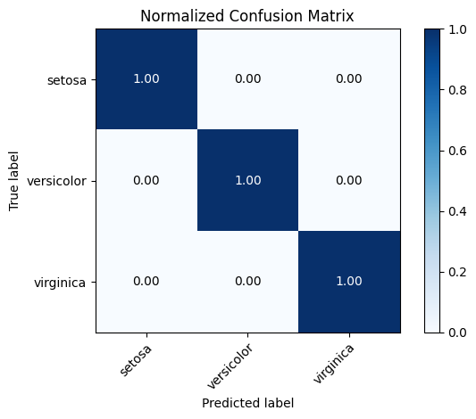
We can add percentages to the confusion matrix to make it easier to interpret. It is then normalized by dividing each row by its total, which gives the percentage of predictions for each true class.
imshow() displays the normalized matrix as an image where each cell’s color intensity reflects the percentage value.xticksand yticks are labeled using the target class names to make the matrix more understandable.tight_layout()adjusts spacing and the matrix is displayed with plt.show().Output:
From the above image the diagonal values show how well the model correctly predicted each class. A value of 1.00 (or 100%) on the diagonal means perfect prediction for that class, while lower values indicate some misclassification.
We can change the color map to suit our preferences. We change the color map to green using cmap=plt.cm.Greensto make the plot visually different.
Output:
We can add titles and axis labels to make the plot more descriptive. We add a custom title and axis labels to clearly indicate what the plot represents.
Output:
Now our confusion matrix looks cleaner and more descriptive for presentations or reports.
.png)