 |
VOOZH | about |
|
VOOZH | about |
Principal Component Analysis (PCA) is a dimensionality reduction technique. It transform high-dimensional data into a smaller number of dimensions called principal components and keeps important information in the data. In this article, we will learn about how we implement PCA in Python using scikit-learn. Here are the steps:
We import all the libraries needed like numpy , pandas, matplotlib, seaborn and scikit learn.
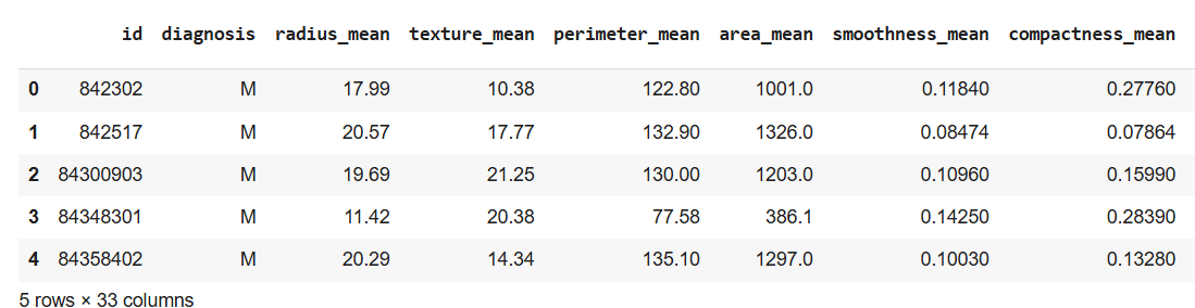
We will use breast cancer dataset. This dataset has 569 data items with 30 input attributes. There are two output classes-benign and malignant. This reads the dataset file and displays the first 5 rows. You can download the dataset from here.
Output:
It drops unnecessary columns like id, Unnamed: 32 and converts diagnosis column: Malignant to 1 and Benign to 0.
In this separate features X contains input features (30 columns) and y contains the target labels (0 or 1)
StandardScaler transforms features so they all have a mean = 0 and standard deviation = 1 which helps PCA to treat all features equally.
Output:
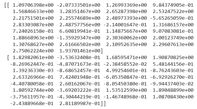
It reduces the data to 2 principal components. PCA finds combinations of original features that explain the most variation in the data.
Output:
[[ 9.19283683 1.94858307]
[ 2.3878018 -3.76817174]]
We reduce 30 features to 2 components. Each row now has 2 values (PC1, PC2) instead of 30. These components contain the most variation from original data.
It tells how much information each principal component holds.
Output:
- Explained variance: [0.44272026 0.18971182]
- Cumulative: [0.44272026 0.63243208]
PC1 explains 44% of data and PC2 explains 19%. Combined these 2 components explain 63% of all data variation.
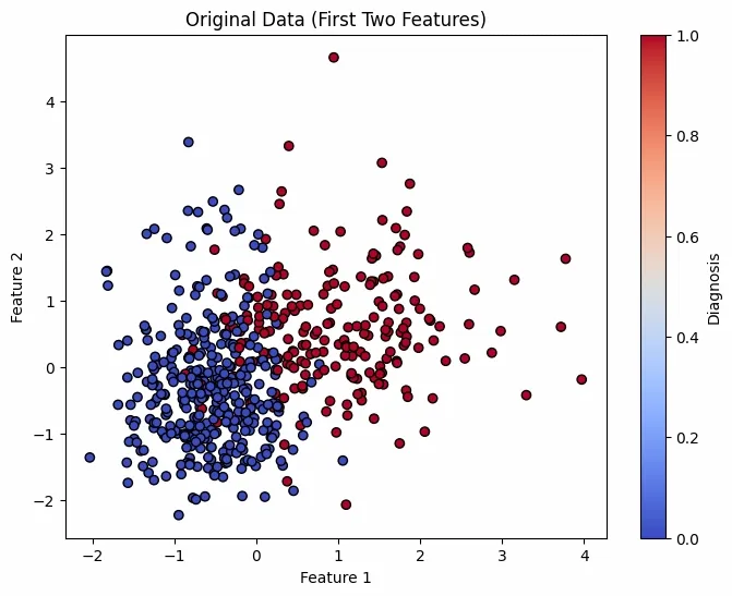
First plot shows original scaled data using first 2 features and second plot shows reduced data using PCA's 2 components. Colors represent diagnosis Benign or Malignant.
Output:
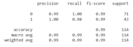
It splits PCA data into training and test sets. Train aLogistic Regression model to classify tumors and predicts and evaluate the model.
Output:
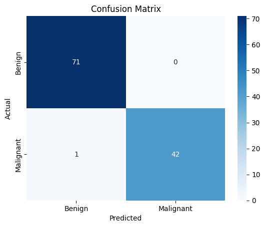
It shows how many predictions were correct or incorrect and helps to visualize true vs. false predictions.
Output:
PCA reduces data size but some information is lost. This step converts reduced data back to its original shape and measures how much data was lost in the reduction process.
Output:
Reconstruction Loss: 0.3676
As shows how much info was lost during PCA. A loss of 0.3676 means PCA with 2 components retains good structure.
Complete Code: click here