VOOZH about

URL: https://www.geeksforgeeks.org/machine-learning/seaborn-categorical-plots/

⇱ Seaborn | Categorical Plots - GeeksforGeeks


  • Courses
  • Tutorials
  • Interview Prep

Seaborn | Categorical Plots

Last Updated : 15 Jun, 2026

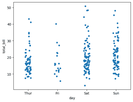
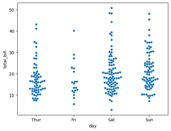
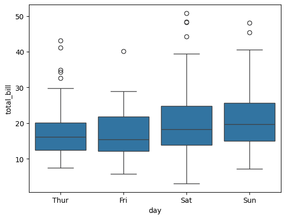
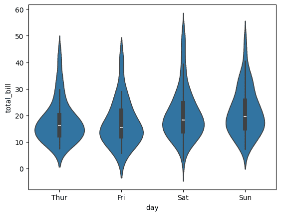
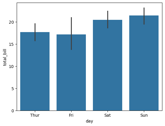
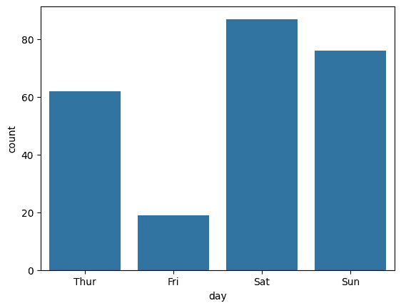
Plots help visualize relationships between variables. Seaborn provides various functions for analyzing categorical data using datasets such as tips, which contains information about restaurant customers and their tips.

Implementation 

1. Import Required Libraries

  • Seaborn provides built-in categorical plotting functions.
  • Matplotlib is used to display the plots.

2. Load the Dataset

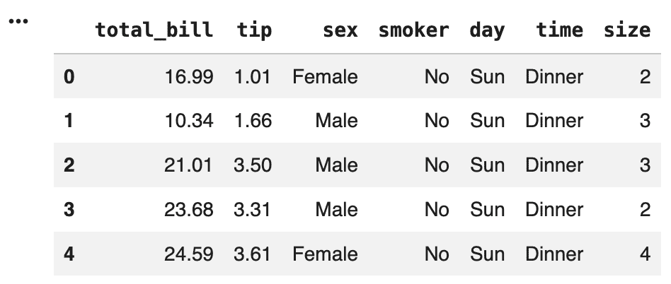
The built-in tips dataset is loaded. It contains information about restaurant customers, including bill amount, tip amount, gender, smoking status and dining time.

👁 output
Dataset

3. Create a Strip Plot

  • Shows the distribution of observations.
  • Helps identify clusters and outliers.

Output:

👁 strip-plot
Strip plot

4. Create a Swarm Plot

  • Provides a clearer view of data distribution.
  • Makes individual observations easier to analyze.

Output:

👁 swarm-plot
Swarm Plot

5. Create a Box Plot

  • Shows median and spread of data.
  • Helps detect outliers.
  • Useful for comparing categories.

Output:

👁 boxplot
Box plot

6. Create a Violin Plot

  • Shows data distribution and density.
  • Helps understand the shape of the data.

Output:

👁 violin-plot
Violin Plot

7. Create a Bar Plot

  • Compares average values across categories.
  • Useful for identifying trends.

Output:

👁 barplot
Bar Plot

8. Create a Count Plot

  • Displays category frequencies.
  • Helps understand dataset composition.

Output:

👁 countplot
Countplot

Download full code from here

Comment
Article Tags: