 |
VOOZH | about |
|
VOOZH | about |
A Bar Chart is a graphical representation of data using bars of different heights. It is widely used for comparing different datasets visually. However, by default, Matplotlib does not display value labels on each bar, making it difficult to analyze the exact values represented by individual bars. In this article, we will explore how to add value labels on a Matplotlib bar chart to improve readability and make data interpretation easier.
Matplotlib provides multiple methods for adding value labels to a bar chart. We will primarily use the following two:
plt.bar() function is used to plot a bar chart.
Syntax:
plt.bar(x, height, color)
Parameters:
To add text labels on top of the bars, we use the plt.text() function.
Syntax:
plt.text(x, y, s, ha, bbox)
Parameters:
To begin, import the required Matplotlib library:
import matplotlib.pyplot as plt
To place numerical values above each bar, a helper function is created. This function:
In this step:
Output:
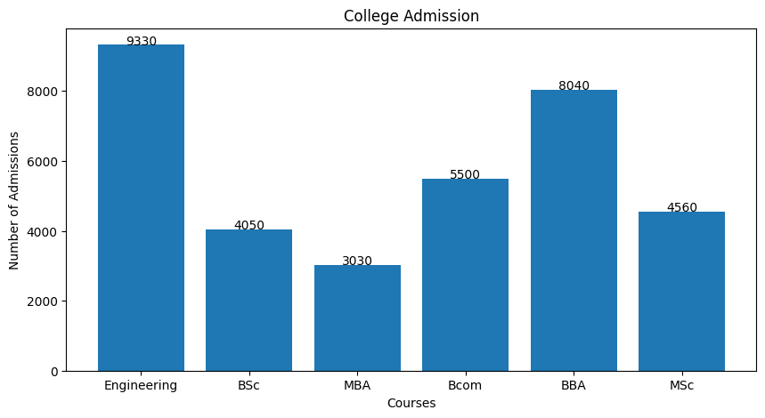
Explanation: add_labels(x, y) function adds numerical labels above each bar by iterating through the data and using plt.text(i, y[i], y[i]) to position values at their respective heights. By default, labels are center-aligned for clarity.
Output:
Explanation: add_labels(x, y) centers numerical labels above bars using ha='center' for readability. plt.figure(figsize=(10, 5)) sets chart size and plt.bar(x, y) plots the bars. Labels are positioned at their heights via plt.text(i, y[i], y[i]), ensuring clarity.
Output:
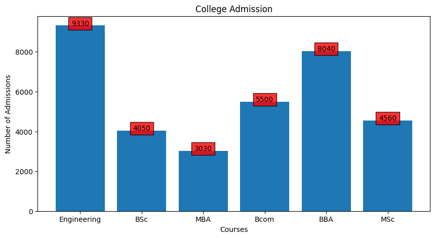
Explanation: add_labels(x, y) adds numerical labels in red-bordered boxes for visibility. plt.bar(x, y) creates the chart and plt.figure(figsize=(10, 5)) adjusts its size. Labels are centered with ha='center'.
Output:
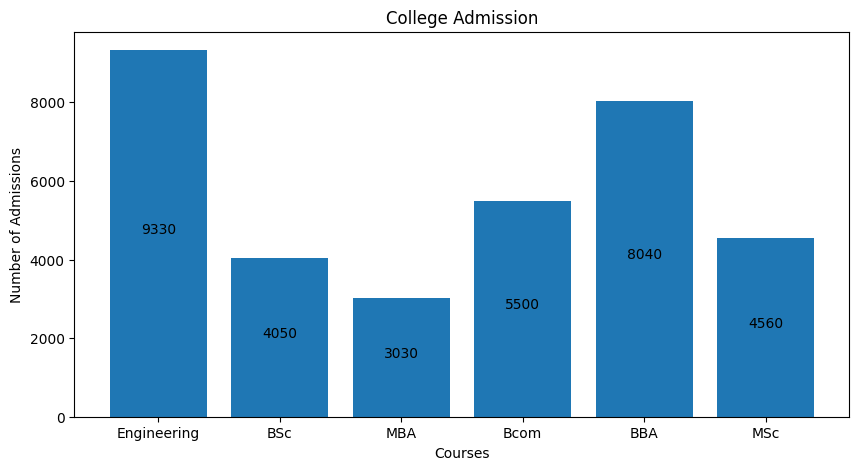
Explanation: add_labels(x, y) positions numerical labels at half the bar height using y[i] // 2 for better alignment. plt.bar(x, y) generates the chart and plt.figure(figsize=(10, 5)) adjusts its size. Labels are centered with ha='center'.
Output:
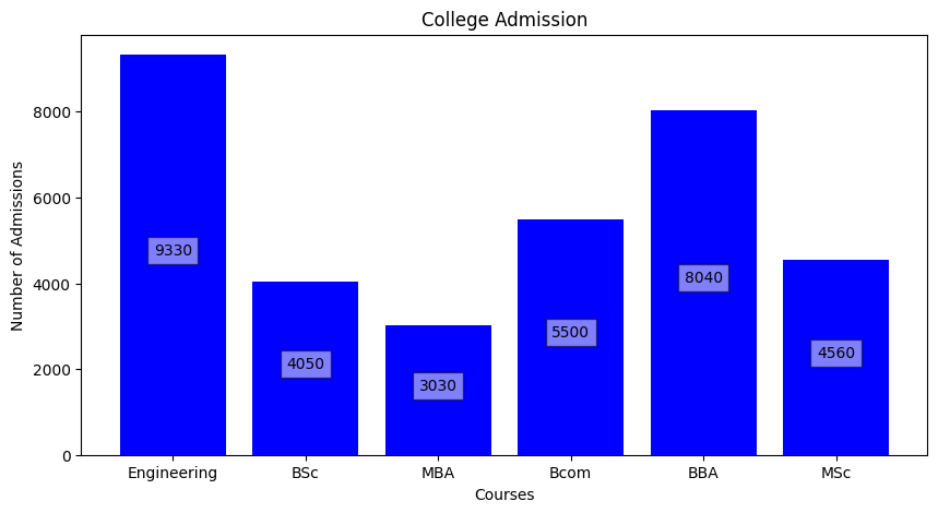
Explanation: add_labels(x, y) centers labels at half bar height in a semi-transparent white box. plt.bar(x, y, color='blue') creates blue bars and plt.figure(figsize=(10, 5)) adjusts the chart size.