 |
VOOZH | about |
|
VOOZH | about |
A Density Plot (also known as a Kernel Density Plot) is a smooth curve that shows the distribution of data points across a range, similar to a histogram but without bars. Higher curves indicate more concentration of data in that area. It provides a clearer view of data distribution, useful for comparing datasets. In Pandas, you can create a density plot using the plot() function with Seaborn or Matplotlib. You can create a density plot using either of the following functions:
Both functions work in the same way and you can use either one.
Syntax:
DataFrame.plot.density(self, bw_method=None, ind=None, **kwargs)
Parameters:
Return Type: It returns a matplotlib.Axes object for further customization.
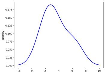
Example: In this example, we will generate a density plot for a simple dataset of integers and customize its appearance with various parameters.
Output
👁 OutputExplanation: plot.density() method generates a Kernel Density Estimate (KDE) plot, providing a smooth curve of the data distribution. The bw_method='scott' controls the curve's smoothness, balancing detail and smoothness. The color='blue' sets the curve color, linestyle='-' makes it a solid line and linewidth=2 thickens the line for better visibility.
Syntax:
DataFrame.plot.kde(self, bw_method=None, ind=None, **kwargs)
Parameters:
Return Type: It returns a matplotlib.Axes object for further customization.
Example: In this example, we will create a KDE plot for a simple dataset using the plot.kde() method. We will also customize the appearance of the plot.
Output
👁 OutputExplanation: plot.kde() method generates a Kernel Density Estimate (KDE) plot, providing a smooth curve of the data distribution. The bw_method='scott' controls the curve's smoothness, balancing detail and smoothness. The color='blue' sets the curve color, linestyle='-' makes it a solid line and linewidth=2 thickens the line for better visibility.
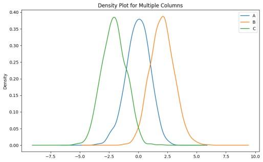
Example 1: In this example, we create a DataFrame with three columns of random data and plot the density distributions for all columns.
Output
Explanation: A DataFrame df is created with three columns (A, B, C), each containing 1000 random values. Columns B and C are shifted by 2 and -2 for contrast. The plot.density() function plots the kernel density estimate (KDE) with Silverman's bandwidth method and a 10x6 inch plot size.
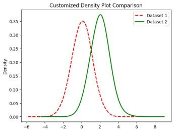
Example 2: In this example, we plot the density for two different columns with customized styles such as color, line style and line width.
Output
Explanation: A DataFrame df is created with two columns (D1 and D2), each containing 1000 random values. Column D2 is shifted by 2 for contrast. The plot.kde() function is used to plot the kernel density estimate (KDE) for both columns with customized styles, including different colors, line styles and line widths.
Example 3: In this example, we generate a density plot using Seaborn for a single column of random data with a shaded fill.
Output
Explanation: Random data is generated using np.random.randn(1000), and the sns.kdeplot() function is used to plot the kernel density estimate (KDE) with a shaded fill, purple color and 50% transparency.