 |
VOOZH | about |
|
VOOZH | about |
In the field of data visualization with Python, especially with the Seaborn library, stripplot() and swarmplot() are widely employed to showcase how data points are spread out across a categorical axis. Although they share similarities, these plots possess unique characteristics and applications that make them appropriate for various situations. This article examines the distinctions between stripplot() and swarmplot() and offers tips on their effective utilization.
Stripplot() | Swarmplot() | |
|---|---|---|
Purpose | Visualize the distribution of a single variable | Visualize the distribution of a single variable while avoiding overlap between points |
Visualization | Points are placed on a number line with random positional adjustments to prevent clustering. | Points are arranged on the number line in a way that ensures they do not intersect |
Overlap | Points can overlap significantly | Points do not overlap significantly |
Scalability | Becomes less scalable with an increasing number of data points. | More efficient with a higher quantity of data points. |
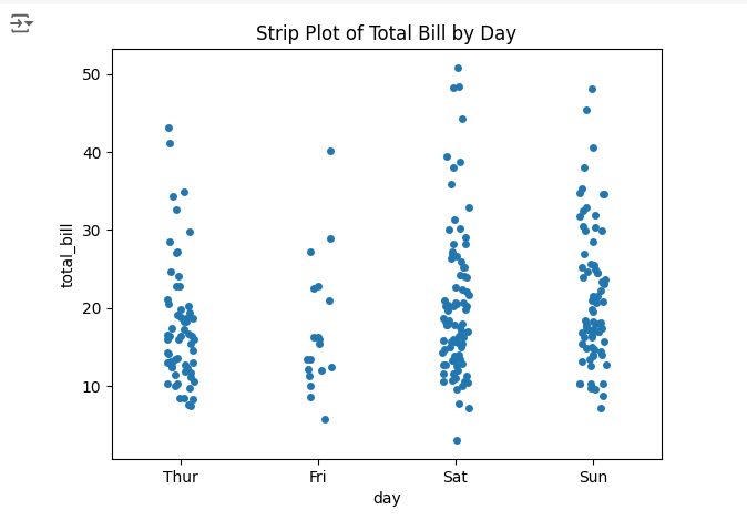
The stripplot() function in Seaborn creates a scatter plot where each data point is plotted along one axis with some jitter (random noise) added to the other axis to prevent overlapping of points. This type of plot is particularly useful for visualizing the distribution of data points in a single dimension.
Output
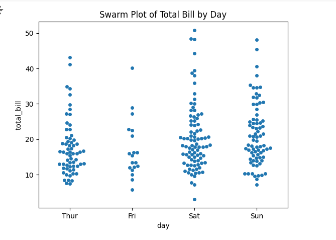
The swarmplot() function in Seaborn, on the other hand, arranges the data points in a non-overlapping manner. Unlike stripplot(), swarmplot() ensures that points are adjusted along the categorical axis so that they do not overlap, giving a better sense of the density of points.