 |
VOOZH | about |
|
VOOZH | about |
In Matplotlib, Axes class is the area where the data is plotted. It is one of the core building blocks of a plot and represents a single plot area inside a Figure. A single Figure can contain multiple Axes, but each Axes can belong to only one Figure.
Each Axes object contains:
The axes() function or add_axes() method can be used to manually create axes at specific locations within a figure.
axes() function create a new set of axes inside a figure at a custom position. The position is given as a list: [left, bottom, width, height], where all values are between 0 and 1, showing how much space they take up compared to the full figure.
plt.axes([left, bottom, width, height])
Parameter:
This code manually adds a custom-sized axes to a figure using plt.axes() and displays it with plt.show(). The position is set using normalized coordinates. This positions plot area centrally inside the figure window.
Output
👁 python-matplotlib-axes1Explanation:
In axes([0.1, 0.1, 0.8, 0.8])
add_axes() method adds a new axes to a figure. It allows the user to set the exact position and size of the axes using [left, bottom, width, height] relative to the figure size.
fig.add_axes([left, bottom, width, height])
This example shows how to add an axes to a figure using add_axes() method. The axes fills the entire figure area, as specified by [0, 0, 1, 1] and plt.show() displays figure window.
Output
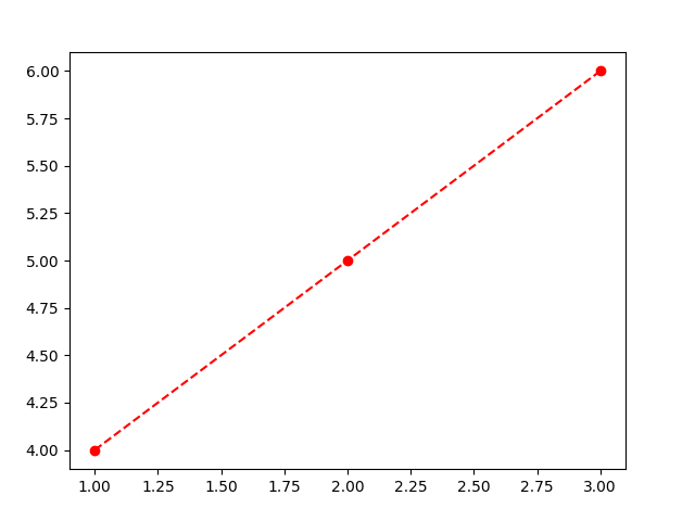
👁 python-matplotlib-add-axesax.plot() function draws lines or markers on the axes. It lets user plot data points by connecting them with lines, making it useful for visualizing trends or comparisons.
ax.plot(X, Y, 'CLM')
Parameter:
This code plots three points connected by a red dashed line with circle markers using ax.plot().
Output
Explanation:
| Characters | Description |
|---|---|
| . | Point Marker |
| o | Circle Marker |
| + | Plus Marker |
| s | Square Marker |
| D | Diamond Marker |
| H | Hexagon Marker |
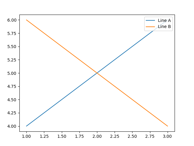
ax.legend() function adds a legend to the axes. It helps label and describe the plotted elements (like lines or markers) so the viewer knows what each one represents.
ax.legend(labels, loc)
Parameter:
This code creates a figure with custom-sized axes and plots two lines labeled 'Line A' and 'Line B'. The ax.legend() function is used to display a legend in the upper right corner, helping to identify each line in the plot.
Output
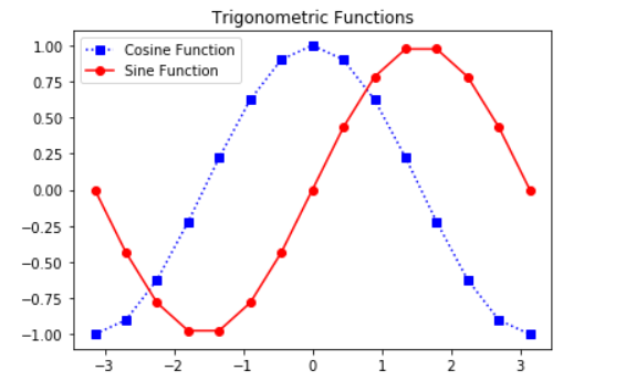
This code plots sine and cosine curves using Matplotlib. It creates custom axes using coordinates, then plots cosine function with blue square markers and sine function with red circle markers. A legend and title are also added to label the curves and describe the plot.
Output
👁 ImageExplanation: