 |
VOOZH | about |
|
VOOZH | about |
In this article, we will learn How to Plot Parallel Coordinates in Matplotlib. So, first, discuss some concepts :
There are various ways to Parallel coordinates in pandas, here we are discussing some generally used methods for Parallel coordinates in pandas those are following.
First, we need to follow some steps to Parallel Coordinates in Pandas which are below.
Here, we will discuss some examples by applying above mentioned steps. In these examples, we will work on dummy data in linear and multi-dimensions.
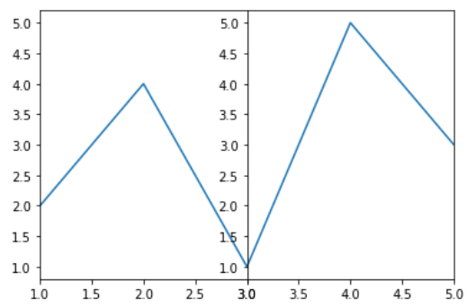
In this example code uses Matplotlib to create a figure with two subplots side by side. It plots the same data (`x` and `y`) in both subplots. The x-axis limits of the subplots are set differently, with the first subplot showing only the first three points of the data and the second subplot showing the last three points.
Output:
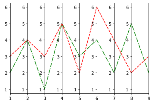
👁 Simple Parallel Coordinate PlotIn this example code uses the Matplotlib library to create a single row of 8 subplots, each displaying two line plots (y1 and y2) with different line styles ('g-.' and 'r--') for the corresponding x values. The x-axis limits for each subplot are set based on consecutive pairs of elements from the 'x' list. The subplots have zero width spacing between them, and the final plot is displayed.
Output :
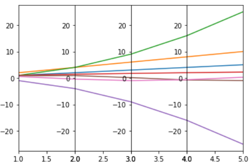
👁 Parallel Coordinate Plot with Multiple Lines and Multiple AxesIn this example code creates four subplots with different data series and sets individual x-axis limits for each subplot. The data consists of various functions applied to an array 'x'. The subplots display the different data series, and 'plt.subplots_adjust(wspace=0)' eliminates horizontal space between subplots.
Output :
👁 Parallel Coordinate Plot Over Multi-dimensions DataIn this example The code loads the Iris dataset, organizes it into a DataFrame, and assigns colors to each class. It then creates separate DataFrames for each class, plots parallel coordinates for each class using seaborn, and adds a legend to distinguish between classes in the plot. The resulting visualization displays the relationships between features in the Iris dataset for different classes.
Output :
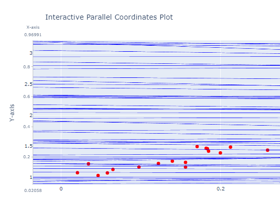
In this example code uses Plotly to create an interactive parallel coordinates plot. It generates example data with a linear relationship, creates a parallel coordinates plot with 'X-axis' and 'Y-axis' dimensions, adds a scatter plot for data points, and updates the layout with titles. The resulting visualization shows a dynamic representation of the data's multivariate relationships.
Output :