 |
VOOZH | about |
|
VOOZH | about |
Color theory is the study of how colors interact with each other and how they can be combined to create visually pleasing designs. It is both a science and an art, explaining the relationships between colors, how they can be mixed or contrasted, and the psychological effects they have on people.
Color theory helps guide designers in choosing color schemes that enhance aesthetics, evoke emotions, and improve visual communication. The color wheel is a central tool in color theory, illustrating how primary, secondary, and tertiary colors relate to one another.
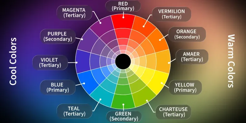
Color Wheel is a great tool for understanding the basics of color theory. This tool can help to visualize relationships between colors in a standard, schematic way. It makes understanding colors and their relations with each other, like how they are correlated to each other, and how two or three colors can be combined with each other.
The color circle is basically made with the formation of primary, secondary and tertiary colors.
1. Primary Colors: The primary are those color which can not be formed by mixing any two or three colors. The three primary colors are Red, Yellow, and Blue.
2. Secondary Colors: Secondary colors are the colors that are formed by mixing any two primary colors. By mixing primary colors we can get Orange, Green, and Purple.
3. Tertiary Colors: A primary color and a secondary color are mixed to generate tertiary colors. More precisely, a tertiary color is created when a primary color mixes with a secondary color that is adjacent to it in the color wheel.
The 12 basic colors are essential for understanding color theory and are widely used in design and art. These colors include three primary colors: red, blue, and yellow.
Color theory works by using the color wheel and a few basic rules to understand how colors look together and how they affect mood and readability.
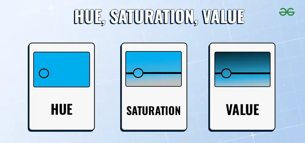
When we talk about colors, we often hear terms like hue, saturation, and value.
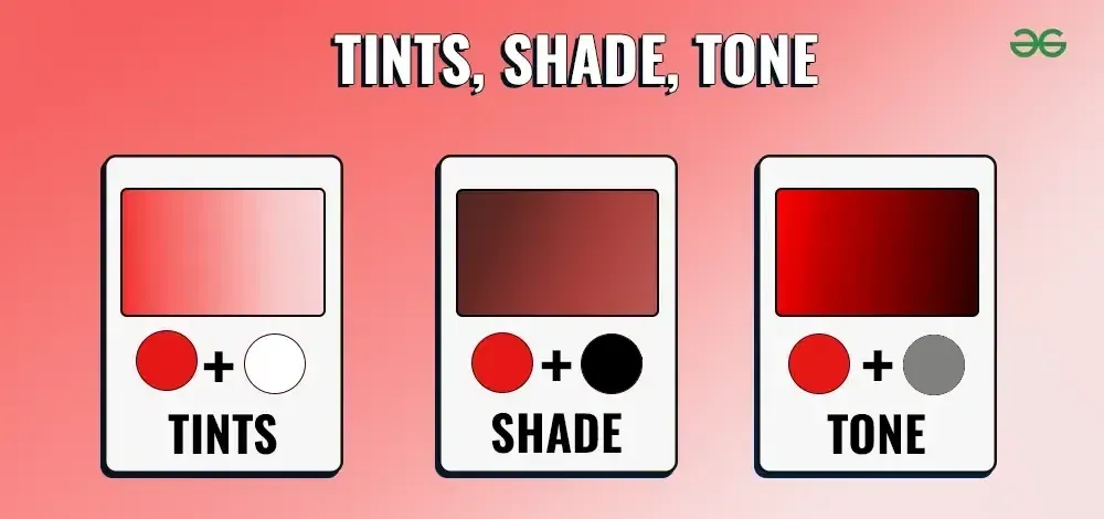
In color theory, tints, shades, and tones refer to different variations of colors that we see. Primary, secondary, and tertiary colors are known as pure colors.
Creating harmony between colors means choosing shades that look good together and create a pleasing effect.
To achieve this, you can use a color wheel as a guide. Colors that are next to each other on the wheel, like blue and green, often work well together and create a calming look. Alternatively, colors opposite each other, like red and green, can create a vibrant and eye-catching contrast. Experimenting with different combinations can help you find the perfect balance for your design or artwork.
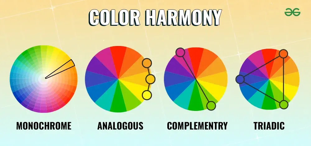
These are also known as color schemes. There are four main types of color schemes.
It contains different hues, saturations, and tints of the same color.
Example: Red and all its tints are the monochrome scheme of the color Red.
Two colors from opposite sides of the color wheel are the base of complementary color schemes.
Example:
- Red and Green
- Blue and Orange
- Yellow and Purple
On the color wheel, adjacent colors are referred to as analogous colors. This type of palette can look very beautiful because the colors fit together so nicely.
Example:
- Red, Orange, & Yellow
- Deep, Blue Indigo, & Violet
- Green, Lime Green, & Yellow
Triadic Scheme is made by using three colors that are at the points of a triangle drawn within the color wheel.
Example:
- Green, Orange, & Purple
- Red, Yellow, & Blue
To read more about color schemes and selections visit Color Schemes.
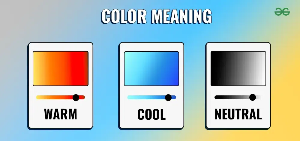
Colors can convey specific meanings and emotions which can be in a positive or negative manner depending on how it is being used. Colors have the ultimate strength to convey what your business is about.
Colors can convey different emotions and meanings, which is important to understand when creating designs. Knowing what colors represent what can help you choose the right colors for your designs. Here’s a simple guide to the meanings of common colors:
These create an energetic effect on the visitor, but when used alone it can be overwhelming. So it is always suggested to mix them with cool and neutral colors for balance.
These have a calming effect on the viewer, and this is the reason why cool colors are the most common colors used on websites.
These are great to mix with warm or cool colors and they are often used to tone down primary colors and create balance in web design.
To read more about the Color Symbolism visit Color Meaning.
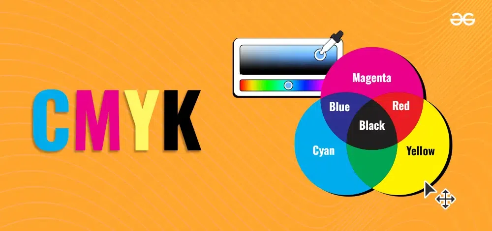
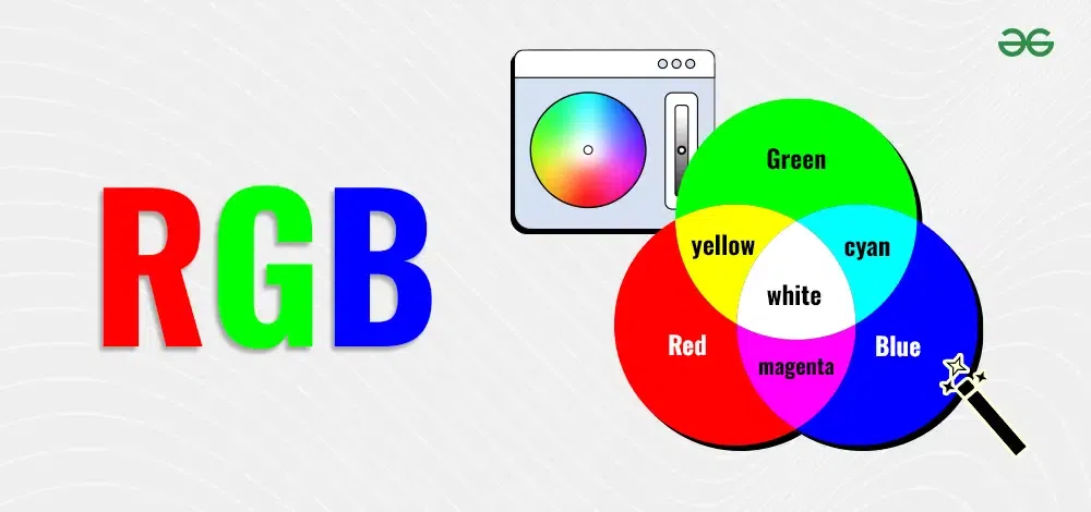
Color models are frameworks that describe the way colors can be represented as groups of numbers, typically as three or four values or color components. The most common color models you might have heard of include RGB (Red, Green, Blue) and CMYK (Cyan, Magenta, Yellow, Key/Black).
CMYK stands for Cyan, Magenta, Yellow, and Key (Black). It's a color model used in printing. Printers mix these four ink colors to create a wide range of other colors. Each letter in CMYK represents one of the main colors used. Cyan is a shade of blue, Magenta is a shade of pink, Yellow is the yellow ink, and Key refers to the black ink used to add depth and detail. By combining different amounts of these inks, printers can produce vibrant and accurate colors on paper.
RGB stands for Red, Green, and Blue. It is a color model used for digital screens like TVs, computers, and smartphones. In the RGB model, colors are created by mixing different amounts of red, green, and blue light. When combined in various ways, these three colors can produce millions of different colors. RGB is essential for displaying images and graphics on digital devices, making it a key concept in digital design and photography.
- To learn more about Color Models visit Color Models
- To see more Color Combinations visit Color Combinations
- To read more about different color theory terminologies visit Mastering Color Theory
.webp)