 |
VOOZH | about |
|
VOOZH | about |
Altair is a powerful Python library for creating declarative statistical visualizations. It is built on top of Vega and Vega-Lite, which provide a robust framework for creating complex visualizations with minimal code. One of the key features of Altair is its ability to customize scale ranges, allowing users to fine-tune the appearance of their charts to better represent their data. This article will guide you through the process of adjusting scale ranges in Altair, covering various aspects such as axis limits, scale types, and color scales.
Table of Content
In Altair, scales are functions that map data values (the domain) to visual values (the range), such as pixel positions or colors. These scales are crucial for translating raw data into meaningful visualizations. Altair automatically chooses default scales based on the data type, but you can customize these scales to better suit your visualization needs.
Altair allows you to set scale ranges for various types of charts, including bar charts, scatter plots, line charts, and more. You can adjust the scale ranges for both the x and y axes, as well as for other encoded properties like color or size.
By default, Altair includes the zero-point in quantitative axes. However, you can customize this behavior using the scale() method in the axis encodings.
To adjust the scale ranges, you typically use the alt.Scale() function within the encoding channels (e.g., x, y, color, size). Here’s a basic example:
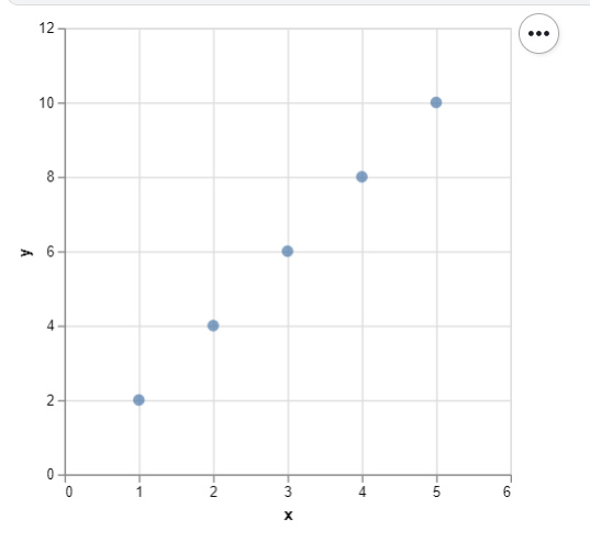
alt.X('field', scale=alt.Scale(domain=[min_value, max_value]))Let’s look at a practical example where we adjust the scale range for a simple scatter plot:
Explanation:
Adjusting these scales ensures that the plot includes a buffer around the data points, providing better context for the visualization.
Altair offers flexibility not only in setting the ranges but also in customizing the type of scale used. Common scale types include linear, logarithmic, and ordinal scales, each suited to different types of data.
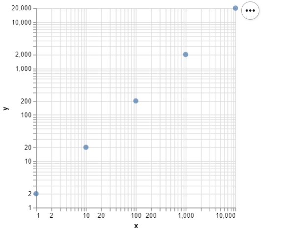
alt.Scale(type='linear', domain=[min_value, max_value])alt.Scale(type='log', domain=[min_value, max_value])alt.Scale(type='ordinal', domain=['A', 'B', 'C'])Output:
In this example, using a logarithmic scale is appropriate because the data spans several orders of magnitude. The logarithmic scale helps compress the data, making it easier to visualize and compare.
When creating faceted charts, you may want to ensure that all sub-charts share the same scale. This can be achieved using the resolve_scale() method.
Output:
Adjusting scale ranges in Altair is a powerful tool for fine-tuning your visualizations. Whether you need to highlight specific data ranges, ensure accurate representations, or improve the aesthetic quality of your charts, understanding how to control scales is essential.
By using the alt.Scale() function, you can set custom scale ranges for different chart types, choose the appropriate scale type (linear, logarithmic, ordinal), and create visualizations that effectively communicate your data. As you continue to work with Altair, mastering scale adjustments will help you create more precise and impactful charts.