 |
VOOZH | about |
|
VOOZH | about |
Time-series data consists of observations collected at regular intervals over time, often used in fields such as finance, meteorology, and economics. One powerful way to visualize this type of data is through animated scatter plots, which not only display the data points but also reveal changes and trends over time in a dynamic and engaging manner.
Plotly is a popular Python library that allows users to create interactive plots easily. Its capabilities extend beyond static visualizations, enabling the creation of animations that can illustrate complex datasets. This article will guide you through the process of creating animated scatter plots in Plotly using a sample time-series dataset.
Table of Content
Let’s create a synthetic dataset that we will use for our animated scatter plot. We will generate random sales data for three different product categories over a span of two years. Here’s how you can do this:
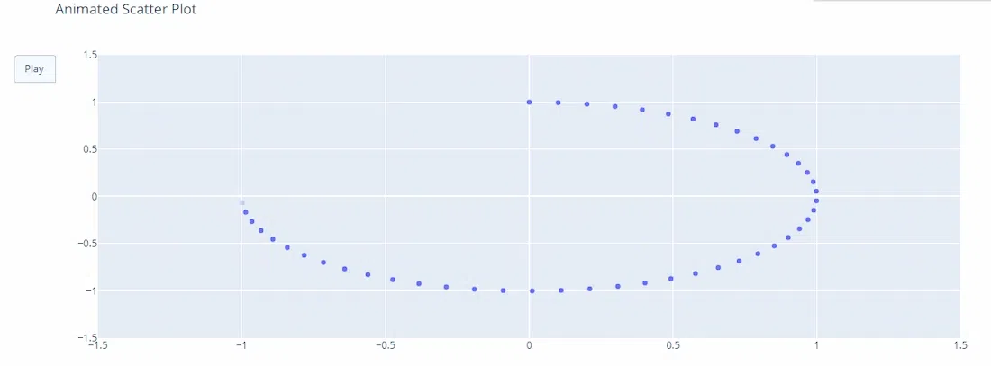
Now that we have our dataset ready, let’s create the animated scatter plot using Plotly. We will utilize the plotly.express module, which provides a high-level interface for creating plots quickly.
Output:
 date sales category
0 2022-01-01 202 B
1 2022-02-01 535 B
2 2022-03-01 960 B
3 2022-04-01 370 A
4 2022-05-01 206 A
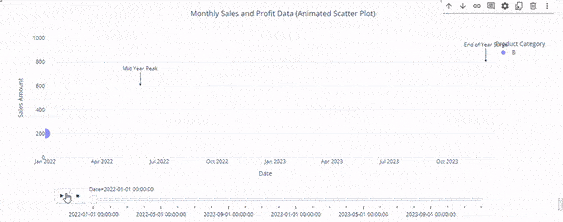
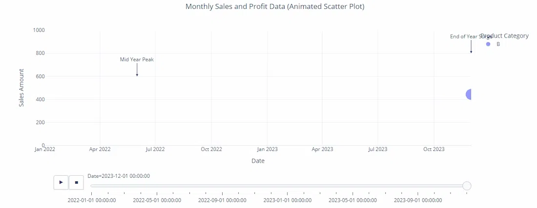
Now that we have our dataset ready, let’s create the animated scatter plot using Plotly. We will utilize the plotly.express module, which provides a high-level interface for creating plots quickly. Few parameters in the code:
Output:
Plotly Express is a high-level interface that simplifies the creation of visualizations. It is particularly useful for quick and easy plotting.
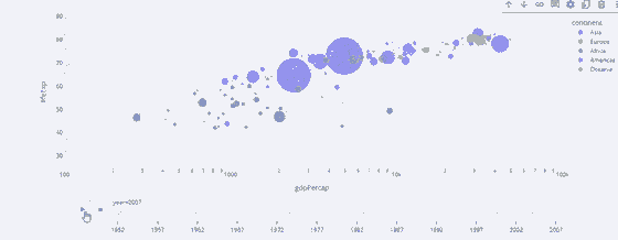
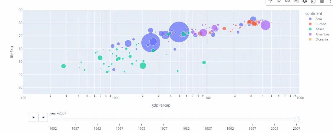
The Gapminder dataset is a popular dataset used for demonstrating animated plots. It contains information about countries' GDP per capita, life expectancy, and population over several years. Key Parameters
Output:
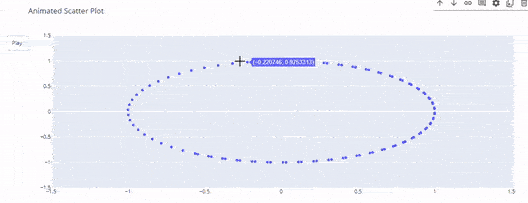
For more control over animations, you can use Plotly Graph Objects. This approach provides greater flexibility but requires more detailed configuration. Customizing Animations:
Output:
Animated scatter plots in Plotly provide a powerful tool for visualizing time-series data dynamically. Whether using Plotly Express for quick plotting or Graph Objects for detailed customization, these animations can enhance your data storytelling capabilities.