 |
VOOZH | about |
|
VOOZH | about |
Bokeh is a powerful visualization library in Python that allows for the creation of interactive plots and dashboards. One of the more advanced features of Bokeh is the ability to create a chart with two different Y-axis ranges. This can be particularly useful when dealing with datasets that have vastly different scales. In this article, we will delve into how to implement this feature in Bokeh, addressing common challenges and providing a step-by-step guide.
Table of Content
In data visualization, there are instances where you need to plot two datasets that share the same X-axis but have different Y-axis ranges. For example, you might want to plot temperature and precipitation on the same chart. Temperature might range from -10 to 40 degrees Celsius, while precipitation could range from 0 to 200 mm. Plotting these on the same Y-axis would make one of the datasets unreadable due to scale differences.
Using a dual Y-axis can introduce complexity in interpreting the chart:
Key Steps in the Implementation:
Let's start by creating a basic plot in Bokeh. We'll use two datasets with different Y-axis ranges.
Output:
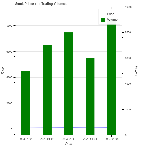
Consider a scenario where you want to plot stock prices and trading volumes on the same chart. Stock prices might range from $100 to $150, while trading volumes could range from 1,000 to 10,000 shares.
Output:
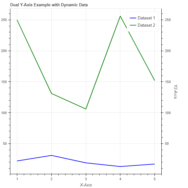
When dealing with dynamic data where the Y-axis ranges can change, it's crucial to ensure the axes adjust accordingly. Bokeh provides DataRange1d which can automatically adjust based on the data being plotted. This is particularly useful for real-time data visualization.
Output:
Creating a chart with two different Y-axis ranges in Bokeh is a powerful way to visualize datasets with varying scales. By carefully managing the axes and ensuring clear labeling, you can create informative and interactive visualizations. While dual Y-axes can be complex, Bokeh's flexibility makes it possible to implement them effectively. Always consider the end-user's ability to interpret the data accurately when designing such visualizations.