 |
VOOZH | about |
|
VOOZH | about |
With the help of the flexible data visualization framework Plotly, users may create dynamic and eye-catching charts. It is particularly effective in developing subplots, which are many storylines organized within one figure. To enhance the user experience while dealing with subplots, borders, side labels, and synchronized panning may be necessary. Borders should also be included for greater visual distinction. This tutorial will walk you through adding borders and side labels to your subplots and show you how to use Plotly in Python to synchronize panning between subplots.
Table of Content
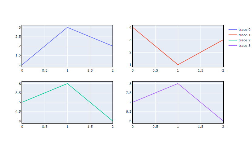
Before diving into adding borders and other enhancements, let's first understand how to create subplots in Plotly. Subplots are useful for displaying multiple plots in a single figure, allowing for easy comparison and analysis.
You can refer to the link for understanding how to: Create Subplots in Plotly
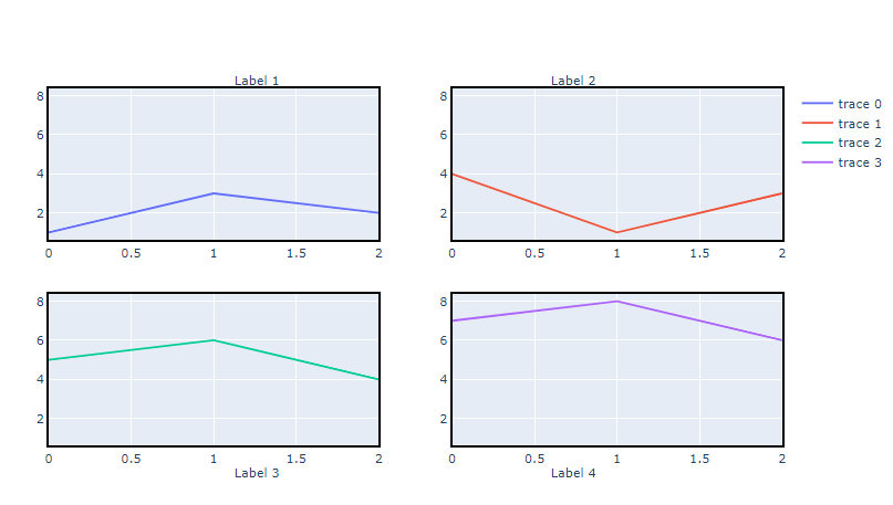
Subplot borders may aid in the visual differentiation of each subplot, facilitating user interpretation of the data. Although adding borders is not possible directly in Plotly, it may be done by modifying the layout parameters.
The following is how borders are added to subplots:
Output:
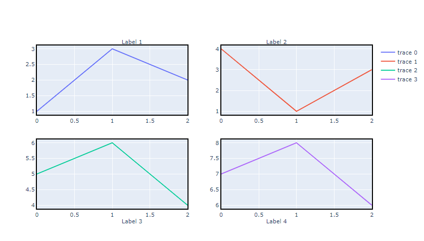
By adding further context to your subplots, side labels help the viewer better comprehend the data being shown. You may use annotations in the Plotly layout to create sidelabels. Custom labeling is possible with the ability to arrange annotations in relation to individual subplots.
This is how sidelabels are added:
Output:
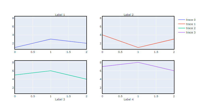
By guaranteeing that panning in one subplot immediately modifies the display in the other subplots, synchronizing panning across subplots enables users to examine the data with ease. This capability comes in handy especially when comparing datasets that have similar axes.
You may connect the axes together and use the relayout approach to synchronize panning:
Output:
To see these techniques in action, let’s combine everything into a single example:
Output:
Plotly provides a robust framework for creating interactive and customizable visualizations. By utilizing features such as borders, sidelabels, and synchronized panning, you can enhance the readability and functionality of your plots. These techniques are especially useful when dealing with complex datasets that require multiple visual representations for comprehensive analysis.