 |
VOOZH | about |
|
VOOZH | about |
Plotly is a powerful library for creating interactive and visually appealing data visualizations in Python. One of the common tasks when working with bar charts is sorting the bars in descending order. This article will guide you through the process of sorting a Plotly bar chart in descending order, using both Plotly Express and Plotly Graph Objects. We will explore the necessary steps, provide code examples, and discuss best practices to ensure your charts are both informative and aesthetically pleasing.
Table of Content
Before diving into sorting, it's essential to understand the basic structure of a Plotly bar chart.Plotly offers two main interfaces for creating bar charts:
Both interfaces allow you to create bar charts, but they differ in terms of syntax and flexibility.
Plotly Express simplifies the process of creating bar charts with minimal code. To sort a bar chart in descending order, you can use the categoryorder attribute in the update_layout method.
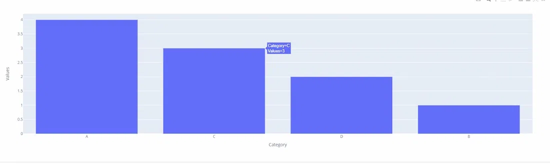
Example with Plotly Express
Output:
In this example, the categoryorder is set to 'total descending', which sorts the bars based on their values in descending order
Plotly Graph Objects provide more control over the chart's appearance and behavior. Sorting a bar chart in descending order using this interface involves setting the categoryorder attribute in the layout.
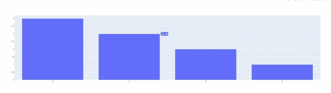
Example with Plotly Graph Objects
Output:
Here, the categoryorder is again set to 'total descending', ensuring the bars are displayed from highest to lowest value.
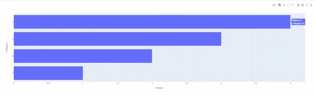
For horizontal bar charts, the sorting logic remains the same, but you need to adjust the axis attributes accordingly.
Output:
In this case, the yaxis is set to 'total ascending' to achieve descending order for a horizontal bar chart.
Sorting a Plotly bar chart in descending order is a straightforward process that enhances the readability and interpretability of your data visualizations. Whether you use Plotly Express for quick plotting or Plotly Graph Objects for more detailed customization, the categoryorder attribute is key to achieving the desired order. By following the examples and best practices outlined in this article, you can create effective and visually appealing bar charts that clearly communicate your data insights.