 |
VOOZH | about |
|
VOOZH | about |
When working in a Jupyter Notebook environment, you can produce interactive Matplotlib plots that allow you to explore data and interact with the charts dynamically. In this article, we'll explore how to create such interactive plots using Matplotlib within Jupyter. Before we proceed with the steps, let's understand some key concepts related to producing interactive Matplotlib plots in Jupyter:
Let's walk through the steps to create interactive Matplotlib plots in a Jupyter Notebook:
Ensure you have the necessary libraries installed. You can install them using pip:
In your Jupyter Notebook, import the required libraries:
Define a function that generates the plot you want to make interactive. This function should accept parameters that you can adjust interactively. For example:
Use the interact function from ipywidgets to create interactive controls for the parameters of your plot function:
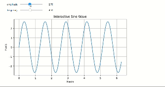
In this example, amplitude and frequency are parameters you can adjust using sliders. The (1, 5, 0.1) and (1, 10, 0.1) tuples define the range and step size for each parameter.
Run the cell containing the interact function. You will see interactive sliders for adjusting the amplitude and frequency of the sine wave plot. As you move the sliders, the plot will update in real-time.
Output
In this , you can see the Jupyter Notebook cell displaying an interactive sine wave plot with sliders for adjusting the amplitude and frequency parameters. As you move the sliders, the plot updates in real-time, allowing for interactive exploration of the plot's characteristics.
Producing interactive Matplotlib plots in a Jupyter environment is a valuable technique for data analysis and visualization, as it allows you to quickly explore and understand data patterns by interacting with the charts.