 |
VOOZH | about |
|
VOOZH | about |
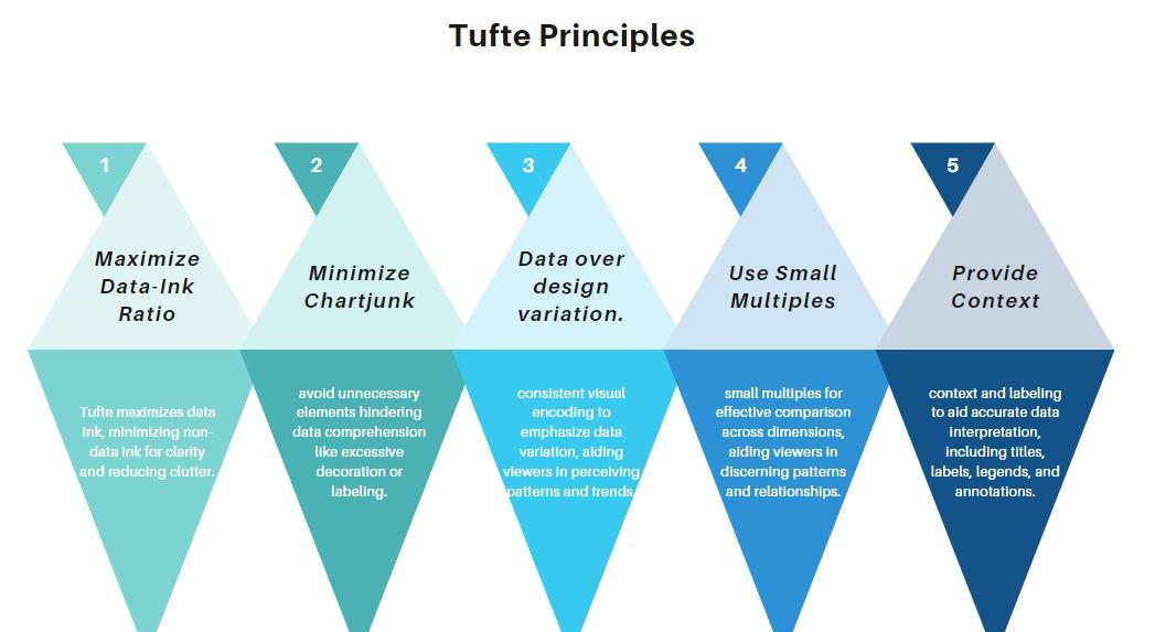
Mastering Tufte’s Data Visualization Principles means creating visuals that are clear, honest and insightful turning complex data into actionable understanding. Edward Tufte’s approach centers on maximizing clarity by enhancing data-ink (the part of a graphic that represents actual data), minimizing chart junk (unnecessary visual clutter) and ensuring every graphic maintains contextual and graphical integrity.
Edward Tufte is a statistician and professor emeritus of political science, statistics and computer science at Yale University. He is famed for his data visualization and information design work, arguing for clarity, accuracy, effectiveness in the presentation of complex material visually.
The idea of Tufte is to highlight:
Edward Tufte strongly advocated for clear, accurate and efficient data communication through graphical displays. He emphasized the importance of graphical integrity, warning against practices that distort or misrepresent data, such as misleading axes, inconsistent scales and excessive slicing in pie charts. Over-decoration adding unnecessary visual elements that do not aid understanding was discouraged, as it can distract from the actual data and lead to misinterpretation. Tufte’s principles guide designers to avoid these pitfalls by focusing on truthful, uncluttered and context-rich graphics, ensuring that visualizations reliably convey the intended message and support sound decision-making.
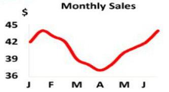
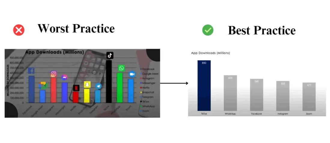
1. Non-Zero Baseline: Starting the y-axis at a value other than zero can exaggerate differences between data points. A y-axis that starts with a value other than zero may thus amplify the distinctions between data points. For example, a bar chart that starts the y-axis at 90 instead of zero can make an increase which is actually small seem bigger.
2. Inconsistent Scales: Using different scales for the x and y axes can distort perceived relationships between variables. Different scales used for the x and y axes leads to misperception of the relationship between variables. Such as, a line graph with the non-uniform intervals on the x-axis can distort trends over time.
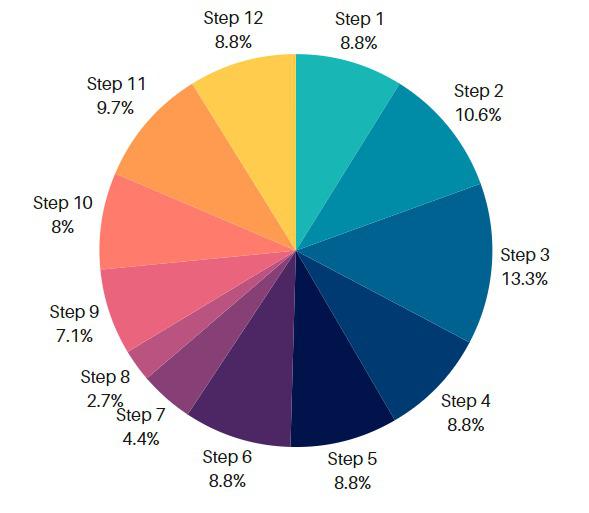
3. Slicing: Using too many slices in a pie chart can make it hard to interpret, as small slices become difficult to distinguish.
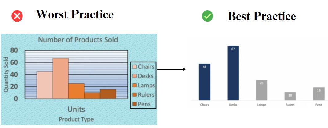
The Data-Ink Ratio is a concept introduced by Edward Tufte, a renowned expert in data visualization. It is defined as the proportion of ink used to present actual data compared to the total amount of ink (or pixels) used in the entire display. The goal is to maximize the data-ink ratio, which means that a large share of ink on a graphic should present data-information and the ink should change as the data change. The data-ink ratio can be mathematically represented as:
Data-ink ratio = Data-ink / Total ink used to print the graphic
Tufte splits ink used to display information into two categories: Data-ink and Non-data-ink.
Good graphics should include only data-ink. Non-data-ink is to be deleted everywhere where possible. The reason for this is to avoid drawing the attention of viewers of the data presentation to irrelevant elements.
Tufte's principles emphasize the importance of simplicity and clarity in data visualization. He advocates for erasing non-data-ink and redundant data-ink to improve the data-ink ratio. This approach helps to avoid distractions, saves time and saves space, making the message clearer and easier to consume by the audience.
Applying the data-ink ratio include simplifying charts by removing unnecessary elements such as gridlines, colors without meaning or purpose, 3D effects and annotations that don’t add to the chart’s message. The goal is to strike a balance between simplicity and the ability to understand the data, ensuring that the data remains the number one priority.
"Chartjunk" is a term coined by Tufte to describe all the unnecessary or distracting elements in a data visualization that do not contribute to understanding the information being presented. One aspect of chartjunk is what Tufte calls "non-data ink" or "redundant data ink."
Redundant data ink refers to elements that represent the data but are excessive or redundant. i.e. Decoration.
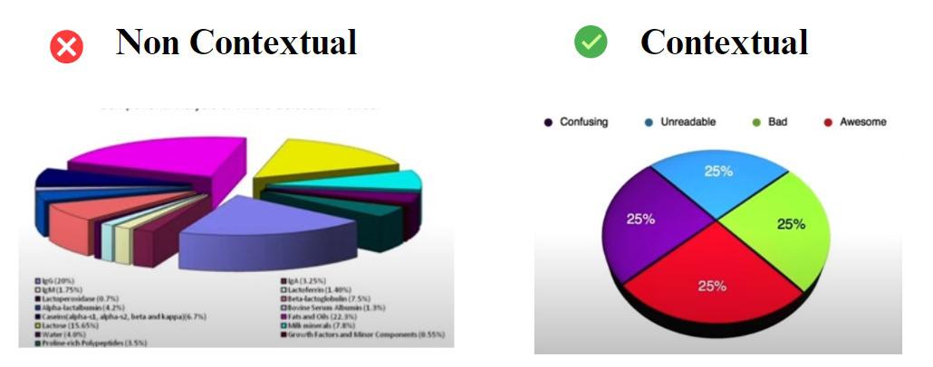
Contextual integrity is the concept of creating visual displays (charts, graphs, dashboards etc.) that are consistent with the information they are meant to represent and the context in which they will be used. In other words, the visuals should be clear, correct and easy to comprehend by the targeted audience.
Why contextual integrity is important?
Edward Tufte's principles for data visualization are widely respected for their emphasis on clarity, accuracy and efficiency. However, implementing these principles can present several challenges. Below is a table summarizing these challenges and potential solutions.
Challenge | Description | Solution |
|---|---|---|
Chart Junk and Visual Clutter | Excessive visual elements (e.g., 3D effects, heavy gridlines) obscure data and reduce clarity. | Strip away non-essential elements and maximize the data-ink ratio for clear, focused graphics. |
Information Overload and Complexity | Presenting too much data at once can overwhelm viewers and hide key insights. | Use small multiples or filter data to highlight the most relevant information for the audience. |
Misleading Visuals and Loss of Integrity | Manipulated axes, truncated scales, or omitted baselines can distort the data story. | Ensure honest representation by starting axes at zero and keeping the lie factor close to 1. |
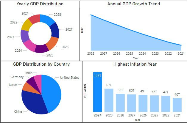
A Tufte-inspired dashboard might use effective color distinction, appropriate chart choices, clear labeling and adequate whitespace to avoid clutter and enhance readability.
Tufte emphasizes that clear presentation is essential to effective data visualization. The below dashboard achieves this by using clear and concise labels, separating the charts with whitespace and using color effectively.