VOOZH about

URL: https://www.geeksforgeeks.org/data-visualization/plotting-with-seaborn-and-matplotlib/

⇱ Plotting with Seaborn and Matplotlib - GeeksforGeeks


  • Courses
  • Tutorials
  • Interview Prep

Plotting with Seaborn and Matplotlib

Last Updated : 23 Jul, 2025

Matplotlib and Seaborn are two of the most powerful Python libraries for data visualization. While Matplotlib provides a low-level, flexible approach to plotting, Seaborn simplifies the process by offering built-in themes and functions for common plots.

Before diving into plotting, ensure you have both libraries installed:

pip install matplotlib seaborn

After installation, Import them in your script:

import matplotlib.pyplot as plt

import seaborn as sns

Basic plotting with matplotlib

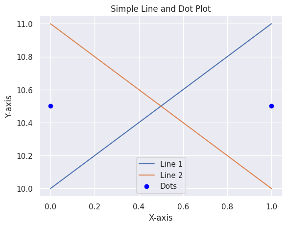
Matplotlib allows you to create simple plots using plt.plot(). Here’s an example of plotting lines and dots:

πŸ‘ output5

Explanation:

  • plt.plot([0, 1], [10, 11], label='Line 1') plots a line moving upward from (0,10) to (1,11).
  • plt.plot([0, 1], [11, 10], label='Line 2') plots a line moving downward from (0,11) to (1,10).
  • label='Line 1' / 'Line 2' assigns names for the legend.

Why Combine matplotlib and seaborn?

Seaborn makes plotting easier, but it is built on top of Matplotlib, so we can use both together for better results:

  • Customization: Matplotlib lets us fully control the plot (axes, labels, grid, colors, etc.).
  • Better Looks: Seaborn has built-in themes and styles that make plots look nicer.
  • Statistical Plots: Seaborn includes special plots like violin plots and KDE plots.
  • More Flexibility: Matplotlib allows extra customization and combining multiple plots.

Enhancing matplotlib with seaborn styles

Seaborn simplifies data visualization with built-in themes and high-level functions.

Example 1. Applying seaborn style to matplotlib plots

Output:

πŸ‘ output

Explanation:

  • sns.set_theme(style="darkgrid") applies a Seaborn theme for a cleaner look.
  • The plot consists of a simple line with markers, enhanced with labels and a legend.

Example 2. Customizing a seaborn plot with matplotlib

Output:

πŸ‘ output2

Explanation:

  • Seaborn’s sns.lineplot() creates a line plot from a DataFrame.
  • Matplotlib functions customize the title, axis labels and grid styling.

Example 3. Overlaying seaborn and matplotlib plots

Output:

πŸ‘ output3

Explanation:

  • sns.lineplot() creates a smooth sine wave.
  • plt.scatter() overlays red data points for better visualization.

Example 4. Enhancing Seaborn Histogram with Matplotlib Annotations

Output:

πŸ‘ output4

Explanation:

  • sns.histplot() creates a histogram with a KDE curve.
  • plt.axvline() draws a dashed red line at the mean value.
  • plt.text() annotates the mean value on the plot.
Comment
Article Tags:
Article Tags: