A scatter diagram is a graphical method used to study the relationship between two variables by plotting data points on a graph. It helps in visually identifying the direction and strength of correlation between variables without performing complex calculations. Each point on the graph represents a pair of values, making it easy to observe patterns such as positive, negative or no correlation.
Does not require complex calculations, making it simple and easy to use.
Helps in detecting outliers or unusual data points in the dataset.
Acts as a foundation for further analysis using methods like correlation and regression.
How to Draw a Scatter Diagram
A scatter diagram is drawn to visually represent the relationship between two variables using data points. The following steps are involved:
Identify the Variables: Determine the independent variable (X) and the dependent variable (Y) from the given data.
Draw Axes: Draw two perpendicular axes on a graph, placing the independent variable on the X-axis and the dependent variable on the Y-axis.
Choose a Suitable Scale: Select an appropriate scale for both axes to clearly represent all data values.
Plot the Data Points: Plot each pair of values (X, Y) on the graph as a dot. Each dot represents one observation.
Observe the Pattern: After plotting all points, examine the overall pattern to identify the type and strength of correlation between the variables.
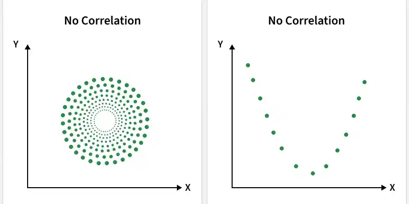
Types of Correlation in Scatter Diagram
A scatter diagram shows different types of correlation based on how the data points are distributed on the graph. By observing the pattern of points, we can identify the direction and strength of the relationship between variables.
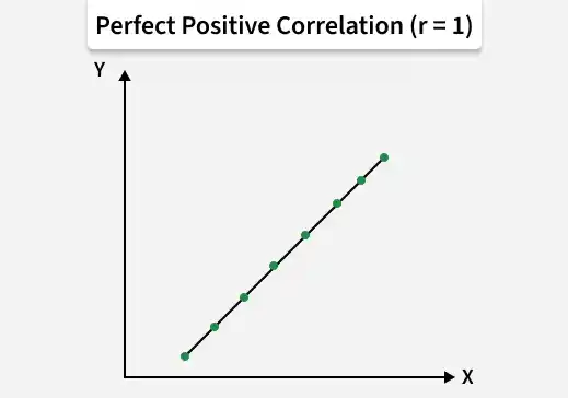
1. Perfect Positive Correlation
All data points lie exactly on a straight line with an upward slope, showing a perfect relationship between variables.
As one variable increases, the other also increases in a perfectly consistent manner.
The correlation coefficient is +1, indicating maximum positive correlation.
The correlation coefficient is a numerical measure that indicates the strength and direction of the relationship between two variables. Its value ranges from -1 to +1, where values close to +1 indicate strong positive correlation, close to -1 indicate strong negative correlation and near 0 indicate no correlation.
How to Interpret a Scatter Diagram
Interpreting a scatter diagram involves analyzing the pattern of plotted points to understand the direction, strength and nature of the relationship between two variables. By carefully observing the distribution of points, meaningful conclusions about correlation can be drawn.
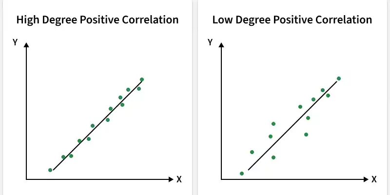
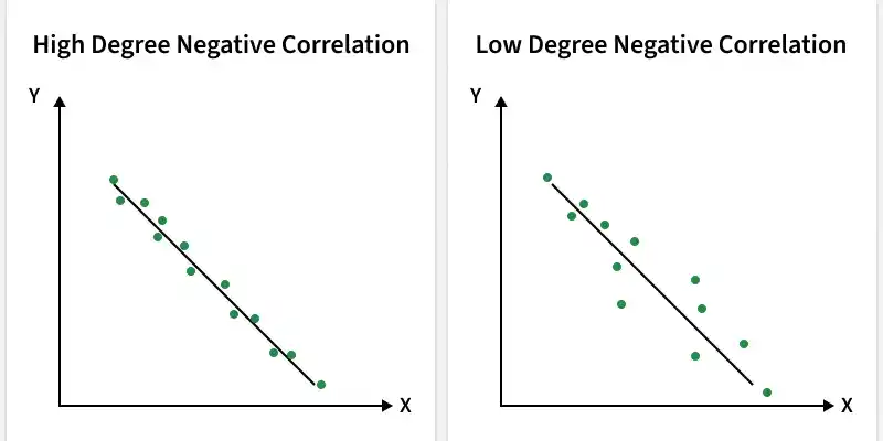
Closeness of Points (Strength of Correlation): If the points are closely clustered around a line, it indicates a strong correlation widely scattered points suggest a weak or no correlation.
Presence of Trend: If the points show a clear upward or downward pattern, the variables are correlated; absence of any visible pattern indicates no correlation.
Direction of Trend: An upward trend from left to right indicates positive correlation (both variables move together), while a downward trend indicates negative correlation (variables move in opposite directions).
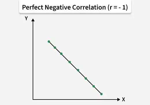
Perfect Correlation: If all points lie exactly on a straight line, the relationship is perfectly correlated, either positively (upward slope) or negatively (downward slope).
Outliers Detection: Unusual points that lie far from the general pattern (outliers) may affect the relationship and should be analyzed separately.
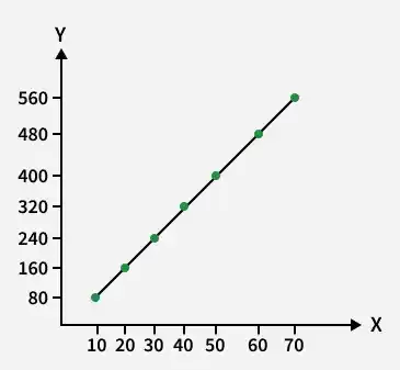
Example: Drawing and Interpreting a Scatter Diagram
Consider the following data for two variables X and Y. We are required to draw a scatter diagram and determine the type of correlation between them.
X
Y
10
80
20
160
30
240
40
320
50
400
60
480
The values of X are plotted on the X-axis and the corresponding values of Y are plotted on the Y-axis. Each pair of values, such as (10, 80), (20, 160), …, (60, 480), is represented as a point on the graph.
