 |
VOOZH | about |
|
VOOZH | about |
Plotly is a powerful graphing library that enables the creation of interactive and visually appealing plots in Python. One of the key features of Plotly is its ability to customize the axes of a graph, including setting the range of the x-axis. This article will provide a comprehensive guide on how to set the x-axis range in Plotly graphs, covering various scenarios and methods.
Table of Content
Before diving into setting the x-axis range, it's essential to understand how Plotly handles axes. Plotly allows for extensive customization of axes, including setting the type (linear, logarithmic, date, category), tick marks, labels, and ranges. The x-axis can be manipulated using both Plotly Express and Plotly Graph Objects, each offering unique functionalities.
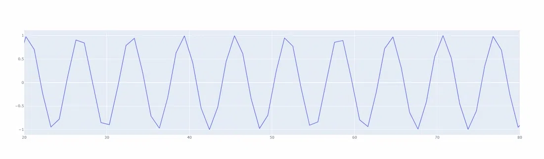
Plotly Express is a high-level interface for creating common figures quickly. It simplifies the process of creating plots with minimal code. Here's how you can set the x-axis range using Plotly Express:
Output:
In this example, the range_x parameter is used to set the x-axis range from 20 to 80. This method is straightforward and efficient for simple plots.
Plotly Graph Objects provide more control and customization options compared to Plotly Express. Here's how to set the x-axis range using Plotly Graph Objects:
Output:
The update_xaxes method is used here to set the x-axis range. This method is more versatile and can be combined with other axis customization options.
For linear axes, the range is set directly using the desired minimum and maximum values. However, for logarithmic axes, you must provide the logarithm of the desired range values:
Output:
In this example, the x-axis is set to logarithmic, and the range is specified in logarithmic scale.
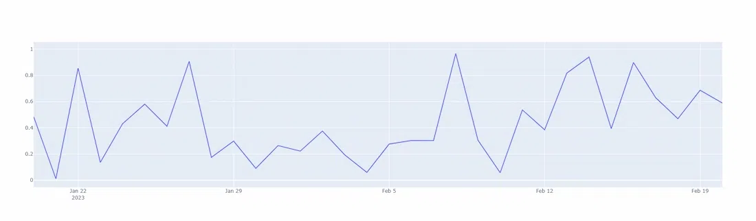
For date axes, the range should be set using date strings or date objects. For category axes, the range is set using the index of the categories:
Output:
In this example, the x-axis is set to date type, and the range is specified using date strings.
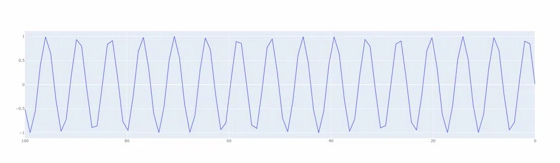
Plotly allows reversing the axis direction by setting the autorange property to "reversed":
This feature is useful when you want to display data in a descending order.
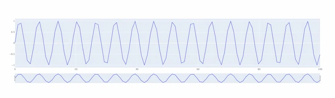
Range sliders allow users to interactively change the range of the x-axis:
Output:
The rangeslider_visible property adds a slider below the x-axis, enabling dynamic range adjustments.
Setting the x-axis range in Plotly graphs is a fundamental aspect of data visualization, allowing for precise control over the displayed data. Whether using Plotly Express for quick plots or Plotly Graph Objects for detailed customization, understanding how to manipulate the x-axis range is crucial for creating effective visualizations. By following the techniques and examples provided in this article, you can enhance your Plotly graphs to meet specific visualization requirements.