 |
VOOZH | about |
|
VOOZH | about |
Data Visualization is a powerful technique to analyze a large dataset through graphical representation. Python provides various modules that support the graphical representation of data. The widely used modules are Matplotlib, Seaborn, and Plotly. And we have one more module named Squarify which is mainly used to plot a Treemap.
Here the question is when to use Squarify instead of Why to use. As Python already has 2 to 3 data visualization modules that do most of the task. Squarify is the best fit when you have to plot a Treemap. Treemaps display hierarchical data as a set of nested squares/rectangles-based visualization.
Squarify is a great choice:
A Treemap diagram is an appropriate type of visualization when the data set is structured in hierarchical order with a tree layout with roots, branches, and nodes. It allows us to show information about an important amount of data in a very efficient way in a limited space.
We shall now plot a Treemap using Squarify. Install the module using pip install module_name.
pip install squarify
Import the necessary modules.
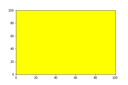
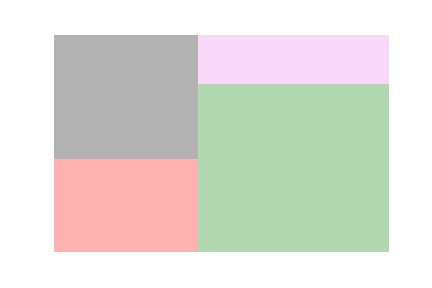
The plot is the method using which you can create a Treemap using Squarify. Squarify takes sizes as the first argument and also supports many features which we will look at one by one. Initially, the plot method plots a square of dimension 100x100.
Output:
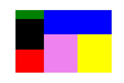
For making the plot more attractive we shall change the color of the plot. There are two ways by which we can change the color of the chart:
Method 1: We shall pass a list with color names it may or may not match the length of the data. If you have a color list less than the length of data, the same colors are repeated.
Output:
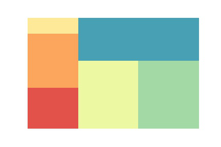
Method 2: We shall import the Python Seaborn module and select a color palette method.
Syntax: seaborn.color_palette(type,total_colors_required)
#total_colors_required should be integer
#you can choose any type from this list:
"""
'Accent', 'Accent_r', 'Blues', 'Blues_r', 'BrBG', 'BrBG_r', 'BuGn', 'BuGn_r', 'BuPu', 'BuPu_r', 'CMRmap', 'CMRmap_r', 'Dark2', 'Dark2_r', 'GnBu', 'GnBu_r', 'Greens', 'Greens_r', 'Greys', 'Greys_r', 'OrRd', 'OrRd_r', 'Oranges', 'Oranges_r', 'PRGn', 'PRGn_r', 'Paired', 'Paired_r', 'Pastel1', 'Pastel1_r', 'Pastel2', 'Pastel2_r', 'PiYG', 'PiYG_r', 'PuBu', 'PuBuGn', 'PuBuGn_r', 'PuBu_r', 'PuOr', 'PuOr_r', 'PuRd', 'PuRd_r', 'Purples', 'Purples_r', 'RdBu', 'RdBu_r', 'RdGy', 'RdGy_r', 'RdPu', 'RdPu_r', 'RdYlBu', 'RdYlBu_r', 'RdYlGn', 'RdYlGn_r', 'Reds', 'Reds_r', 'Set1', 'Set1_r', 'Set2', 'Set2_r', 'Set3', 'Set3_r', 'Spectral', 'Spectral_r', 'Wistia', 'Wistia_r', 'YlGn', 'YlGnBu', 'YlGnBu_r', 'YlGn_r', 'YlOrBr', 'YlOrBr_r', 'YlOrRd', 'YlOrRd_r', 'afmhot', 'afmhot_r', 'autumn', 'autumn_r', 'binary', 'binary_r', 'bone', 'bone_r', 'brg', 'brg_r', 'bwr', 'bwr_r', 'cividis', 'cividis_r', 'cool', 'cool_r', 'coolwarm', 'coolwarm_r', 'copper', 'copper_r', 'crest', 'crest_r', 'cubehelix', 'cubehelix_r', 'flag', 'flag_r', 'flare', 'flare_r', 'gist_earth', 'gist_earth_r', 'gist_gray', 'gist_gray_r', 'gist_heat', 'gist_heat_r', 'gist_ncar', 'gist_ncar_r', 'gist_rainbow', 'gist_rainbow_r', 'gist_stern', 'gist_stern_r', 'gist_yarg', 'gist_yarg_r', 'gnuplot', 'gnuplot2', 'gnuplot2_r', 'gnuplot_r', 'gray', 'gray_r', 'hot', 'hot_r', 'hsv', 'hsv_r', 'icefire', 'icefire_r', 'inferno', 'inferno_r', 'jet', 'jet_r', 'magma', 'magma_r', 'mako', 'mako_r', 'nipy_spectral', 'nipy_spectral_r', 'ocean', 'ocean_r', 'pink', 'pink_r', 'plasma', 'plasma_r', 'prism', 'prism_r', 'rainbow', 'rainbow_r', 'rocket', 'rocket_r', 'seismic', 'seismic_r', 'spring', 'spring_r', 'summer', 'summer_r', 'tab10', 'tab10_r', 'tab20', 'tab20_r', 'tab20b', 'tab20b_r', 'tab20c', 'tab20c_r', 'terrain', 'terrain_r', 'turbo', 'turbo_r', 'twilight', 'twilight_r', 'twilight_shifted', 'twilight_shifted_r', 'viridis', 'viridis_r', 'vlag', 'vlag_r', 'winter', 'winter_r'
"""
Output:
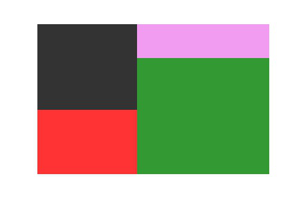
The alpha argument is used to vary the opacity of the image. It can either be an integer or floating value in the range of 0 to 1. The alpha value near 1 has high opacity whereas the alpha value near 0 has less opacity.
Output:
Here, we will see a lower value of alpha.
Output:
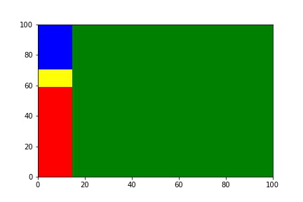
Scale is used to change the range of the chart, by default, the range of the plot is 100x100. Using norm_x you can scale x-axis data whereas norm_y you can scale the y-axis.
Output:
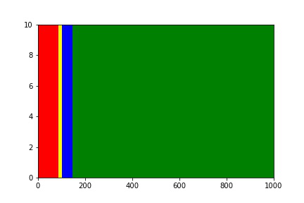
Scaling with both axes.
Output:
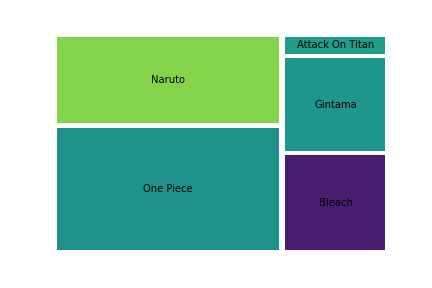
A Treemap without a label is just a box with no meaning. The label adds meaning to the treemap divisions and denotes what specific plots represent. You can increase the font size of the label by adding an extra argument text_kwargs.
Output:
Padding takes an integer value that is used to add spaces between treemaps for proper visualization.
Output:
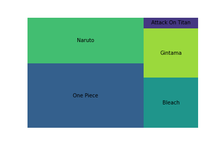
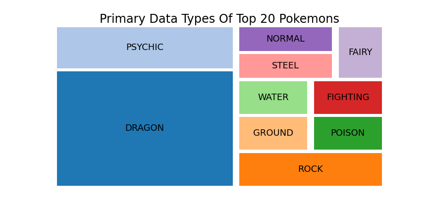
We shall now see how to implement a Treemap on a real-world dataset. You can download the dataset from https://www.kaggle.com/hamdallak/the-world-of-pokemons. In the below code we are taking the top 20 Pokemons and creating a Treemap based on the Primary Type of the top 20 Pokemons.
Output: