 |
VOOZH | about |
|
VOOZH | about |
Bokeh is a powerful and flexible Python library for creating interactive plots and dashboards for modern web browsers. One of the great features of Bokeh is its extensive customization options, including the ability to turn off or modify tick marks on the axes of your plots. In this article, we'll cover how to hide tick marks on both the X and Y axes, how to customize their appearance, and we’ll provide example code for turning off tick marks in your Bokeh visualizations.
Table of Content
Before diving into how to remove tick marks, it is essential to understand what tick marks are and why they are used in visualizations. Tick marks, along with axis labels and grid lines, are a critical part of data representation on a graph. They help provide a scale to visualize the magnitude and frequency of data points, but sometimes these elements can clutter the chart.
In Bokeh, tick marks are automatically placed based on the range of your data. However, in certain cases, like when you're creating minimalistic dashboards or need to highlight specific elements without distraction, you might want to hide these tick marks.
In Bokeh, axes are customizable objects, and you can control their visibility and styling in detail. To hide tick marks on either the X or Y axis, you will work with the major_tick_line_color and minor_tick_line_color properties of the axis.
Steps to Hide Tick Marks:
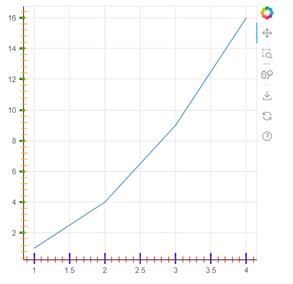
Output:
By setting the major_tick_line_color and minor_tick_line_color properties to None, Bokeh will no longer render the tick marks on the respective axis.
While turning off tick marks is useful in many cases, you might want to simply adjust their appearance instead of hiding them completely. Bokeh provides a number of options for customizing the size, color, and location of the tick marks. This section will cover some of the most common customizations.
Output:
There are several scenarios where you may prefer to turn off tick marks:
Below is a complete example where we turn off both major and minor tick marks for both axes in a Bokeh plot. This is useful when you want to create a cleaner, more minimalist chart that focuses solely on the data.
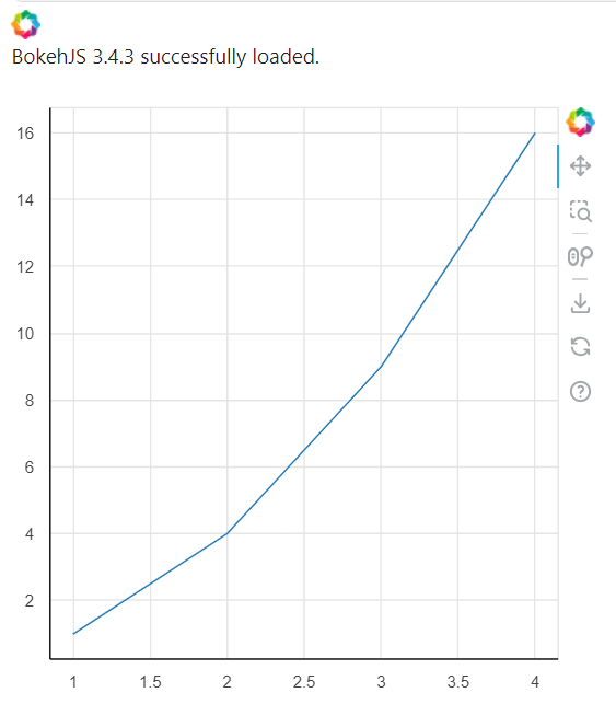
Output:
While turning off tick marks can enhance the aesthetics of your visualizations, it's important to carefully consider the use case. Tick marks provide important context for users to understand the scale of the data. If your visualization depends heavily on user interpretation of axis scales, you should ensure that the absence of tick marks does not detract from the plot’s clarity.
Here are some factors to consider:
Turning off tick marks in Bokeh is a simple and effective way to clean up your visualizations when you want to focus more on the data itself or create a minimalist design. By controlling the major_tick_line_color and minor_tick_line_color properties, you can selectively hide or modify the appearance of ticks for both the X and Y axes. Additionally, Bokeh allows you to customize the size, color, and width of tick marks to suit your needs.