 |
VOOZH | about |
|
VOOZH | about |
Prerequisite: Data Visualization in Python
Visualization is seeing the data along various dimensions. In python, we can visualize the data using various plots available in different modules.
In this article, we are going to visualize and predict the crop production data for different years using various illustrations and python libraries.
The Dataset contains different crops and their production from the year 2013 – 2020.
There are a lot of python libraries which could be used to build visualization like matplotlib, vispy, bokeh, seaborn, pygal, folium, plotly, cufflinks, and networkx. Of the many, matplotlib and seaborn seems to be very widely used for basic to intermediate level of visualizations.
However, two of the above are widely used for visualization i.e.
pip install matplotlib
pip install seaborn
Below are some programs which indicates the data and illustrates various visualizations of that data:
Example 1:
Output:
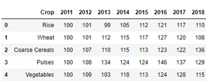
These are the top 5 rows of the dataset used.
Example 2:
Output:
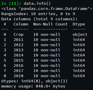
These are the data constraints of the dataset.
Example 3:
Output:
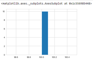
The above program depicts the crop production data in the year 2011 using histogram.
Example 4:
Output:
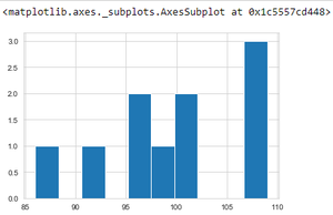
The above program depicts the crop production data in the year 2012 using histogram.
Example 4:
Output:
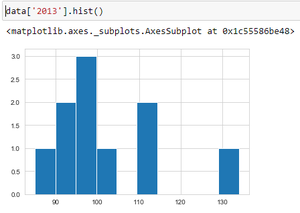
The above program depicts the crop production data in the year 2013 using histogram.
Example 5:
Output:
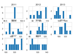
The above program depicts the crop production data of all the available time periods(year) using multiple histograms.
Example 6:
Output:
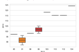
Comparing crop productions in the year 2013 and 2014 using box plot.
Example 7:
Output:
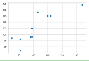
Comparing crop production in the year 2013 and 2014 using scatter plot.
Example 8:
Output:
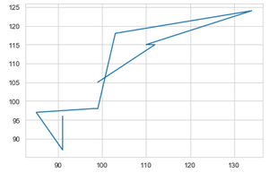
Comparing crop productions in the year 2013 and 2014 using line plot.
Example 9:
Output:
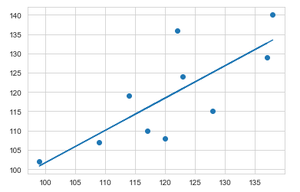
Applying linear regression to visualize and compare predicted crop production data between the year 2017 and 2018.
Example 10:
Output:
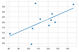
Applying linear regression to visualize and compare predicted crop production data between the year 2016 and 2017.
This video shows how to depict the above data visualization and predict data, using Jupyter Notebook from scratch.
In this way various data visualizations and predictions can be computed.