 |
VOOZH | about |
|
VOOZH | about |
Yellowbrick is an innovative Python library designed to enhance the machine learning workflow by providing visual diagnostic tools. It extends the Scikit-Learn API, allowing data scientists to visualize the model selection process, feature analysis, and other critical aspects of machine learning models. By integrating with Matplotlib, Yellowbrick offers a comprehensive suite of visualizations that help in understanding and improving machine learning models.
This article will explore yellowbrick's functionalities and how it can transform the machine learning workflow by providing interpretability and transparency.
Table of Content
Yellowbrick is a machine learning visualization library built on top of Scikit-learn, the popular machine learning framework in Python. While a range of tools for model training and evaluation are offered by Scikit-learn, it lacks extensive capabilities for visualizing the internal processes of machine learning algorithms. Yellowbrick fills this gap by offering a suite of visualizations to assess model performance, feature importance and dataset structures.
By integrating seamlessly with Scikit-learn, Yellowbrick enables users to create diagnostic visuals that can be directly applied to machine learning models without requiring a steep learning curve. It allows for quick and insightful analysis across several machine learning tasks, from classification and regression to clustering and feature selection. With Yellowbrick, you can:
Yellowbrick enhances model interpretability through a variety of visualization tools that cater to different types of machine learning models. Here are some ways it improves the model-building process:
Setting up Yellowbrick is simple since it's built on scikit-learn, the integration is seamless, and it can be installed using the Python package manager, pip:
Step-by-Step Installation, Install Yellowbrick:
pip install yellowbrickImport into Your Environment : You can import visualizers and apply them to any Scikit-learn compatible model. Here is an example:
Set Up a Classifier or Regressor: Yellowbrick requires you to fit a model using Scikit-learn. For instance, to visualize a confusion matrix for a RandomForestClassifier, you can do the following:
Yellowbrick offers several tools to visualize the performance of classification models. These include confusion matrices, classification reports, and ROC/AUC curves.
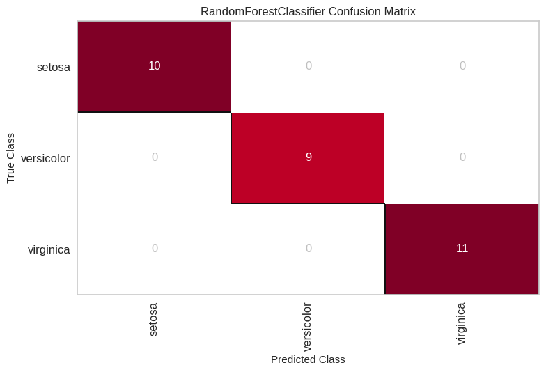
A confusion matrix visualizes the number of correct and incorrect predictions made by the classification model, broken down by class. It's useful for understanding how well your model is performing at classifying specific classes.
Example:
Output:
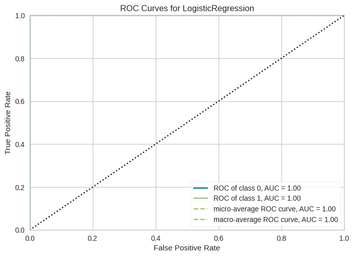
The ROC (Receiver Operating Characteristics) curve helps to evaluate a model's ability to distinguish between classes, particularly in binary classification tasks. yellowbrick's ROCAUC visualizer shows the trade-off between true positive rate (sensitivity) and false positive rate (1-specificity).
Example:
Output:
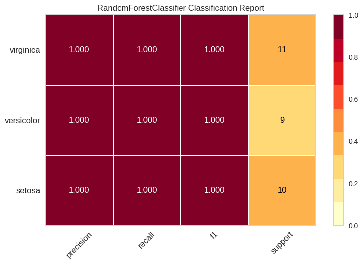
This visualization generates a report showing the precision, recall, F1-score, and support for each class in a classification problem.
Example:
Output:
Yellowbrick provides several tools for visualizing regression models, making it easier to interpret how well a model fits the data.
The residuals plot is one of the most valuable visualizations for regression tasks. It shows the difference between the predicted and actual values, helping to identify potential issues like heteroscedasticity (variance changing across the data) or non-linearity in the model.
Example:
Output:
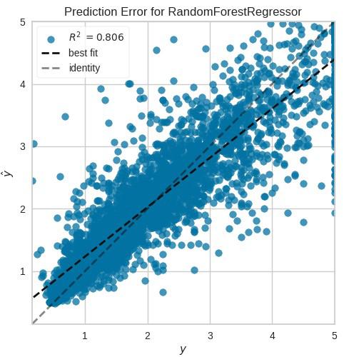
The prediction error plot visualizes the relationship between the true values and the predicted values. This plot helps understand whether the model is overfitting, underfitting, or performing adequately.
Example:
Output:
Clustering models require a unique set of Visualisation tools, given their unsupervised nature. Yellowbrick provides several visualizations for interpreting clustering models like KMeans, DBSCAN, and Agglomerative clustering.
The elbow method is used to determine the optimal number of clusters in a dataset. By plotting the sum of squared distances from each point to its assigned cluster centre, you can identify the "elbow" point where increasing the number of clusters provides diminishing returns.
Example:
Output:
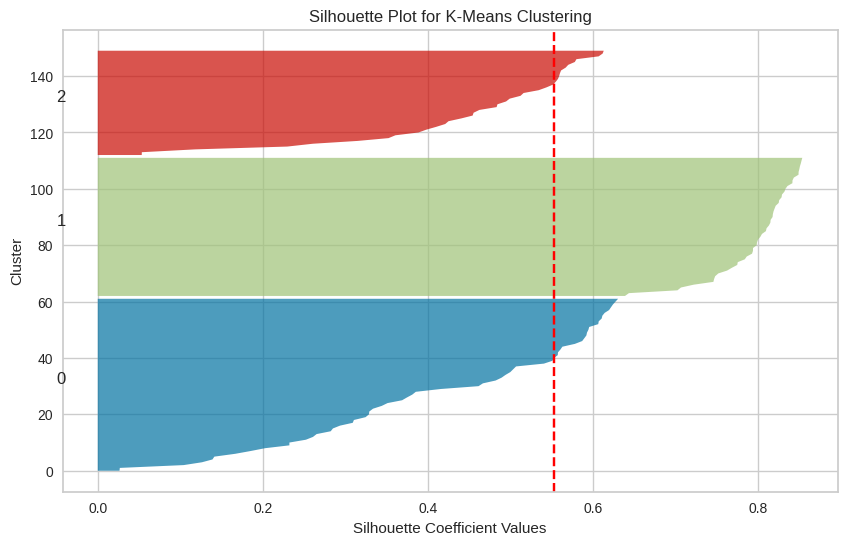
The silhouette score measures how similar each point is to its own cluster compared to other clusters. The silhouette plot provided by Yellowbrick helps you understand the cohesion and separation of clusters.
Example:
Output:
Understanding which features contribute the most to your model's predictions can be invaluable for optimizing model performance. Yellowbrick offers several feature analysis tools:
The Rank2D visualizer generates a correlation matrix to rank features based on their pairwise relationships.
Example:
Output:
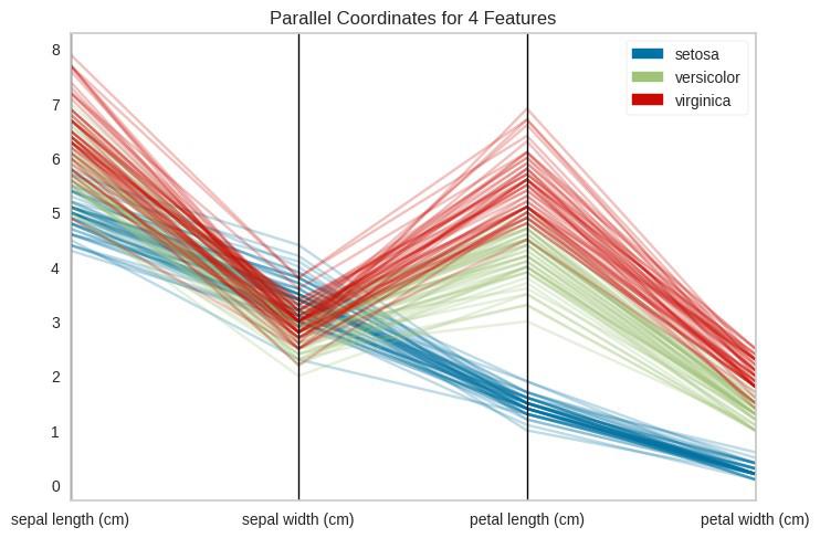
This visualization helps analyze high-dimensional data by plotting feature values on parallel axes. It's particularly useful when you have many features and want to identify patterns.
Example:
Output:
Yellowbrick offers a powerful set of visual diagnostic tools that significantly enhance the interpretability of machine learning models. Whether you're working on classification, regression, clustering, or feature selection, Yellowbrick can provide insights that go beyond conventional performance metrics. Its seamless integration with scikit-learn makes it an invaluable resource for data scientists and machine learning practitioners looking to improve model transparency and performance evaluation.