 |
VOOZH | about |
|
VOOZH | about |
A histogram is a graphical representation of the numerical data. Sometimes you'll want to share data insights with someone, and using graphical representations has become the industry standard.
Pandas.DataFrame.hist() function plots the histogram of a given Data frame.
It is useful in understanding the distribution of numeric variables. This function splits up the values into the numeric variables.
When Pandas function DataFrame.hist() is used, it automatically calls the function matplotlib.pyplot.hist() on each series in the Pandas DataFrame. As a result, we obtain one histogram per column.
Syntax: DataFrame.hist(data, column=None, by=None, grid=True, xlabelsize=None, xrot=None, ylabelsize=None, yrot=None, ax=None, sharex=False, sharey=False, figsize=None, layout=None, bins=10, backend=None, legend=False, **kwargs)
Parameters:
- data: DataFrame
- column: str or sequence
- xlabelsize: int, default None
- ylabelsize: int, default None
- ax: Matplotlib axes object, default None
- **kwargs All other plotting keyword arguments to be passed to matplotlib.pyplot.hist().
Return: matplotlib.AxesSubplot or numpy.ndarray
Below are the examples of Pandas DataFrame.hist() functions that we can use to plot histograms with Pandas in Python:
Sometimes we need to plot Histograms of columns of DataFrame to analyze them more deeply. In that case, the DataFrame.hist() function helps a lot. Using this function, we can plot histograms of as many columns as we want.
In the below example, we plot histograms of columns 'Length' and 'Breadth' using the DataFrame.hist() function.
Output
In the below example, we plot histograms of columns 'Length', 'Breadth', and 'Height' using DataFrame.hist() function.
In this example, histograms for the columns 'Length', 'Breadth', and 'Height' are generated from a DataFrame named 'values' using the DataFrame.hist() function with 12 bins each.
Output
In the below example, we plot histograms of columns 'Length', 'Breadth', 'Height', and 'Weight' using DataFrame.hist() function.
Output
👁 Plot Histogram using Pandas DataFrame
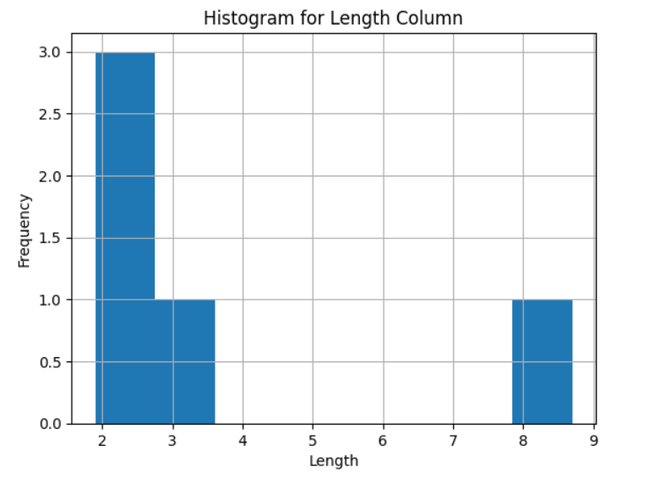
In this example, a histogram is created for the 'Length' column of a DataFrame named 'values' using Matplotlib and Pandas. The histogram is customized with a title, x-axis label ('Length'), and y-axis label ('Frequency'), and then displayed using plt.show().
Output
👁 Plot Histogram With Pandas For Specific Column
Also Check:
Using graphs to graphically represent the findings is a very important step in data analysis. A histogram is used to represent the spread of your data.
In this tutorial, we covered how to use the in-built Pandas function DataFrame.hist() to plot a histogram in Python. We have explained the DataFrame.hist() function in easy words with examples. You can practice and experiment with the function to gain confidence using it.