 |
VOOZH | about |
|
VOOZH | about |
Bokeh is a powerful Python library for creating interactive visualizations in web browsers. When creating plots or figures in Bokeh, adding clear and descriptive labels for the X and Y axes is crucial for improving the readability and interpretability of the graph. Customizing these axis labels can also help you make your plots more visually appealing and aligned with your presentation or reporting style.
This article will guide you through setting and customizing axis labels in Bokeh, including changing their font size, style, and color. We will also provide example code to demonstrate how to apply these customizations.
Table of Content
Adding labels to the X and Y axes of a Bokeh figure is quite simple. The xaxis.axis_label and yaxis.axis_label properties allow you to define labels for both axes. These labels help users understand what the data represents, especially in cases where numeric or categorical axes could be ambiguous without proper context.
Basic Syntax for Setting Axis Labels:
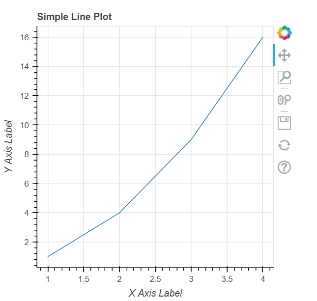
Output:
In this example, we create a simple line plot, and both axis labels are applied to describe the data.
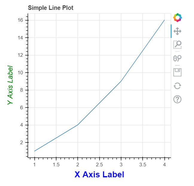
Bokeh offers a wide range of customization options for axis labels, including font size, style, color, and alignment. These customizations are done using the axis_label_text_font_size, axis_label_text_font_style, and axis_label_text_color properties.
Code Example for Customizing Axis Labels:
Output:
Explanation:
These customizations can help make your graph look more professional and better aligned with the design or branding you are using in your reports or presentations.
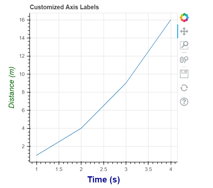
Below is a complete example that demonstrates setting and customizing axis labels in a Bokeh figure. We’ll apply different font sizes, styles, and colors to the X and Y axes, and show the resulting plot.
Output:
Explanation:
This example demonstrates a simple yet effective way to customize your axis labels, ensuring they provide clarity and fit well within your visualizations.
Customizing X and Y axis labels in Bokeh is a simple but powerful way to enhance the readability and aesthetics of your visualizations. With just a few lines of code, you can set axis labels and adjust their font size, style, and color to match your design needs. By customizing these elements, you can make your plots more professional and informative, especially when presenting them to stakeholders or in reports.
Using Bokeh's extensive customization options, you can control nearly every aspect of your figure’s appearance, making it a great tool for producing interactive, visually appealing visualizations in Python.