 |
VOOZH | about |
|
VOOZH | about |
Altair is a declarative statistical visualization library for Python, built on top of the Vega-Lite visualization grammar. It provides a simple and intuitive API for creating a wide range of interactive and informative visualizations, including bar charts. This article will guide you through the process of creating bar charts using Altair, focusing on the syntax, customization options, and practical examples to help you leverage the full potential of this powerful library.
Table of Content
In Altair, all visualizations start with the Chart class. This class takes your data as input and uses methods to specify the type of chart and the encoding of the data.
Syntax:
alt.Chart(data).mark_bar().encode()
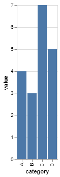
Here is a simple example of how to create a bar chart using Altair:
Output:
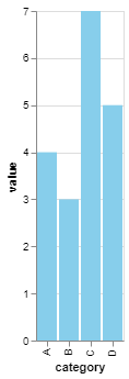
You can customize the colors of the bars to make the chart more visually appealing or to highlight specific data points.
Output:
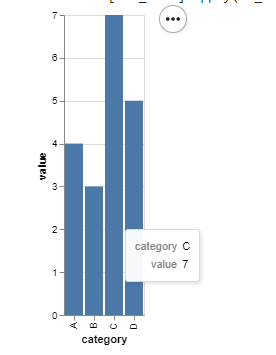
Tooltips can be added to provide more information when hovering over the bars.
Output:
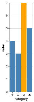
You can highlight specific bars based on a condition using the alt.condition() method.
Output:
Altair provides a powerful and flexible framework for creating bar charts in Python. By understanding the basic syntax and exploring customization options, you can create informative and visually appealing bar charts that effectively communicate your data insights.