 |
VOOZH | about |
|
VOOZH | about |
Seaborn, a powerful Python data visualization library built on top of matplotlib, provides a range of tools for creating informative and attractive statistical graphics. One of its key features is the ability to plot numpy arrays, which are fundamental data structures in Python. This article delves into the details of plotting numpy arrays using Seaborn, covering the necessary steps, examples, and best practices.
Table of Content
Before diving into plotting, it is essential to understand numpy arrays. Numpy arrays are multi-dimensional arrays that can store large amounts of data efficiently. They are widely used in scientific computing, data analysis, and machine learning. Numpy arrays can be created from various data sources, including lists, tuples, and other arrays.
To plot a numpy array using Seaborn, you need to import the necessary libraries. Here is the basic import statement:
To create a numpy array, you can use the numpy.array function. Here is an example:
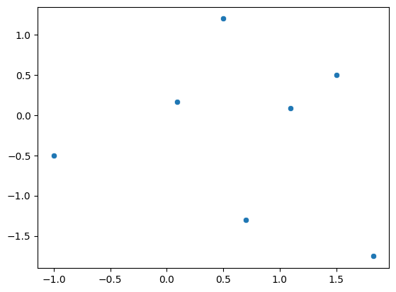
Seaborn provides several functions for plotting numpy arrays, including scatterplot, lineplot, and heatmap. Here is an example of using scatterplot to plot a numpy array:
Output:
In this example, scatterplot is used to create a scatterplot of the numpy array. The x and y arguments specify the columns of the array to use for the x and y axes, respectively.
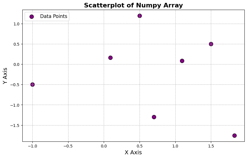
Seaborn allows you to customize the plot by adding additional features such as titles, labels, and legends. Here is an example of customizing the plot:
Output:
In this example, the title, xlabel, and ylabel functions are used to add a title and labels to the plot. The legend function is used to add a legend to the plot.
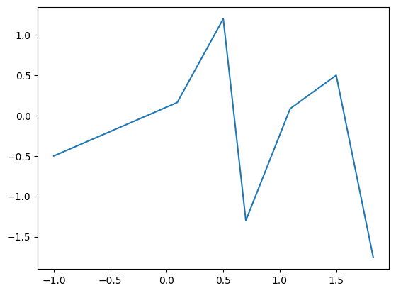
Seaborn provides various plot types that can be used to visualize numpy arrays. Here is an example of using lineplot to create a line plot:
Output:
In this example, lineplot is used to create a line plot of the numpy array.
Heatmaps are useful for visualizing high-dimensional data. Here is an example of using heatmap to create a heatmap:
Output:
In this example, heatmap is used to create a heatmap of the numpy array. The annot argument is used to add annotations to the heatmap, the cmap argument specifies the color map, and the square argument ensures that the heatmap is square.
Plotting numpy arrays using Seaborn is a powerful tool for data visualization. By understanding the basics of numpy arrays and Seaborn, you can create informative and attractive plots to explore and analyze your data. This article has covered the necessary steps and examples to get you started with plotting numpy arrays using Seaborn.