 |
VOOZH | about |
|
VOOZH | about |
Bokeh is a powerful visualization library in Python that provides interactive plots and dashboards. One of its key features is the ability to handle datetime data, which is essential for time series analysis and other applications involving temporal data. This article will guide you through the process of setting the X-axis as datetimes on a Bokeh plot, including formatting and customization options.
Table of Content
Bokeh is designed to create interactive and visually appealing plots that can be easily integrated into web applications. It supports various types of data, including datetime, which allows you to create plots with time-based axes. This is particularly useful for visualizing trends over time, such as stock prices, weather data, or any other time series data.
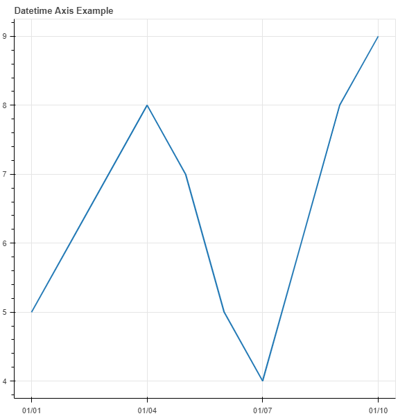
To create a plot with a datetime X-axis, you need to specify the x_axis_type parameter as 'datetime' in the figure() function. Here is a basic example:
Output:
Bokeh provides DatetimeTickFormatter that allows you to specify the format of the ticks on the datetime axis. You can customize the format for different time intervals such as years, months, days, etc.
Output:
Setting the X-axis as datetimes in a Bokeh plot is straightforward and offers a range of customization options to enhance your data visualization. By leveraging Bokeh's powerful features, you can create interactive and informative time series plots that effectively communicate trends and patterns in your data.