Seaborn is a Python data visualization library built on top of Matplotlib. It provides a high-level interface for drawing attractive, informative statistical graphics. Unlike Matplotlib, Seaborn works seamlessly with Pandas DataFrames, making it a preferred tool for quick exploratory data analysis and advanced statistical plotting.
Comes with built-in datasets like iris, tips, etc.
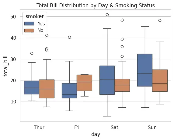
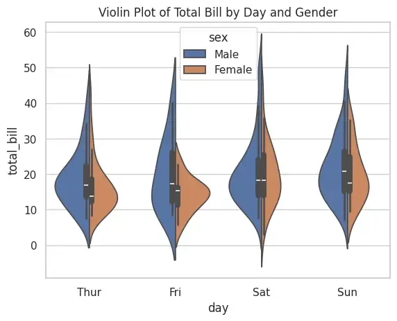
Provides statistical plots such as boxplots, violin plots, swarm plots, etc.
Handles categorical data visualization better than Matplotlib.
Supports aesthetic customization (themes, color palettes, styles).
Simplifies working with DataFrames by auto-labeling axes.
Different Plots in Seaborn
Let's see the various types of plots in seaborn,
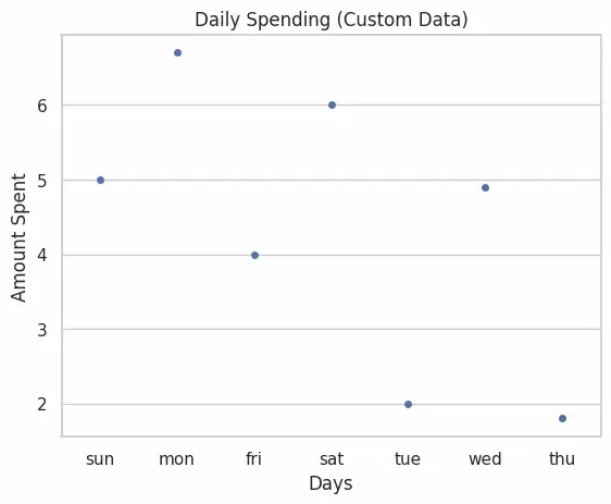
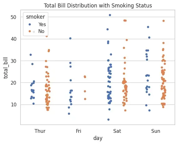
1. Strip Plot
A strip plot is a categorical scatter plot where data points are plotted along one categorical axis. It is useful for visualizing the distribution of values but may suffer from overlapping points.
Applications
Used when we want to visualize raw distribution of numerical data across categories.
Helpful for detecting clusters or general spread of values.
Advantages
Simple and easy to interpret.
Shows individual data points clearly.
Limitations
Overlapping points may cause loss of clarity in dense datasets.
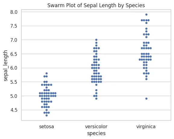
A swarm plot is similar to a strip plot, but points are arranged to avoid overlap. This ensures all data points are visible, making it more informative.
Applications
Useful when dataset is small/medium and we want to show all observations.
Comparing sub-groups clearly without stacking.
Advantages
Prevents overlap of data points.
Provides clearer visual insight than strip plot.
Limitations
Can be slow for large datasets.
May look cluttered when categories have thousands of points.
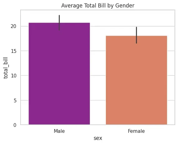
A bar plot shows the average (by default mean) of a numerical variable across categories. It can use different estimators (mean, median, std, etc.) for aggregation.
Applications
Comparing average values across categories.
Displaying results of group-by operations visually.
