 |
VOOZH | about |
|
VOOZH | about |
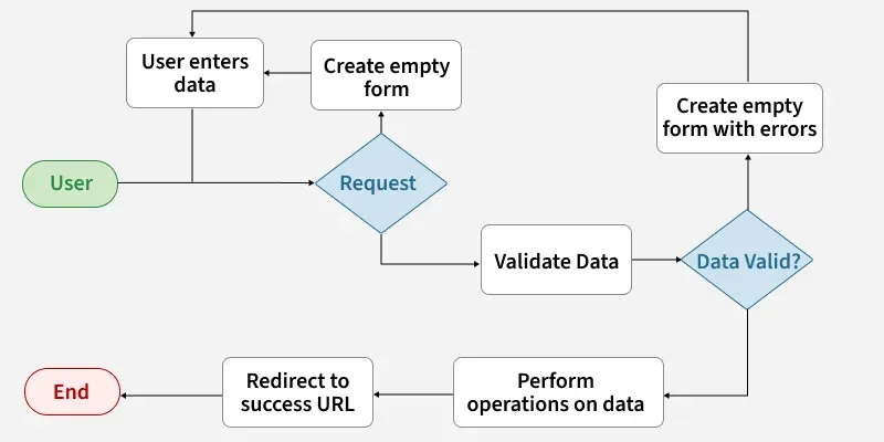
Django Forms are used to collect input from users, check if the input is correct and process the data.
field_name = forms.FieldType(**options)
Before creating forms, ensure that a Django project and app are already set up. Creating a form in Django is similar to creating a model, as it requires specifying the fields and their types.
To create a form, create a "forms.py" file in app folder:
Django form fields have several built-in methods to ease the work of the developer but sometimes one needs to implement things manually for customizing User Interface (UI). A form comes with 3 in-built methods that can be used to render Django form fields.
To render this form into a view, Create a home_view in views.py:
After defining the view, configure the URL patterns to connect it. Next, create an instance of the form class inside the view and set up a templates/home.html file to render the form and display it to users.
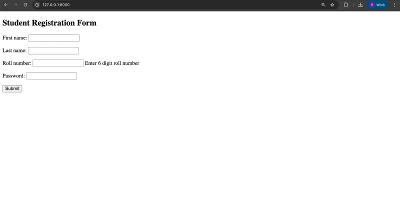
Visit: http://localhost:8000/
Django ModelForm is a class used to directly convert a model into a Django form. In database-driven applications, forms often map closely to Django models.
Once the project is ready, create a model in geeks/models.py:
To create a form directly for this model, in geeks/forms.py:
By visiting http://127.0.0.1:8000/, the form will be displayed and users can input data according to the fields defined in the model.
Django Forms provide a high-level interface for handling user input, rendering form elements, validating data, and processing submissions securely.
The most important part of a form and the only required part is the list of fields it defines. Fields are specified by class attributes. Here is a list of all Form Field types used in Django
| Name | Class | HTML Input |
|---|---|---|
| BooleanField | class BooleanField(**kwargs) | CheckboxInput |
| CharField | class CharField(**kwargs) | TextInput |
| ChoiceField | class ChoiceField(**kwargs) | Select |
| TypedChoiceField | class TypedChoiceField(**kwargs) | Select |
| DateField | class DateField(**kwargs) | DateInput |
| DateTimeField | class DateTimeField(**kwargs) | DateTimeInput |
| DecimalField | class DecimalField(**kwargs) | NumberInput when Field.localize is False, else TextInput |
| DurationField | class DurationField(**kwargs) | TextInput |
| EmailField | class EmailField(**kwargs) | EmailInput |
| FileField | class FileField(**kwargs) | ClearableFileInput |
| FilePathField | class FilePathField(**kwargs) | Select |
| FloatField | class FloatField(**kwargs) | NumberInput when Field.localize is False, else TextInput |
| ImageField | class ImageField(**kwargs) | ClearableFileInput |
| IntegerField | class IntegerField(**kwargs) | NumberInput when Field.localize is False, else TextInput |
| GenericIPAddressField | class GenericIPAddressField(**kwargs) | TextInput |
| MultipleChoiceField | class MultipleChoiceField(**kwargs) | SelectMultiple |
| TypedMultipleChoiceField | class TypedMultipleChoiceField(**kwargs) | SelectMultiple |
| RegexField | class RegexField(**kwargs) | TextInput |
| SlugField | class SlugField(**kwargs) | TextInput |
| TimeField | class TimeField(**kwargs) | TimeInput |
| URLField | class URLField(**kwargs) | URLInput |
| UUIDField | class UUIDField(**kwargs) | TextInput |
Note: NullBooleanField (a boolean field that allowed True, False, or NULL) is deprecated. Use BooleanField(null=True, blank=True) instead.
Core Field arguments are parameters provided to each field in a model to apply constraints or impart specific characteristics. For example, adding required=False to a CharField allows the field to be left blank by the user.
Each Field class constructor accepts at least these core arguments. Some Field classes may also accept additional, field-specific arguments, but the following are always supported:
| Field Options | Description |
|---|---|
| required | By default, each Field class assumes the value is required, so to make it not required you need to set required=False |
| label | The label argument lets you specify the “human-friendly” label for this field. This is used when the Field is displayed in a Form. |
| label_suffix | The label_suffix argument lets you override the form’s label_suffix on a per-field basis. |
| widget | The widget argument lets you specify a Widget class to use when rendering this Field. See Widgets for more information. |
| help_text | The help_text argument lets you specify descriptive text for this Field. If you provide help_text, it will be displayed next to the Field when the Field is rendered by one of the convenience Form methods. |
| error_messages | The error_messages argument lets you override the default messages that the field will raise. Pass in a dictionary with keys matching the error messages you want to override. |
| validators | The validators argument lets you provide a list of validation functions for this field. |
| localize | The localize argument enables the localization of form data input, as well as the rendered output. |
| disabled. | The disabled boolean argument, when set to True, disables a form field using the disabled HTML attribute so that it won’t be editable by users. |