VOOZH about

URL: https://www.geeksforgeeks.org/python/pairplot-in-matplotlib/

โ‡ฑ Pairplot in Matplotlib - GeeksforGeeks


  • Courses
  • Tutorials
  • Interview Prep

Pairplot in Matplotlib

Last Updated : 23 Jul, 2025

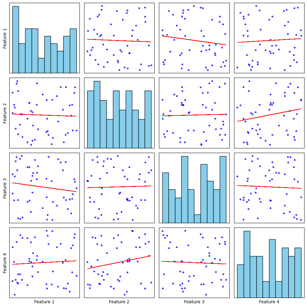
Pair Plot is a type of chart that shows how different numbers in a dataset relate to each other. It creates multiple small scatter plots, comparing two variables at a time. While Seaborn has a ready-made pairplot() function to quickly create this chart, Matplotlib allows more control to customize how the plot looks and behaves. A Pair Plot (also called a scatterplot matrix) consists of:

  • Scatter plots for each pair of numerical variables.
  • Histograms (or kernel density plots) on the diagonal, representing the distribution of individual variables.

This visualization helps in identifying:

  • Linear and non-linear relationships between features.
  • Clusters or groups within data.
  • Potential outliers.

Creating a pair plot using matplotlib

To get started, we first need to import the necessary libraries.

import matplotlib.pyplot as plt

import pandas as pd

import numpy as np

Implementation:

Output

๐Ÿ‘ download

Explanation:

  • Data Generation: 4 features ร— 50 values (0-1) stored in a Pandas DataFrame (np.random.seed(42)).
  • Subplots Grid: 4ร—4 layout (plt.subplots()), with histograms on the diagonal (i == j) and scatter plots elsewhere (i โ‰  j).
  • Histograms: ax.hist() with 15 bins, skyblue fill, black edges for clarity.
  • Scatter Plots: ax.scatter() with alpha=0.7, s=10, blue color to show relationships.
  • Formatting: Labels only on leftmost column (j == 0) & bottom row (i == num_features - 1). Ticks removed for a clean look. plt.tight_layout() prevents overlap.
  • plt.show() renders the final visualization.

Advantages of pair plot in matplotlib

  • Customizability: Unlike Seabornโ€™s pairplot(), Matplotlib allows full control over plot styling.
  • Better Integration: Works seamlessly within larger Matplotlib-based visualizations.
  • Flexibility: Can modify elements like colors, markers, line styles, and annotations easily.

Enhancing the pair plot

To improve the visualization, consider:

  • Adding regression lines to scatter plots.
  • Using different colors to highlight categories in the dataset.
  • Replacing histograms with kernel density estimation (KDE) plots.

Example:

Output:

๐Ÿ‘ output11


Explanation:

  • Data Preparation: Random values are generated for four features using NumPy and Pandas DataFrame stores the dataset.
  • Creating Subplots: A 4ร—4 grid of subplots is created to display the pairwise relationships. plt.subplots(num_features, num_features, figsize=(10, 10)) sets up the grid layout.
  • Plotting the Pair Plot: If i == j, a histogram is plotted on the diagonal using ax.hist(). If i โ‰  j, a scatter plot is created using ax.scatter().
  • Adding Regression Lines: The np.polyfit(x, y, 1) function computes the slope (m) and intercept (b) of the regression line. The ax.plot(x, m*x + b, color="red", linewidth=1) function overlays a red regression line on the scatter plot.
  • Labels are added to only the leftmost and bottom plots. Ticks are hidden for a clean design.
  • plt.tight_layout() ensures proper spacing for readability.
Comment
Article Tags:
Article Tags: