 |
VOOZH | about |
|
VOOZH | about |
In this article, we will discuss Analyse Covid-19 data and will visualize it using Plotly Express in Python. This article deals with creating dozens of bar charts, line graphs, bubble charts, scatter plots. The graph that will be made in this project will be of excellent quality. Envisioning COVID-19 will primarily be using Plotly Express for this project. The analysis and visualization enable people to understand complex scenarios and make predictions about the future from the current situation.
This analysis summarizes the modeling, simulation, and analytics work around the COVID-19 outbreak around the world from the perspective of data science and visual analytics. It examines the impact of best practices and preventive measures in various sectors and enables outbreaks to be managed with available health resources.
Tools and Technologies Used in the Project: Google Colab(Runtime type - GPU).
Requirements to Build the Project:
The task is simple, once the installation of all the required libraries is successful, they need to be imported to the working space, since they will provide the additional support for analysis and visualization.
Example: importing libraries
Importing three datasets into this project
To import datasets to the working space pandas read_csv() method can be used.
Syntax:
read_csv(path)
Output:
👁 ImageFurther, information regarding the dataset we are using will help us sample it better for analysis.
Output:
(209, 17)
3553
Output:
<class 'pandas.core.frame.DataFrame'>
RangeIndex: 209 entries, 0 to 208
Data columns (total 17 columns):
 # Column Non-Null Count Dtype
--- ------ -------------- -----
 0 Country/Region 209 non-null object
 1 Continent 208 non-null object
 2 Population 208 non-null float64
 3 TotalCases 209 non-null int64
 4 NewCases 4 non-null float64
 5 TotalDeaths 188 non-null float64
 6 NewDeaths 3 non-null float64
 7 TotalRecovered 205 non-null float64
 8 NewRecovered 3 non-null float64
 9 ActiveCases 205 non-null float64
 10 Serious,Critical 122 non-null float64
 11 Tot Cases/1M pop 208 non-null float64
 12 Deaths/1M pop 187 non-null float64
 13 TotalTests 191 non-null float64
 14 Tests/1M pop 191 non-null float64
 15 WHO Region 184 non-null object
 16 iso_alpha 209 non-null object
dtypes: float64(12), int64(1), object(4)
memory usage: 27.9+ KB
Similarly other datasets can be imported and explored.
Output:
👁 ImageOutput:
(35156, 11)
386716
Output:
<class 'pandas.core.frame.DataFrame'>
RangeIndex: 35156 entries, 0 to 35155
Data columns (total 11 columns):
 # Column Non-Null Count Dtype
--- ------ -------------- -----
 0 Date 35156 non-null object
 1 Country/Region 35156 non-null object
 2 Confirmed 35156 non-null int64
 3 Deaths 35156 non-null int64
 4 Recovered 35156 non-null int64
 5 Active 35156 non-null int64
 6 New cases 35156 non-null int64
 7 New deaths 35156 non-null int64
 8 New recovered 35156 non-null int64
 9 WHO Region 35156 non-null object
 10 iso_alpha 35156 non-null object
dtypes: int64(7), object(4)
memory usage: 3.0+ MB
Data cleaning is the process of altering, modifying a recordset, correcting erroneous records from the database and identifying incomplete, incorrect, or irrelevant parts of the data, and then removing dirty data.
Output:
Index(['Country/Region', 'Continent', 'Population', 'TotalCases', 'NewCases', 'TotalDeaths', 'NewDeaths', 'TotalRecovered', 'NewRecovered', 'ActiveCases', 'Serious,Critical', 'Tot Cases/1M pop', 'Deaths/1M pop', 'TotalTests', 'Tests/1M pop', 'WHO Region', 'iso_alpha'], dtype='object')
We don't need 'NewCases', 'NewDeaths', 'NewRecovered' columns as they contains NaN values. So drop these columns by drop() function of pandas.
Syntax:
drop(name of columns)
Output:
👁 ImageLet's create a table through the table function already available in plotly express.
Output:
👁 ImageUsing one line of code, we will create amazing graphs using Plotly Express. Visualization can be done easily by moving the cursor in any plot, we can get label presence point directly by using the cursor. We can visualize and analyze the dataset with each aspect using the relation between the columns.
Primarily look at the country with respect to a total number of cases by top 15 countries only and color total cases and hover data as 'Country/Region', 'Continent'.
Output:
👁 ImageAs the plot clearly shows the data for the top 15 countries, now again take the country with respect to the total number of cases from the top 15 countries, color the total deaths hover data as 'Country/Region', 'Continent' and analyze the visualization.
Output:
👁 ImageLet's analyze by coloring the total number of recovered cases
Output:
👁 ImageVisualize the same again by coloring the total number of tests.
Output:
👁 ImageThe visualization could be as we have done with the top 15 countries with total cases, deaths, recoveries, and tests. We can analyze the plot by looking at them.
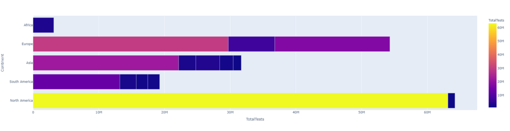
Let's create a horizontal orientation plot with X-axis as 'TotalTests' and Y-axis as 'Country/Region' with passing parameter orientation="h" and color the plot by 'TotalTests'.
Output:
👁 ImageLet's look at 'TotalTests' followed by 'Continent' and color the plot with 'Continent'.
Output:
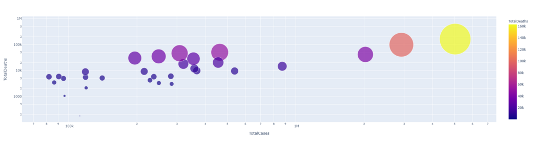
Let's create a scatter plot and take a look at the continent's statistics, firstly look at the total number of cases by continent and take hover data as 'Country/Region', 'Continent'.
Output:
👁 Imagelog_y= True, the histogram axis (not the returned parameter) is in log scale. The return parameter (n, bins), i.e. the values of bins and sides of bins are the same for log=True and log=False. This means both n==n2 and bins==bins2 are true
Output:
👁 ImageOutput:
👁 ImageOutput:
👁 ImageLet's take a look at the country-wise data visualization, first look at the continent with respect to the total number of deaths by the top 50 countries only and color the total number of deaths and take the hover data as 'Country/Region', 'Continent'.
Output:
👁 ImageNow, the Country/Region with respect to the total number of cases for top 30 countries only and color the total number of cases and take the hover data as 'Country/Region', 'Continent'.
Output:
👁 ImageNow format the image of the country/region in relation to the total number of deaths. And do the same for the other aspects of COVID-19 from dataset1.
Output:
👁 ImageOutput:
👁 ImageOutput:
👁 ImageOutput:
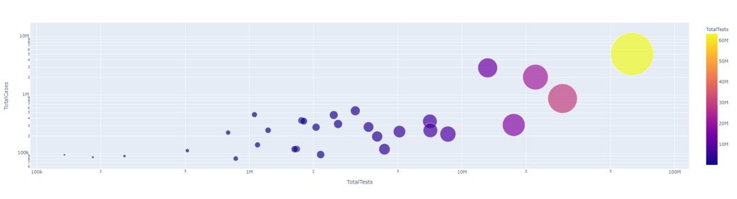
👁 ImageIt is clear from the result that they have a linear relationship between the total number of cases and the total number of deaths. That means more cases, more deaths.
Output:
Output:
In this task, we will explore covid-19 data using bar graphs and charts and use dataset2 as it has date column.
Output:
👁 ImageThe above graph we get as output which includes all countries with respect to recovered cases. we can imagine the exponential growth of corona cases by date. We can use log function for this to be more clear.
Output:
👁 ImageLet's imagine death instead of confirmation with the same and color it by date.
Output:
👁 ImageIn this specific task, we will analyze data of the USA country.
Now let us plot and study the covid situation in the USA.
Output:
👁 ImageHere we can clearly see how the confirmed cases increased in the United States with respect to time (January 2020 to July 2020). Similarly, we can check the same for recovered cases, tests and deaths.
Output:
👁 ImageSimilarly, we can analyze the data in all the ways to generate the line graph for the same.
Output:
👁 ImageOutput:
👁 ImageOutput:
👁 ImageOutput:
👁 ImageNow let us create bar charts and study the USA situation using that.
Output:
👁 ImageSimilarly, let us also plot a line plot.
Output:
👁 ImageWe can use choropleth to visualize the data in terms of maps, with maps usually being the predominant way of visualizing the data. Since COVID-19 is a global phenomenon and so we look through and fix them in terms of wall maps. Ortho-graphics, rectangular and natural earth projection to visualize the data With dataset2 for the purpose as it has Dates column. It will look at the growth of Covid-19 (from Jan to July 2020) as in how the virus reached across the world.
Choropleth is an amazing representation of data on a map. Choropleth maps provide an easy way to visualize how a measurement varies across a geographic areal-Life
Project Application in Real choropleth map displays divided geographical areas or regions that are colored, shaded or patterned in relation to a data variable.
Equi-rectangular Projection:
Syntax: chloropleth()
parameters:
- dataset
- locations= ISOALPHA
- color
- hover_name
- color_continuous_scale= [RdYlGn, Blues, Viridis...]
- animation_frame= Date
Output:
This creates an animation containing visualizations from January to July 2020. Playing this animation will make it more clear how the virus spread around the world. The darker the color, the higher the confirmed cases are.
Output:
This code creates an animation of death cases by date. By playing this animation it will be shown how deaths increase around the world.
Natural Earth projection is a compromise pseudo-cylindrical map projection for world maps.
Output:
By running the output, things start to become more clear about how the recovery rate changes with respect to the date. Lets also look at how an animation can be added to a bar graph. We can convert the bar graph into animation using Dates column that is in dataset2.
Output:
When running the output, the animation will run from January to July 2020. It will show 6 different bar graphs, each continent has its own color representing the confirmed cases.
Visualize the causes of death due to covid-19, as covid-19 affects people in different ways, hence creating a word cloud to visualize the leading cause of covid-19 deaths. To visualize the text the steps need to be followed are-
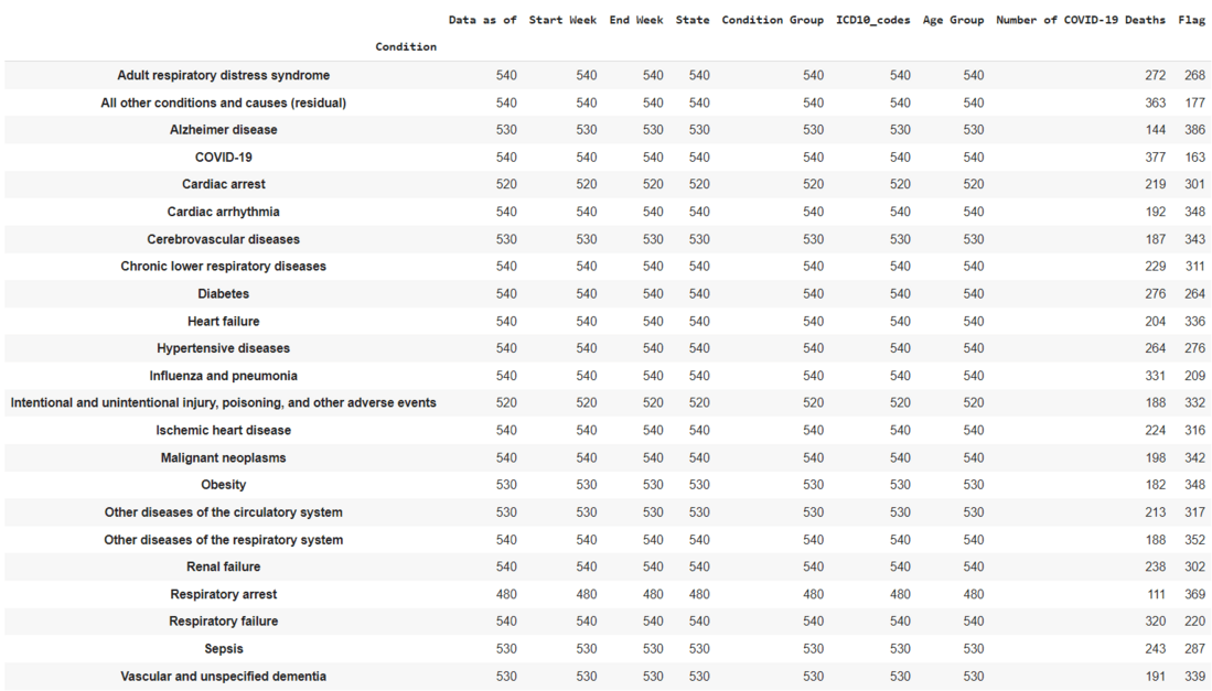
Dataset3: This dataset contains real world examples of number of Covid-19 deaths and the reasons behind the deaths.
Output:
👁 ImageOutput:
👁 ImageOutput:
Output:
👁 ImageFrom the output, it can be clearly seen that the leading cause of death is Influenza Pneumonia. We have converted the condition group to the list and stored the list in the variable "column_to_list". Here we have converted the list into a single string and stored in a variable named "column2_to_string" by using .join().
Output:
👁 ImageHere, respiratory diseases are the major cause of death followed by circulatory diseases which are cardiovascular diseases.