 |
VOOZH | about |
|
VOOZH | about |
Sometimes there is a range of scenarios where it is hard to convey the information in a table and written format. Under such situations, Bar charts make things easier and more understandable.
Stacked charts are a sort of bar chart which are multiple-series in nature where related values are placed atop one another. This feature allows comparing the contribution of worth to a total, either in absolute or percentage terms, and comparing multiple categories and category totals simultaneously.
Bar Charts are a summary of categorical data and display data using several bars, each representing a particular category. The height of each bar is equal to the sum of the values in the category it represents. It is also possible to color or split each bar into another categorical row in the data, which enables you to see the contribution from different categories to each bar or group of bars in the bar chart.
There are mainly two variations of Bar Chats. Depending on the situation charts are used.
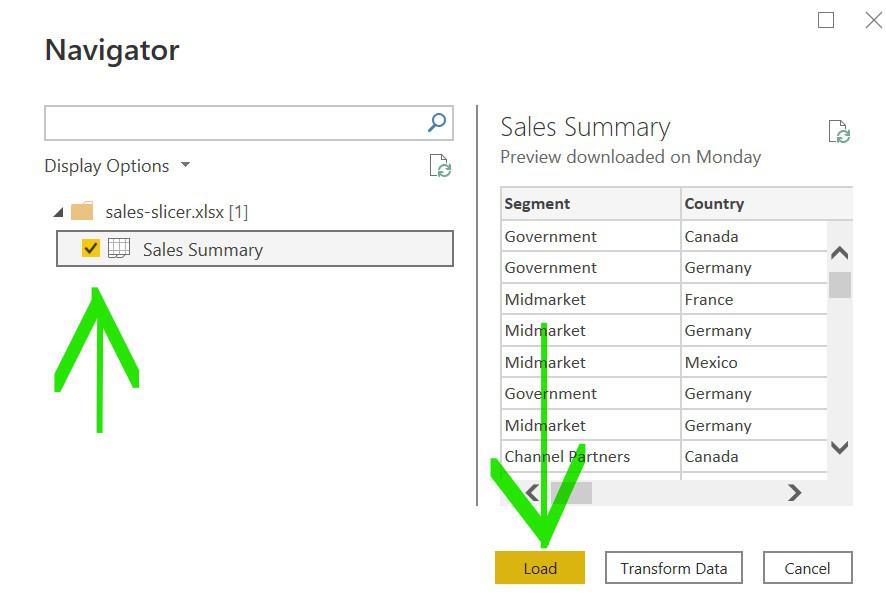
Import data from Your Excel to Power BI. To develop this tutorial we have used this dataset.
Home Tab-> Get Data -> Choose Data which you want Example Excel ->
 Select the file and Open -> Select The sheet and Load
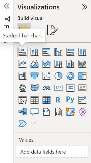
Under visualization click on the 'stacked bar chart' icon.
The chart will be loaded on the screen and can be resized if required.
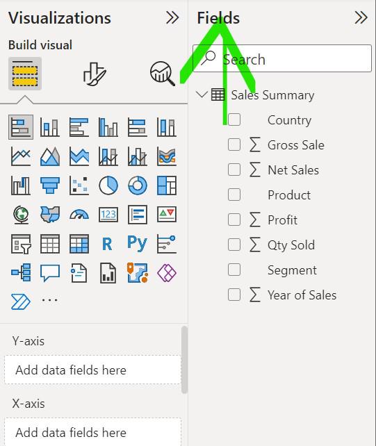
To start creating a bar chart click on the fields which is to be used in a bar chart
Drag and drops the fields that are to be placed on the X-axis and Y-axis of the chart respectively
A simple Bar chart has been created
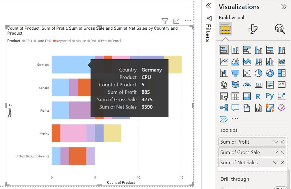
To show the category in different colors use 'Legend', drag and drop the category which is to be shown in color
On hovering on certain visuals Little information is shown
To add more information on the data field drag and drop the category under 'ToolTips'
To split the visuals into multiple versions of itself drag the category under 'Small Multiples'
The disadvantage of using a stacked bar chart