A Card visual in Power BI is used to highlight a single important value that responds dynamically to filters and slicers. Proper formatting of a Card helps improve readability, visual appeal and ensures that key metrics stand out clearly in a report.
Formatting a Card in Power BI
Formatting a Card in Power BI means customising its appearance and layout to make key metrics more readable and visually appealing. This includes changing the title, font size, colour, background, border and callout value as well as adjusting alignment and adding tooltips.
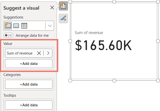
3. The Card now displays the selected value and can be formatted further.
Card Visual Formatting in Power BI
Visual formatting in Power BI allows you to customize the main elements of a Card to make the displayed value and its label more readable and visually appealing.
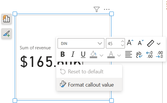
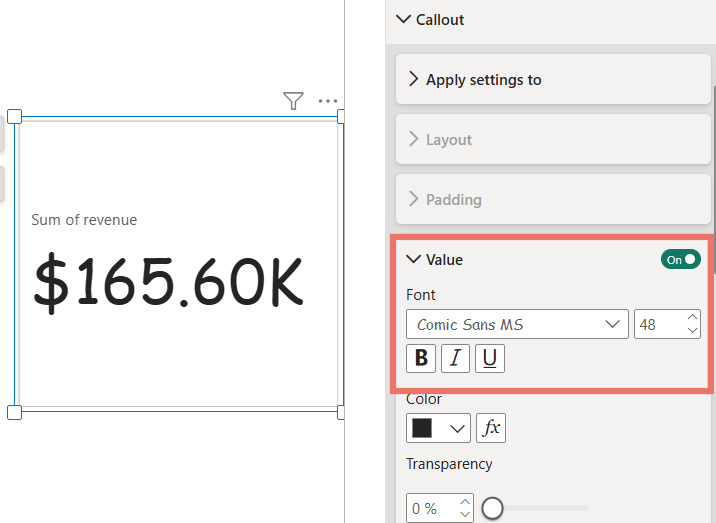
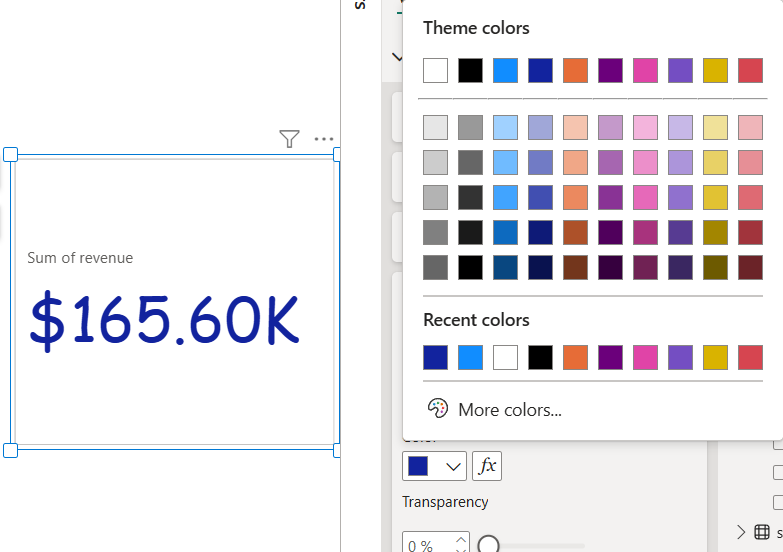
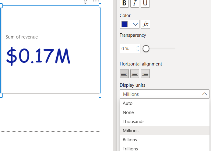
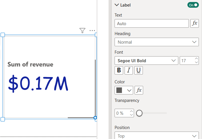
The Callout Value is the main number or metric displayed on a Card visual in Power BI. Formatting the callout value properly ensures that the key metric stands out clearly and is easy to read.
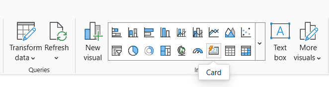
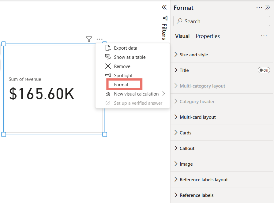
Select the Card Visual: Click on the Card you want to format so that the formatting options for that visual become active.
Click on the Values Field: In the Visualizations pane, select the Values field this represents the metric displayed on the Card.
Change Color: Use the Color option to set a custom color for the label
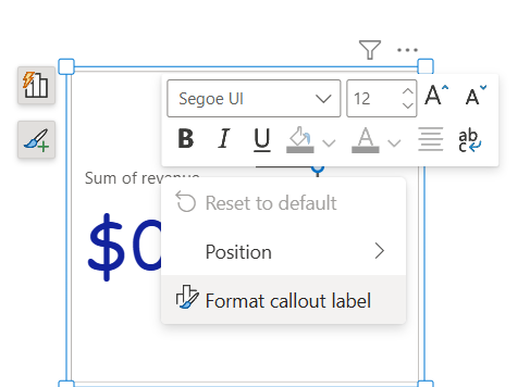
Formatting the Title in Power BI
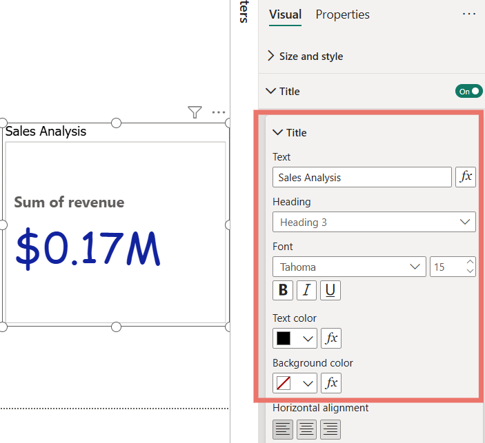
The Title adds a heading to your Card visual making it easier to understand the metric being displayed. Proper title formatting improves clarity and visual appeal.
Enable and Select the Title: Select the Card visual and go to the Format pane under the Visual section. Toggle the Title slider to enable the title for your Card.
Add and Format the Text: In the Text field, type the desired title. You can also adjust the font type, size and alignment to match your report’s design.
Change Title Color: Use the Text color option to set a custom color for the title.
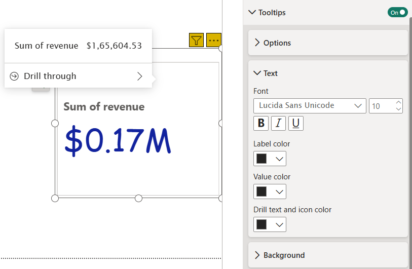
Tooltips allow you to display additional information when you hover over a Card visual in Power BI. For example, you can show the Sum of Projects Completed when hovering over the Card, providing context without cluttering the visual.
Click on the Tooltips option in the formatting pane to enable this feature.
Customize the text to display the information you want on hover.
Adjust the background color to match your report’s design and improve readability.
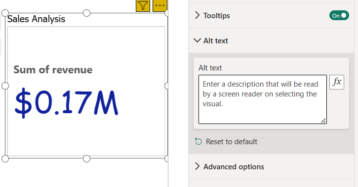
Alt Text is a property available in every Power BI visual that improves accessibility for users with visual impairments. Unlike tooltips it is not displayed when hovering over the visual instead, it is read aloud by screen readers or a system narrator.
Click on the Alt Text option in the formatting pane.
Enter a descriptive text that explains the purpose or content of the Card.
When a narrator or screen reader is active, this text will be spoken to help visually impaired users understand the visual.
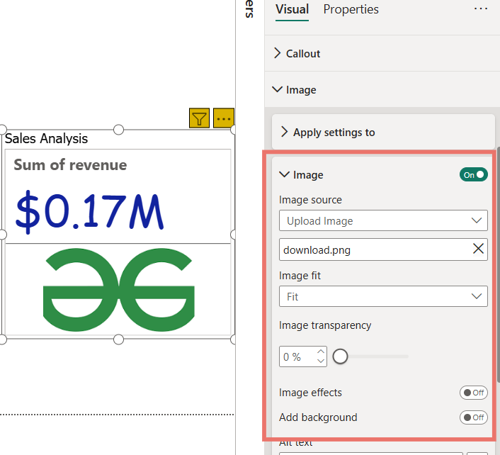
You can enhance your Card visual by adding an image which can help highlight the metric or make your report more visually appealing. Power BI allows you to insert an image directly through the formatting options.
Select the Card visual that you want to enhance.
In the Format pane, click on the Image option under the visual settings.
Upload the desired image from your computer or select one from available sources.
Adjust the size, alignment, and position of the image to fit your Card layout.
