Formatting is a technique to enhance the looks of the charts by giving a cosmetic appearance to the chart title and chart legend. Titles are given to the X and Y axis to add clarity for the user. Formatting commands are applied to a chart for the identical reason they're applied to a worksheet. they create the chart easier to read. However, formatting techniques also facilitate chart quality and explain the data in a chart.
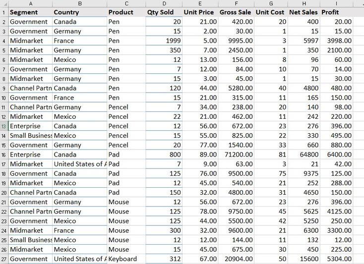
Stacked Bar Chart A Stacked Bar Chart is drawn using the sample excel sheet below. Below is the dataset mentioned and the link to the dataset is here .
👁 Dataset SampleDataSheet The stacked bar chart of the dataset is mentioned below:
👁 Stacked-bar-chart-formed Steps to Format Stacked Bar Chart Below are the steps that can be used to apply different formatting on the stacked bar chart formed:
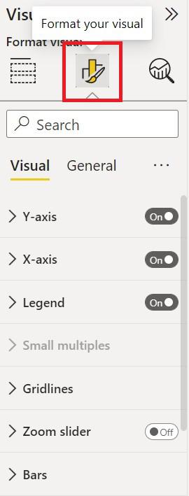
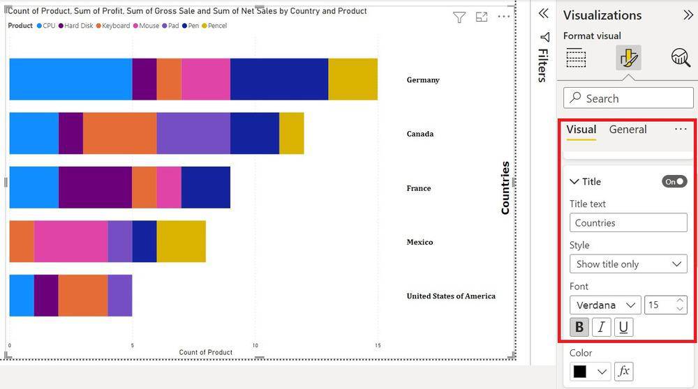
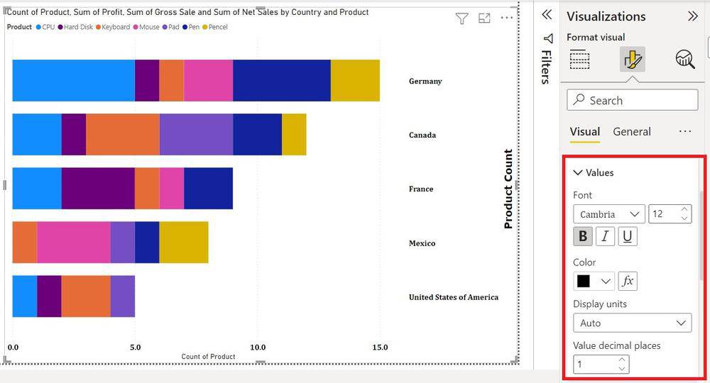
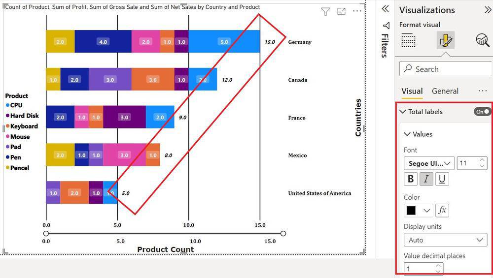
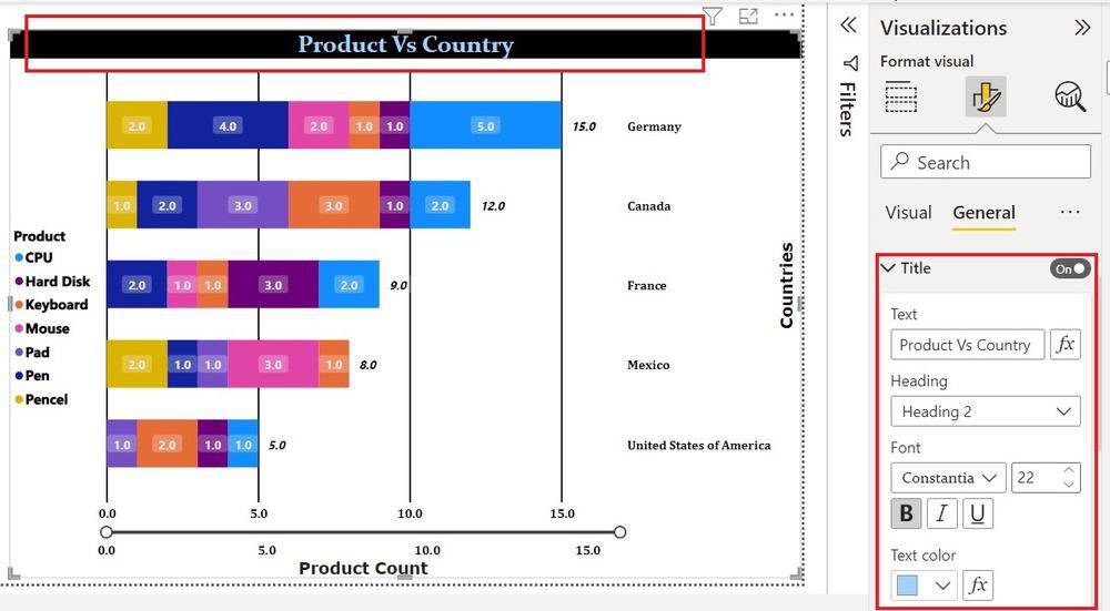
Click on the format icon under Visualization to format the chart. 👁 Clicking-format-icon To Format the y-axis 'Value' click on the drop-down of the Y-axis. 👁 Editing-y-axis Fonts are changed to 'Cambria' Font size is set to '12' Fonts set to 'Bold' Color set to 'Black' Switch axis position 'ON' To Format the y-axis 'Title' click on the drop-down of the y-axis. 👁 Formatting-title-on-y-axis Title set to 'Countries' Fonts are changed to 'Verdana' Font sizes are set to '15' Fonts set to 'Bold' Color set to 'Black' To format x-axis 'values' click on the drop-down of the X-axis. 👁 Formatting-x-axis Fonts are changed to 'Cambria' Font size is set to '12' Fonts set to 'Bold' Color set to 'Black' Value Decimal Place to '1' To Format the x-axis 'Title' click on the drop-down of the X-axis. 👁 Formatting-title-on-X-axis Title set to 'Product Count' Fonts are changed to 'Verdana' Font sizes are set to '15' Fonts set to 'Bold' Color set to 'Black' To change the Legend of the Bar chart. 👁 Changing-legend-of-the-chart The position changed to 'Center left' Fonts changed to 'Segoe UI Bold' Fonts size to '13' Color to 'Black' To add gridlines on the Chart, click on the dropdown Gridlines under Visuals. 👁 Image Style Changed to 'Solid' The Color Changed to 'Black' Width Changed to '2' To get Slider on Values 'ON' Zoom Slider. 👁 Getting-sliders Slider on x-axis 'on' Slider labels are 'on' Green Arrow shows the Position for sliding the Bars To change the bar Color or stack click on the bar under the visualization. 👁 Changing-bar-color The reverse Stack is 'ON' No colors are changed To change the Space between the bar click on Spacing 👁 Changing-spaces-between-bars Inner Padding Changed to '36px' Minimum width to '20px' To Show Values of each type on bars click on Data Labels. 👁 Clicking-data-labels Series are applied to 'All'. The position is set to 'Inside Center'. To change the font and color of the data label click under 'Values'. 👁 Changing-font-and-color-of-data-label Fonts changed to 'Segoe UI' Font size changed to '11' Font Style 'Bold' The color changed to 'Grey' Decimal Place to '1' Background Transparency '76' To show totals of Each bar 'on' Total Labels. 👁 Total-of-each-bar-shown Font Changed to 'Seogoe UI Bold' Font Size to '11' Font Style 'Italic' Color to 'Black' Value decimal Places '1' To Format Table Position, Table Table Title, and Table Effect Click on 'General' under visualization. 👁 Formatting-table-position To manage the Size and Position of the table Click on the drop-down of Properties. 👁 Formatting-size-and-position-of-table Height set to '680' Width set to '981' Horizontal position to '299' Vertical Position to '34' To change the Title of the Table click on the drop-down of the Title. 👁 Changing-title-of-table Title Changed to 'Product vs Country' Heading to 'Heading2' Font to 'Constantia' Font Size to '22' Font Style to 'Bold' Text Color to 'Light Blue Text Background to 'Black' Text Alignment to 'Center' To give Color Effect To chart click on effects under General. 👁 Providing-color-effect-to-chart Background color changed Transparency changed to '28%' Visual border of color 'Blue' Rounded corners '30px' Shadows Color changed to 'Black' Offset changed to 'Inside' Position Changed to 'Left' To change the color of the Icon on the Top click on Header Icon. 👁 Changing-color-of-icon Background Color to 'Yellow' Border to 'Black' Icon to 'Black' Transparency to '0%' These are a number of the most frequent formatting done on Stacked Column Charts. Power BI provides us with dynamic options to format a chart and it is often explored with some self-research easily.
