 |
VOOZH | about |
|
VOOZH | about |
A Power BI dashboard is a single-page view that uses visualizations to present key insights. Since it is limited to one page, it focuses only on the most important information. Dashboards are created in the Power BI Service, while reports are built in Power BI Desktop.
The visuals on a dashboard are called tiles, which are pinned from reports based on datasets. A dashboard provides an overview of the data and selecting a tile allows users to navigate to the underlying report or dataset.
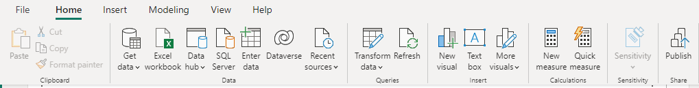
Data can be loaded using the "Get Data" option:
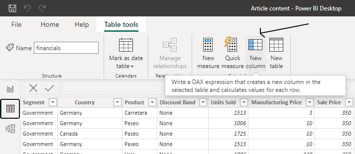
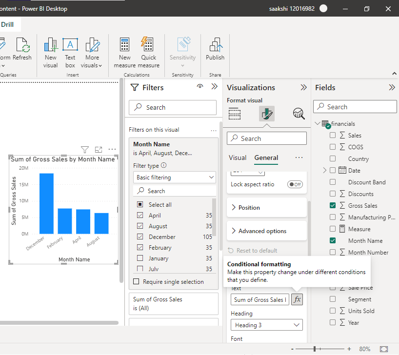
After the data gets loaded into the application, you can begin transforming and modeling your data. You can select add new column option with custom options and make your own calculated field column.
Step 1: For this step Select "Data" from the three options on the left margin.
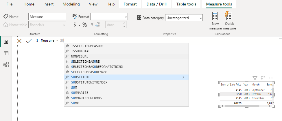
Step 2: Select "New Measure" from the "Calculation" section in the "Table Tools" tab.
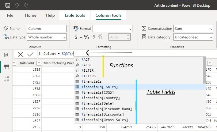
Step 3: Now you can get your desired functions with the table field's name and thus you'll be able to create a new column.
Step 4: In this step, you create the required calculated columns or measures. Use New Column when you want the result to be stored in the table and available during data refresh. Use measures for dynamic calculations based on the filter context, as they are computed at query time.
Power Query Editor is used earlier in the process to clean and transform data, helping prepare it for visualization and building an effective data model.
Note: Reports in Power BI use only a single dataset whereas dashboards use many datasets.
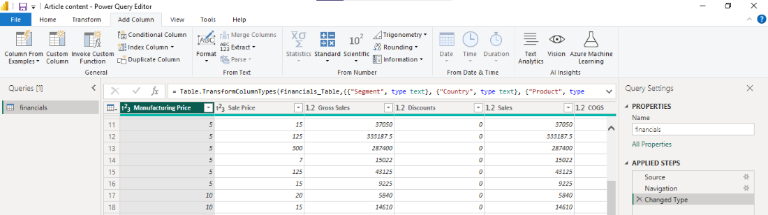
Power Query is used to transform data by performing tasks such as filtering, grouping and pivoting. It helps to create calculated columns and measures by using the formula bar and functions. After the cleaning and transformation of your data, you can move on to your visualizations. Following are the steps to use Power Query.
Step 1: Select "Home" from the top menu.
Step 2: From the queries section select “Transform data”.[(A new window will open with Power Query Editor),(If no data connection is made yet then it'd show a blank page)].
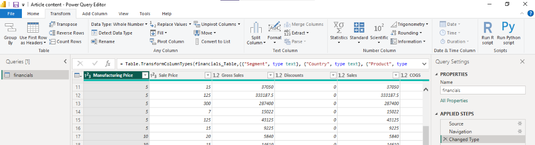
Step 3: On this page you'll get to add, change, view, transform and correct your data.
Step 4: With a right-click on your column you can make different changes.
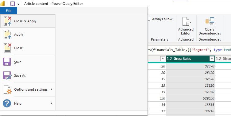
Step 5: After making the necessary transformations, click on "Close & Apply" by clicking on the "File" tab to save the changes and return to the Power BI Desktop.
Your data is now ready to be used in visualizations and reports.
Note: If you want to make more complex changes to your visualizations, you can use the "DAX" formulas to create calculated columns and measures.
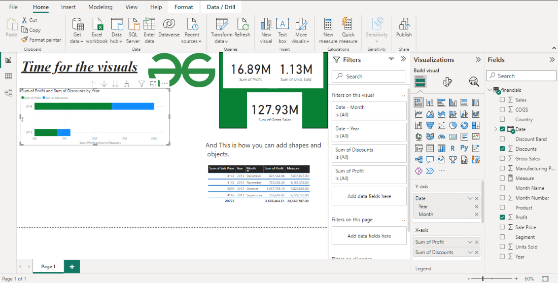
Format and Fields sidebar is the section to make your dashboard and report visually attractive.
If you want to make more complex changes to your visualizations, you can use the "DAX" formulas to create calculated columns and measures.
A Power BI dashboard is a collection of visualizations (tiles) pinned from reports that provide an overview of key metrics. It is a single-page view that allows users to monitor and analyze data in a visually interactive way. While users can interact with the visuals, editing and detailed analysis are typically performed in reports.
Note: Dashboards are only provided in the Power BI Service and not in Power BI Desktop or Mobile.
Reports can be shared within an organization and embedded in websites, portals or applications. Users can interact with visualizations in a report to explore insights and gain a deeper understanding of the data.
A report can contain a single or multiple visuals and can span one or more pages, depending on the requirements.
These are the reports that you should be acquainted with:
These are some of the most commonplace types of reports that are created in Power BI, however, there are different styles of words that can be created as well.