 |
VOOZH | about |
|
VOOZH | about |
Multi-Row Cards in Power BI allow you to display multiple key metrics within a single visual making them ideal for quick comparisons and summary views. Unlike a standard Card they present several related measures together in a compact layout.
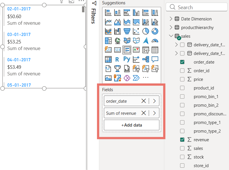
The first field added defines the row labels while additional measures appear as values within the same card. This structure ensures the visual responds dynamically to filters and slicers, providing real-time insights.
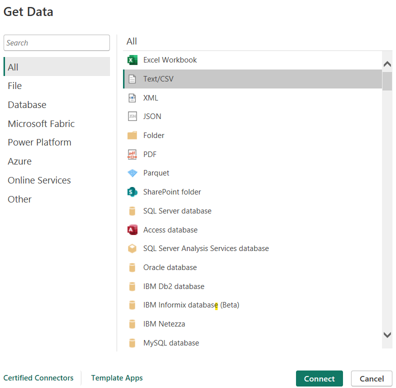
1. Open Power BI Desktop and load the required dataset into your report.
You can download dataset from here
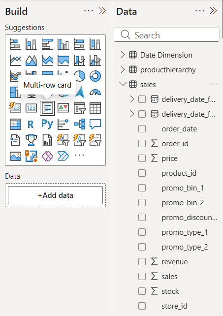
2. Go to the Visualizations pane on the right side of the screen.
3. Select the Multi-Row Card visual and place it on the report canvas.
4. Drag the required field or category into the Fields section to define the row labels.
5. Add one or more measures under the same field to display their values in the card.
6. Resize the visual as needed to clearly display all rows and values.
After successfully creating a Multi-Row Card in Power BI various formatting options are available to enhance its appearance and readability. These options allow you to customize elements such as the title, colors, alignment, background and data labels to make the visual more informative and visually appealing.
Here we are using a Sales dataset, where Order Date is added as the row field and Sum of Revenue is used as the value in the Multi-Row Card. Each row represents revenue generated on a specific date, enabling quick comparison of daily performance directly within the card.
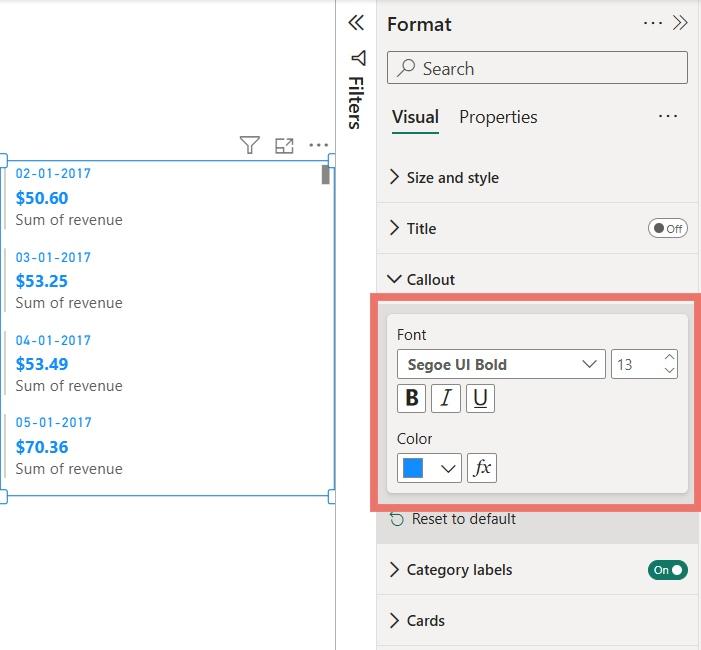
The Callout Value option is used to format the main values displayed in a Multi-Row Card, helping improve visibility and highlight important metrics.
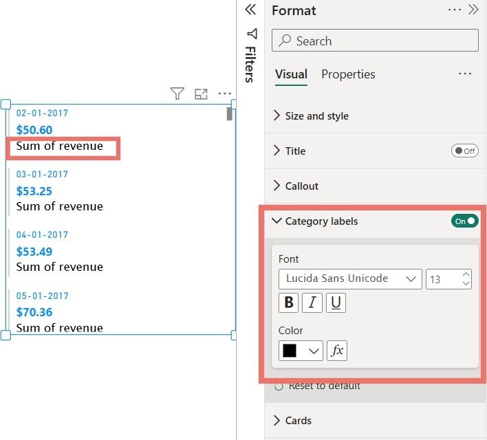
The Category Label option is used to format the descriptive text displayed below the main values in a Multi-Row Card such as Sum of Salary or Sum of Bonus. Proper formatting of category labels helps improve clarity and context for the displayed metrics.
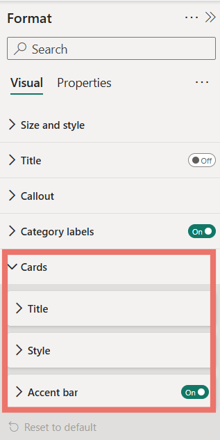
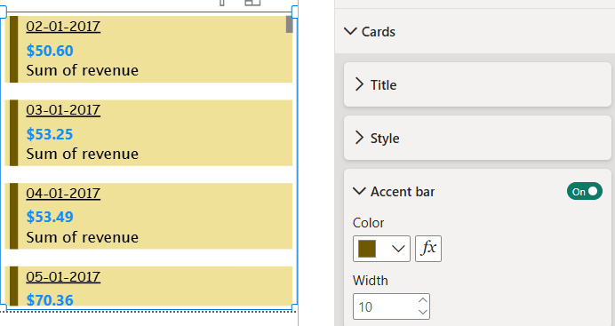
The Cards option is exclusive to Multi-Row Cards and allows you to customize the appearance of each individual card within the visual. It includes settings to control the title, layout style and accent indicators for better visual separation.
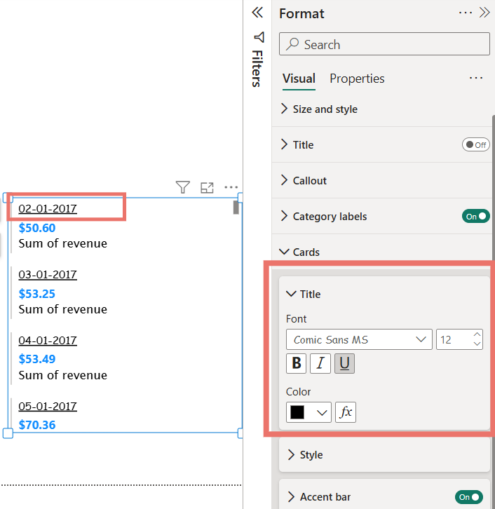
1. Title
The Title option lets you format the heading shown for each card subgroup. You can customize the font, text size and color to clearly label categories and improve readability.
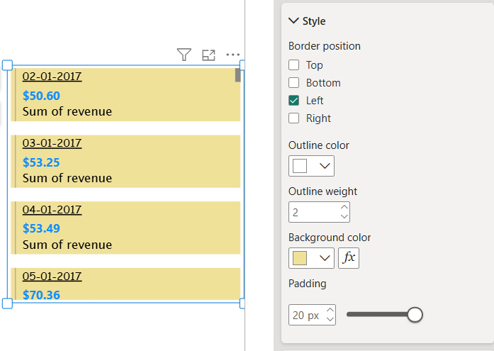
2. Style
The Style option controls the overall look of each card, including border position, border color, background color and padding. These settings help visually separate each card and enhance the layout.
3. Accent Bar
Accent Bars are vertical lines displayed beside each card subgroup. They can be customized in color to highlight and distinguish different categories within the Multi-Row Card.
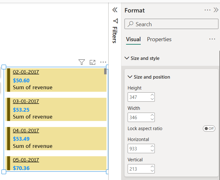
The Size and Position option under the General section in the Format pane allows you to control where the Multi-Row Card appears on the report canvas and how much space it occupies. This helps in aligning the visual properly with other report elements and maintaining a clean dashboard layout.
Using this option, you can precisely adjust the X and Y position of the card on the canvas, as well as set the Width and Height of the visual. These settings are especially useful when creating pixel-perfect reports or aligning multiple visuals consistently across a page.
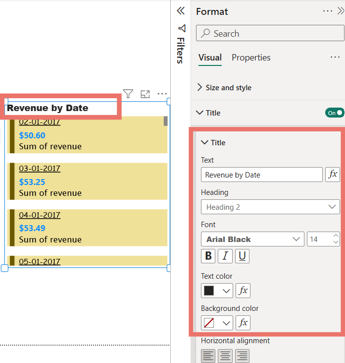
The Title option is available in all Power BI visuals and is used to display a heading for the visualization. Enabling a title helps clearly describe the purpose of the visual and improves report readability.
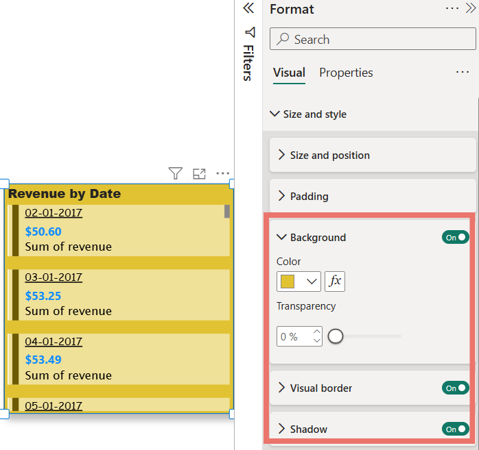
The Effects section is used to enhance the appearance of a Multi-Row Card by applying visual styling options such as background, border and shadow. These features help the visual stand out and improve the overall look of the report.
The Background option is available under the Format pane, within Visual and then Size and Style. It allows you to apply a background color to the visualization.
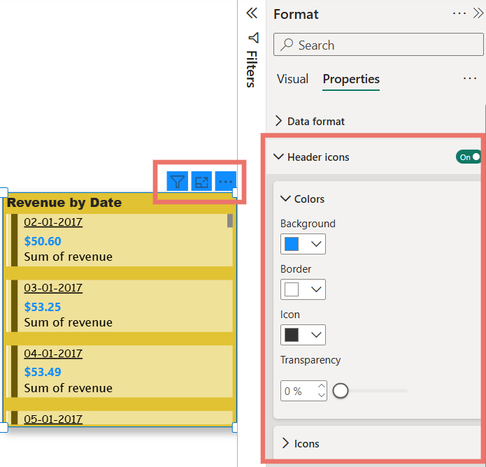
In Power BI, Header Icons can be customized from the Format pane under the visual properties. These icons appear at the top of a visualization and provide interactive options. For Card visuals, the main header icons include Filter on this visual and More options.
Within the Header Icons settings in the Format pane, you can adjust properties such as Background, Border and Icon colors. This allows you to match the icons to your report theme, enhance clarity and improve the overall visual appeal of your dashboards.
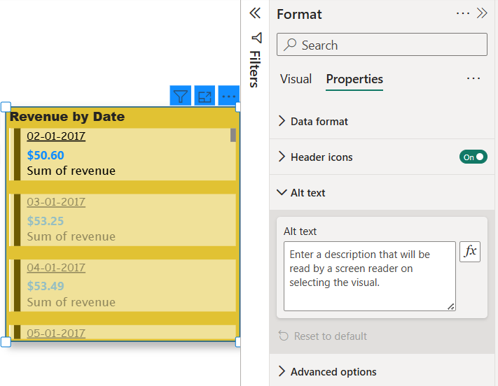
Alt Text is a property available for every visualization in Power BI, accessible through the Format pane then Properties section. Alt text is not displayed when hovering over a visual. Instead it is designed to assist users with visual impairments.
When a screen reader or narrator is active on your system, the alt text will be read aloud, providing context about the visual for those who cannot see it. To use this feature, click on Alt Text in the Format pane and type a descriptive explanation of the visual, ensuring that it clearly conveys the purpose or key insights of the chart or image.
You can download Power BI file from here