 |
VOOZH | about |
|
VOOZH | about |
Power BI supports multiple chart types to visualize and analyze data from different perspectives. By combining charts in a report, users can better understand patterns and relationships in the data. This helps in the following ways:
Stacked Column Line charts display more than two metric values aggregated across a shared dimension. They are primarily used to visualize two quantities together over time, where:
The datasets are used to create the visualizations where Loan values are displayed as columns and Interest_rate is represented as a line using its average value. The Date field acts as the shared axis and can be grouped by day, month, quarter or year to compare loan amounts and interest rates over time.
You can download dataset from here
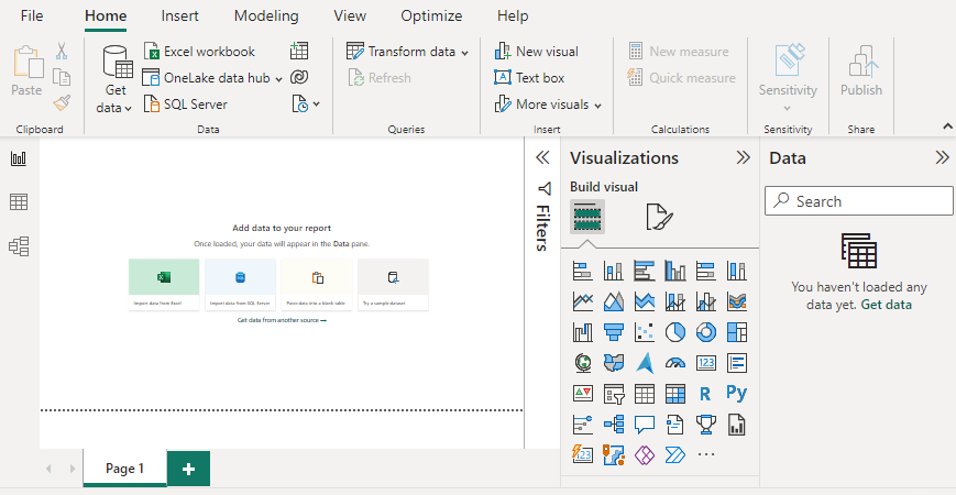
1. Open Power BI Desktop.
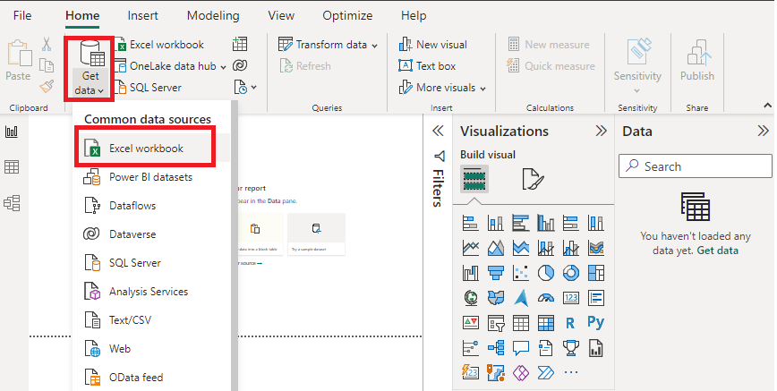
2. Click Get Data and select Excel as the data source.
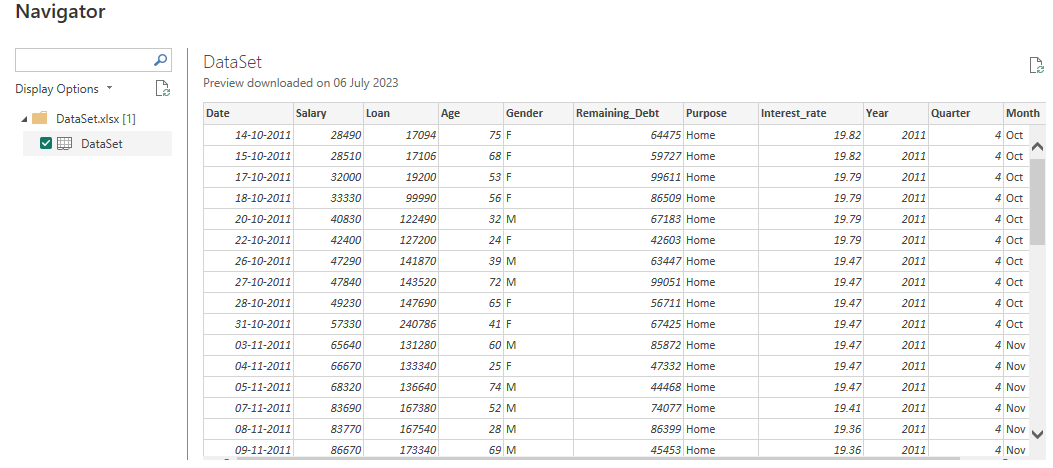
3. Select the relevant desired file from the folder for data load. In this case, the file is "DataSet.xls". click the "Load" button once the preview is shown for the Excel data file.
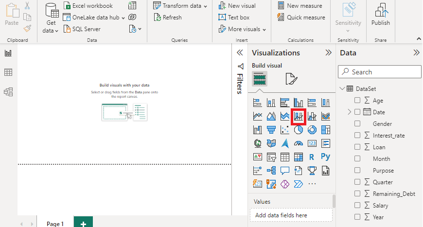
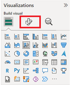
4. Once the file is loaded, the dashboard displays the Visualizations pane and Data Fields pane containing the dataset variables. Drag the Stacked Column and Line Chart visual onto the main canvas.
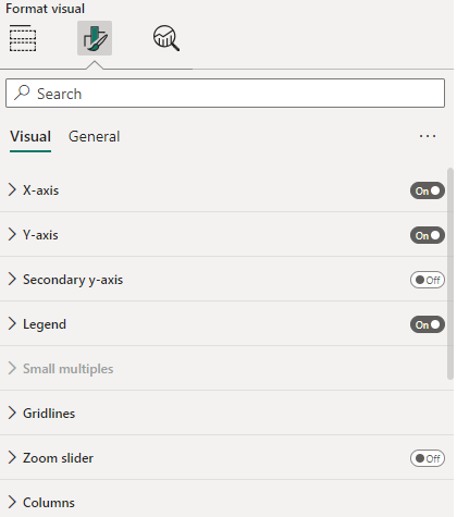
5. Open the Format option from the visualization pane to access customization settings and enable Data labels to display values on the chart. After applying the required field settings, the final output is generated.
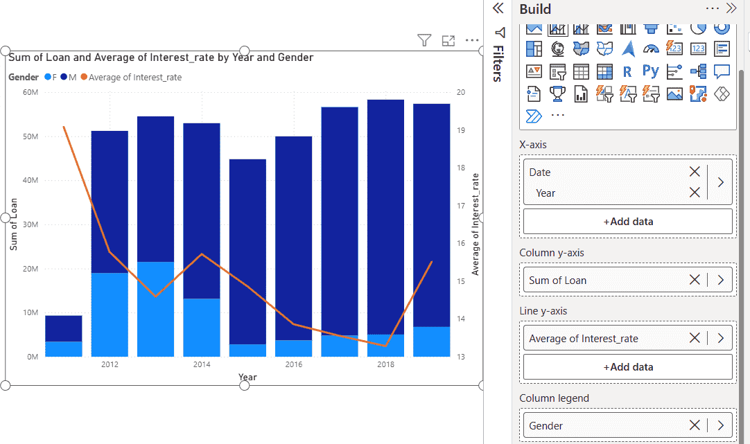
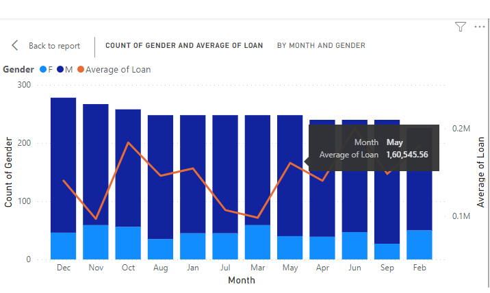
The stacked column and line chart combines Sum of Loan and Average of Interest Rate across Year and Gender. The Male and Female categories appear as column legends, allowing a clear comparison of loan distribution along with interest rate trends.
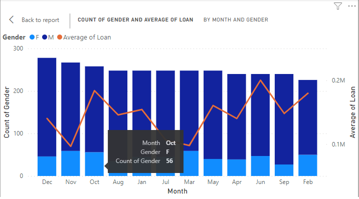
1. The month of "October" shows 15 female candidates for loans.
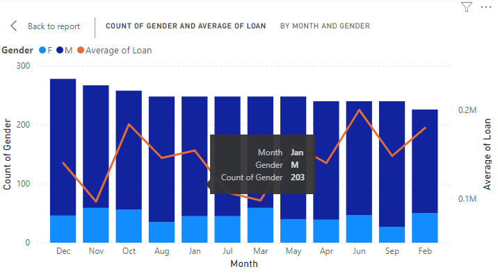
2. The month of "January" shows 203 male candidates for loans.
3. The following shows the "Average of loan" in the month of "May" by using the Line y-axis.
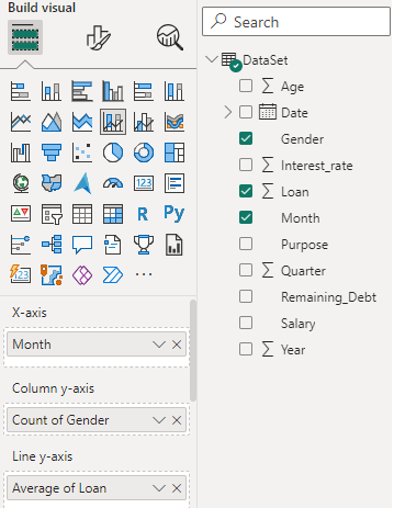
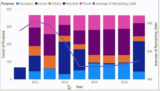
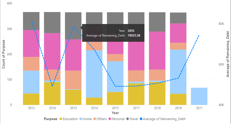
The same dataset is used to create another Line and Stacked Column chart, with modifications in the X-axis, Y-axis, line values and column legend to provide a clearer understanding of loan purposes.
1. Configure the Visualization pane with the updated fields:
2. Build the chart on the canvas the stacked columns are color-coded by loan purpose and the line represents the average remaining debt over time.
1. This chart represents the intersection of two numeric values, with a third dimension shown by the size of the bubble for detailed evaluation.
2. Users or developers can adjust formatting based on report requirements, including colors, legends and data labels.
3. After formatting, the column legends appear at the bottom center of the chart for better readability.
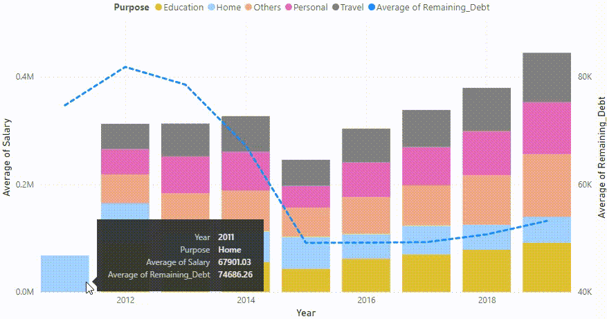
4. The same visual can be modified to display other measures, such as Average Salary and Average Remaining Debt, stacked by different purposes like Home or Education.
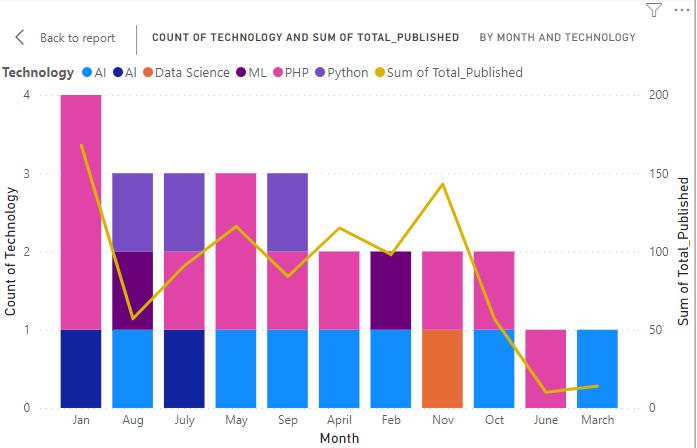
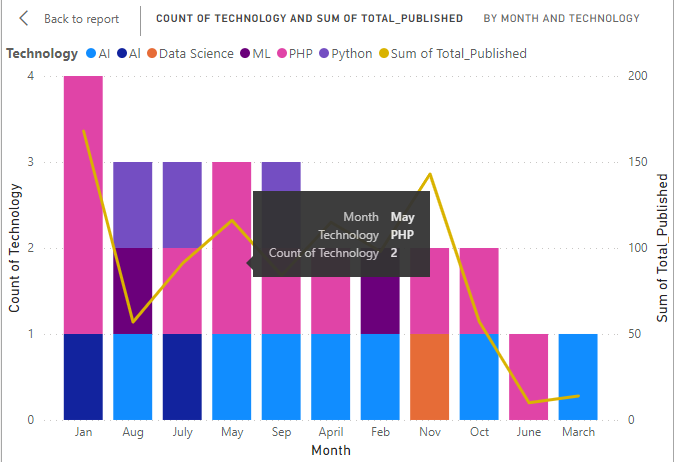
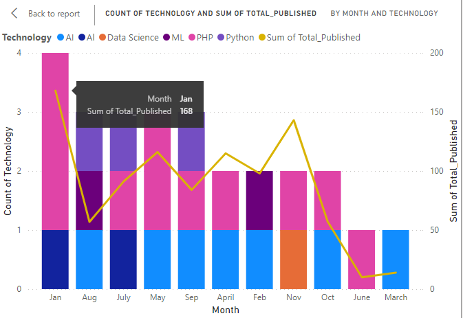
Here we demonstrates a Line and Stacked Column chart showing the total articles published across different technologies for all months in a year.
You can download dataset from here
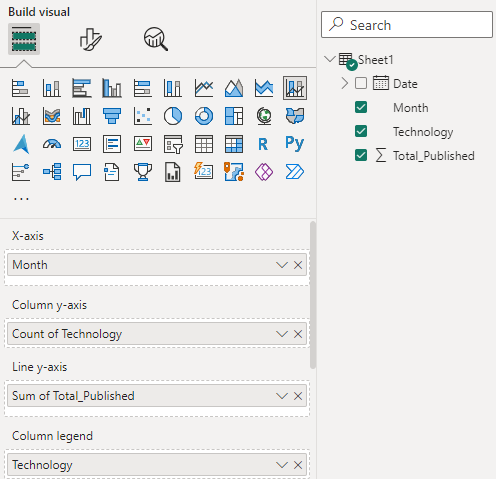
1. Set Visualization Pane: Configure the X-axis, Y-axis, column legend, and line values in the visualization pane to build the chart.
2. The stacked columns show the number of articles published for each technology, while the line represents the total articles per month, with the Y-axis indicating counts for individual technologies like AI, Data Science, and PHP.
3. On hovering on the month "May", the count for "PHP" technology is 2 which means 2 dates show articles submission based on "PHP".
4. On hovering on the month "Jan", the sum of total_published articles (based on PHP and AI) is 168.
Bubble charts represent the relationship between two numeric values, with a third variable shown as bubble size.
Here we show a bubble chart using the SaleData dataset in Power BI. This chart allows visualization of three variables simultaneously
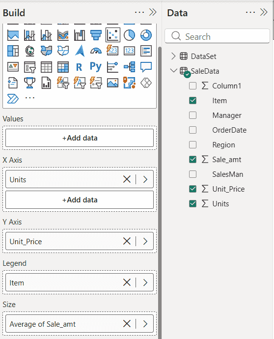
1. Upload the SaleData file into Power BI.
You can download dataset from here
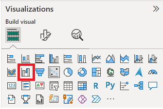
2. Once the file is loaded, the dashboard displays the Visualizations and Data Fields panes. Drag the Bubble/Scatter Chart icon onto the canvas to build the visual.
3. The axes are configured by dragging the required data fields into their respective axis sections.
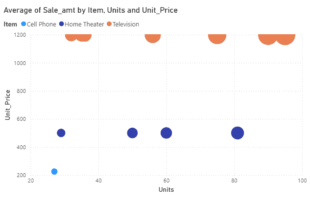
4. The bubble chart displays the average Sale_amt for different item based on units sold and unit price. The size of each bubble is proportional to the average Sale_amt, making value comparisons easier.
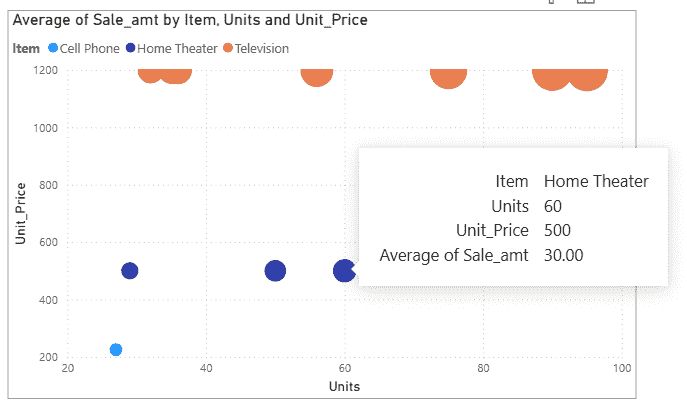
5. On hovering over any bubble, it displays all the needed metrics for analysis.
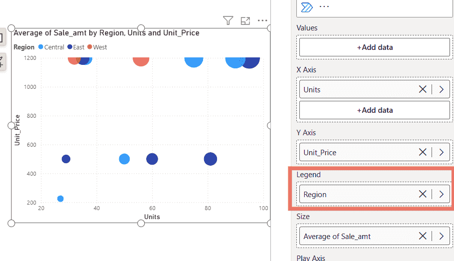
6. The same steps are applied using Region as the legend while keeping the X-axis, Y-axis and Size unchanged. This creates a bubble chart comparing regions such as Central, East, and West.
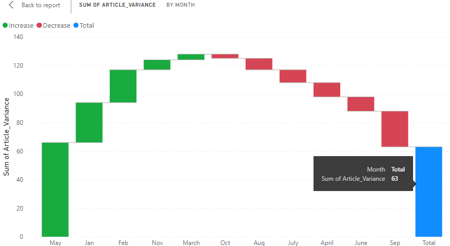
Waterfall charts also known as Bridge charts, display the running total of values as they increase or decrease over time or across categories. They use color-coded columns to clearly show how individual positive and negative changes affect an initial value and lead to a final result, with intermediate values reflecting fluctuations in between.
A Waterfall Chart shows how positive and negative values contribute to the overall variance. In Power BI, load the dataset, then select the Waterfall Chart icon from the Visualizations pane to add it to the canvas.
1. The initial canvas displays a blank report area where the waterfall chart visual can be added and configured.
2. The Y-axis is set to Sum of Article_variance to represent the total variance of published articles across all technologies for each month.
3. Hovering over any column displays detailed variance values for the corresponding month.