 |
VOOZH | about |
|
VOOZH | about |
A line chart is a visual representation of data points connected by straight lines. It is used to show trends over time or to compare multiple data sets and it uses two axes:
Line charts are ideal for tracking continuous data such as sales figures, stock prices or the number of applicants to a course over time. They are useful when we want to visualize trends, detect patterns and make comparisons between multiple variables.
Also a line chart can display one or multiple lines each representing a different data series. This allows us to compare multiple trends on the same chart helps in making it easy to spot relationships in data.
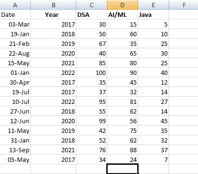
Let’s assume we have a dataset with data on course from 2017 to 2022 for the practical understanding of Line charts. The dataset includes the following columns:
You can download dataset from here.
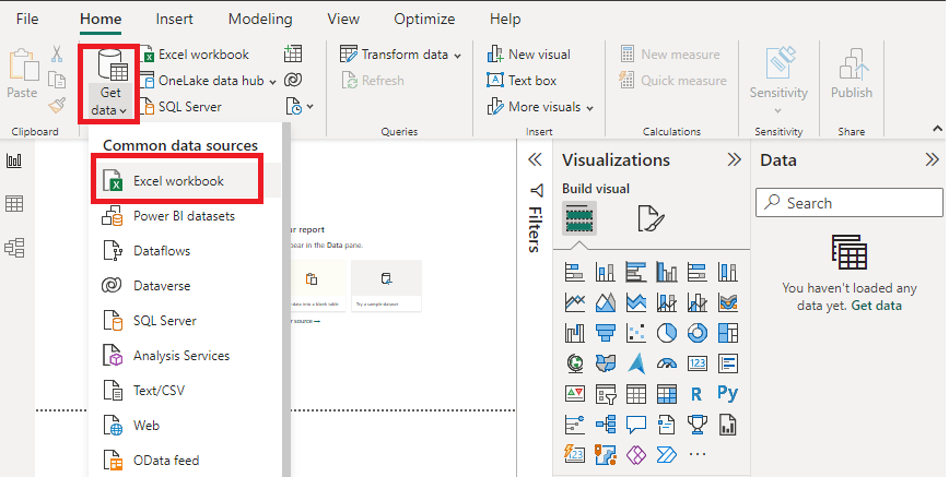
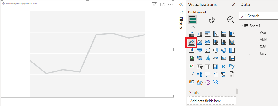
Now we will see the steps to create a line chart using the Power BI Desktop tool by using a "DataSet" Excel sheet file as given above in the "Dataset" section.
1. Open Power BI Desktop.
2. Click Get Data and choose Excel workbook.
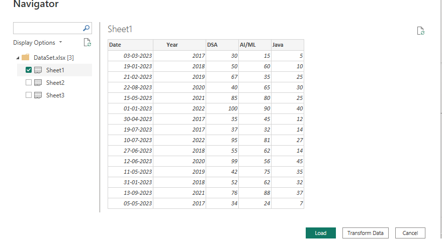
3. Select the relevant file (e.g "DataSet.xlsx") from the folder.
4. Click Load to import the data into Power BI.
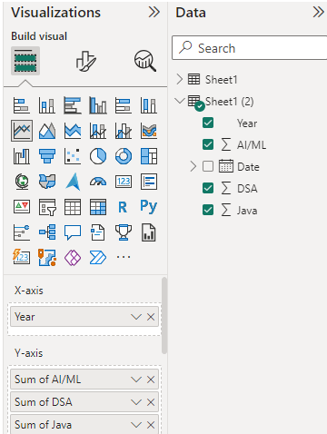
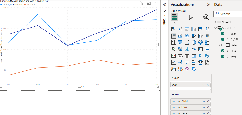
Once the file is loaded, we'll see the Visualizations and Fields panes on the right which will allow us to work with our data.
Refer to the Power BI format line charts article for more customization.
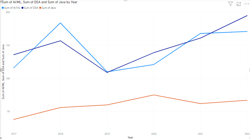
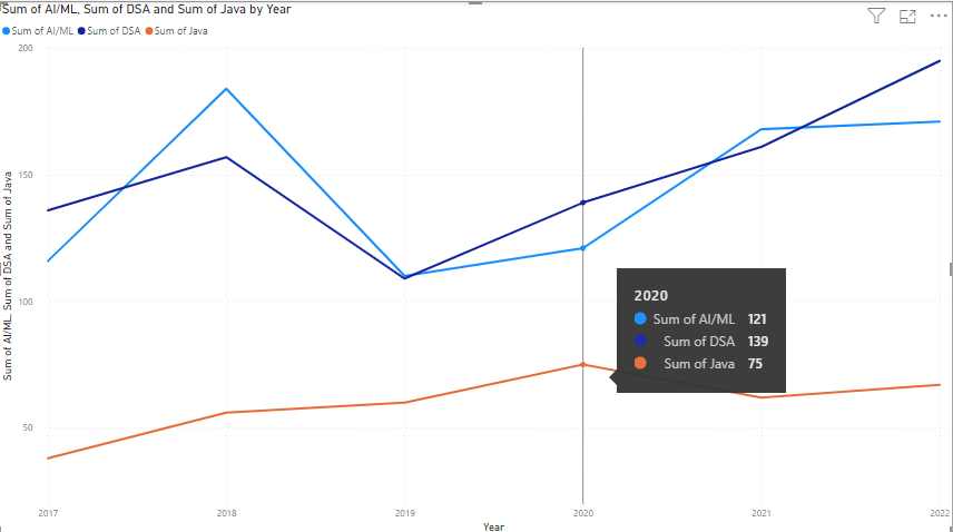
Output:
The total number of applicants on all three courses are taken by their sum over the yearly time period from 2017 to 2022.
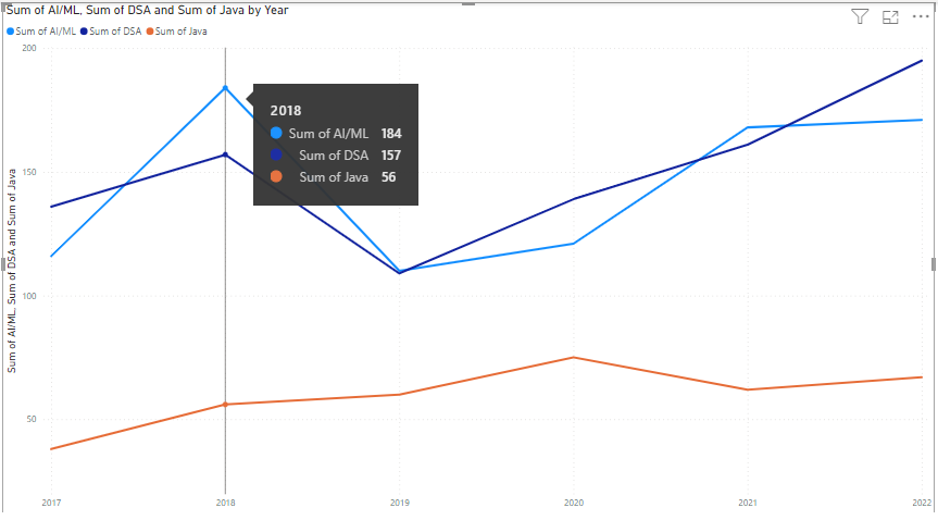
By hovering over a data point, we can view the exact number of applicants for that year.
In the year 2020, the number of applicants for AI/ML courses is 121, 139 for DSA and 75 for Java.
👁 Power BI - Line Charts