 |
VOOZH | about |
|
VOOZH | about |
The very nature of R as a language of financial market analysis can be harnessed with the tools mentioned above. Specific packages and tools are employed to gather, clean, and visualize financial data and sometimes generate insights about their dynamics in time, using techniques like time series and moving averages. Forecasting incoming market movements could be effected using predictive modeling ARIMA or machine learning algorithms.
Financial markets can perhaps be explained as those environments around which sellers and buyers of financial assets- meaning stocks, bonds, floating exchange rates, commodities, and derivatives among others- may possibly gather. These function in the economy as they structure the network of financial intermediaries, help financial markets support different kinds of economic agents and manage financial risks. Key types of financial markets include:
This is important to traders because it helps them predict the right time to either take up a particular position or sell with the aim of making high returns.
First, we'll fetch historical stock data, handle missing values, and adjust for splits and dividends:
Output:
 AAPL.Open AAPL.High AAPL.Low AAPL.Close AAPL.Volume AAPL.Adjusted
2020-01-02 71.96207 73.02120 71.70701 72.96047 135480400 72.96047
2020-01-03 72.18313 73.01634 72.02523 72.25114 146322800 72.25114
2020-01-06 71.36692 72.86572 71.11428 72.82685 118387200 72.82685
2020-01-07 72.83656 73.09405 72.26327 72.48433 108872000 72.48433
2020-01-08 72.18556 73.95400 72.18556 73.65035 132079200 73.65035
2020-01-09 74.63417 75.40908 74.38154 75.21474 170108400 75.21474
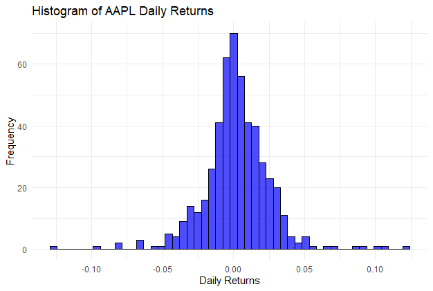
A histogram of daily returns shows the distribution and can indicate if the returns follow a normal distribution:
Output:
The histogram helps to understand the volatility and distribution of AAPL's daily returns:
First, we shall pull data from the historical stock data of multiple investments. Next, we will clean the data by dealing with missing values and handling splits as well as dividends in the data set.
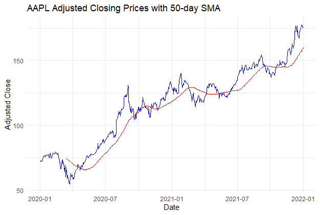
Take the closing prices of the specific shares and plot them with the moving averages to apparently understand trends and even seasonality.
Output:
The blue line shows the actual daily closing prices, adjusted for corporate actions like dividends and stock splits and the red line represents the 50-day Simple Moving Average of the adjusted closing prices.
Overall, this plot provides a visual tool for analyzing the performance and trends of AAPL's stock over time, making it easier to identify patterns and make informed decisions.
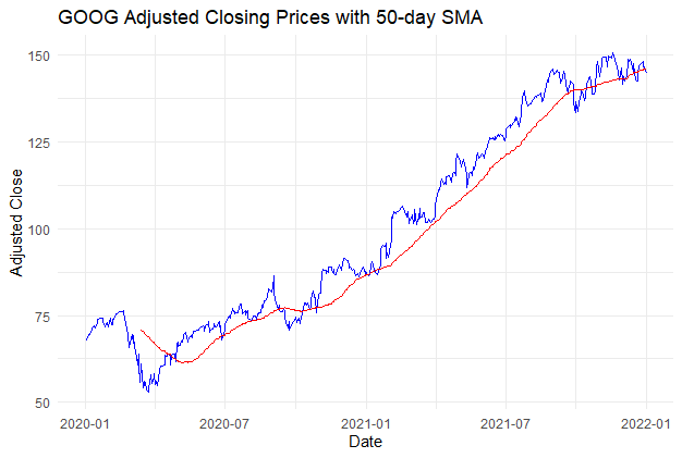
Take the closing prices of the specific shares and plot them with the moving averages to apparently understand trends and even seasonality.
Output:
This plot provides a visual tool for analyzing the performance and trends of Google stock over time, making it easier to identify patterns and make informed decisions.
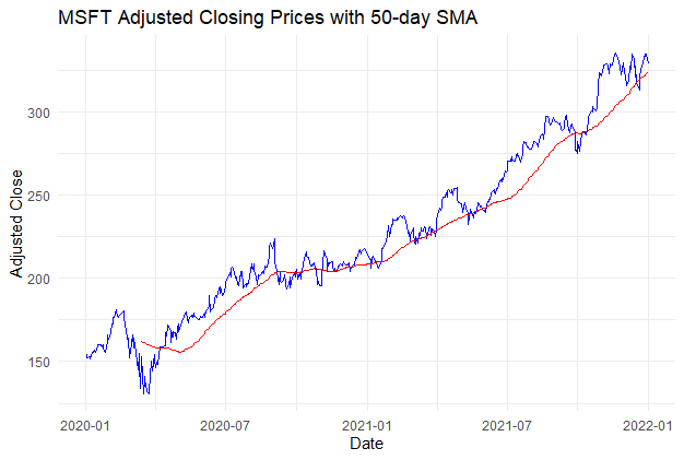
Take the closing prices of the specific shares and plot them with the moving averages to apparently understand trends and even seasonality.
Output:
This plot provides a visual tool for analyzing the performance and trends of Microsoft stock over time, making it easier to identify patterns and make informed decisions.
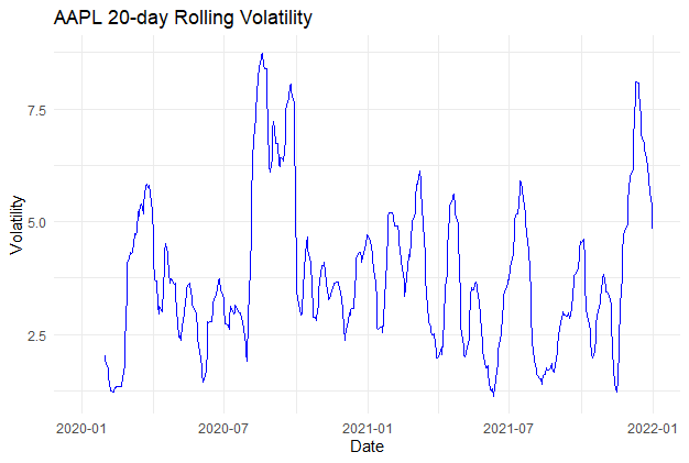
Check the validity of the assumptions by employing rolling standard deviation for the assessment of the volatility of the assets.
Output:
line plot showing the rolling volatility of Apple (AAPL) stock over the specified 20-day period. The x-axis will represent dates, the y-axis will represent volatility, and a blue line will indicate the volatility trend over time. This visualization provides insights into the fluctuation and stability of AAPL stock over the selected time frame.
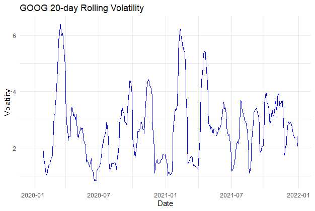
Check the validity of the assumptions by employing rolling standard deviation for the assessment of the volatility of the assets.
Output:
line plot showing the rolling volatility of Google stock over the specified 20-day period. The x-axis will represent dates, the y-axis will represent volatility, and a blue line will indicate the volatility trend over time. This visualization provides insights into the fluctuation and stability of AAPL stock over the selected time frame.
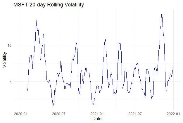
Check the validity of the assumptions by employing rolling standard deviation for the assessment of the volatility of the assets.
Output:
line plot showing the rolling volatility of Microsoft stock over the specified 20-day period. The x-axis will represent dates, the y-axis will represent volatility, and a blue line will indicate the volatility trend over time. This visualization provides insights into the fluctuation and stability of AAPL stock over the selected time frame.
In conclusion, R is a powerful tool for analyzing financial market trends, offering a comprehensive suite of functions and packages for data manipulation, visualization, and modeling. By harnessing the capabilities of R, analysts can gain deeper insights into market behavior, identify profitable trading opportunities, and mitigate risks effectively. Whether you're a seasoned quant or a novice investor, mastering R for financial analysis can significantly enhance your decision-making prowess in the dynamic world of finance.