 |
VOOZH | about |
|
VOOZH | about |
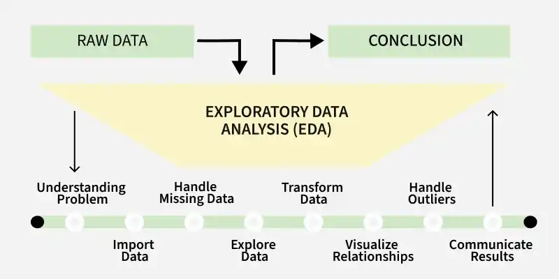
Exploratory Data Analysis (EDA) is a process for analyzing and summarizing the key characteristics of a dataset, often using visual methods. It helps to understand the structure, relationships and potential issues in data before conducting formal modeling. Key Aspects of EDA
EDA is an iterative process that involves:
In R, we perform EDA through two primary approaches:
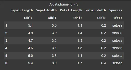
In this example, we will use the built-in iris dataset in R to show EDA techniques.
Output:
Descriptive statistics involve summarizing and describing the main features of a dataset through numerical measures like mean, median, mode, standard deviation, variance and range. These statistics help in understanding the central tendency, dispersion and overall distribution of the data,
To summarize the data, we begin with measures of central tendency: the mean, median and mode of the numeric variables.
Output:
Mean Sepal Length: 5.843333
Median Sepal Length: 5.8
Mode Sepal Length: 5
To understand the spread of the data, we calculate the variance, standard deviation, range and interquartile range (IQR).
Output:
Variance: 0.6856935
Standard Deviation: 0.8280661
Range: 4.3 7.9
Interquartile Range (IQR): 1.3
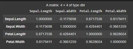
Next, we examine the relationships between numerical variables by computing the correlation matrix.
Output:
Graphical methods involve visualizing the data using plots such as histograms, box plots, scatter plots and bar charts. These visualizations help in identifying patterns, trends, outliers and the distribution of data, making it easier to interpret and communicate insights. We will use the ggplot2 package for this purpose.
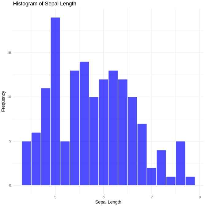
We begin by plotting histograms to visualize the distribution of variables like Sepal Length.
Output:
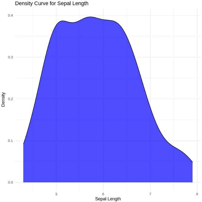
Next, we can plot the density curve for Sepal Length:
Output:
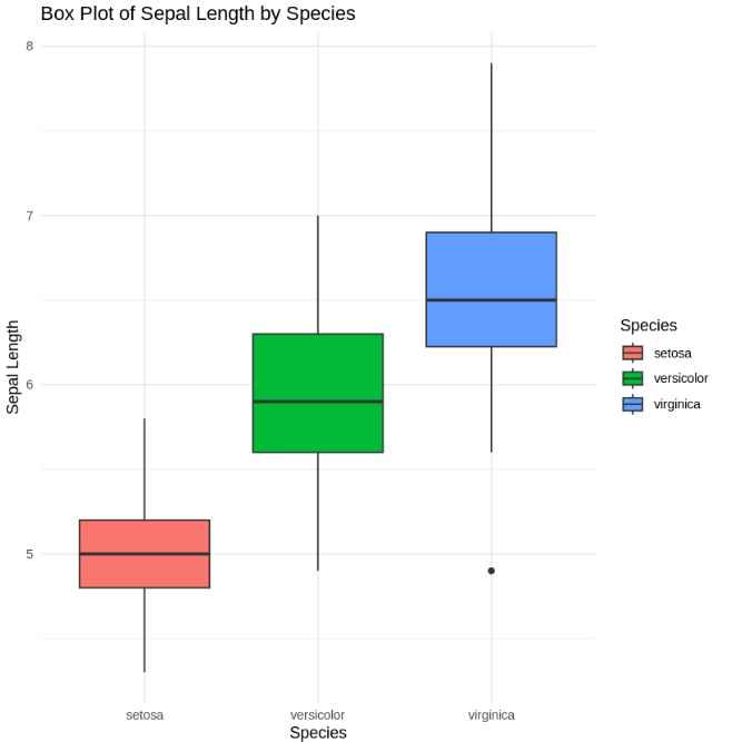
A box plot is useful to visualize the spread and potential outliers in the data.
Output:
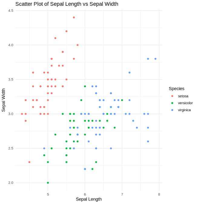
We can also examine the relationships between two numerical variables with scatter plots. For example, we’ll plot Sepal Length against Sepal Width.
Output:
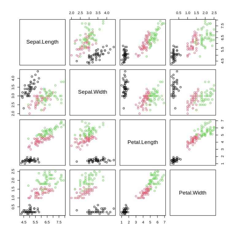
For more comprehensive visualization, a pairwise scatter plot (or pairs plot) can help us see all pairwise relationships between the numerical variables in the dataset.
Output:
You can download the source code from here.