 |
VOOZH | about |
|
VOOZH | about |
A line graph is a type of chart that helps us visualize data through a series of points connected by straight lines. It is commonly used to show changes over time, making it easier to track trends and patterns. In a line graph, we plot data points on the X and Y axes and connect them with lines, which helps us understand how values move over time or across categories.
To create a line graph in R, we use the plot() function. This function allows us to customize the graph with various parameters like the type of plot, color, labels, and titles.
plot(v, type, col, xlab, ylab, main)
To create a simple line graph, we use the plot() function with the required parameters. Below is an example where we specify the vector of data and use the argument type = "o" to display both points and lines.
Output:
We can make our line graph more informative and visually appealing by adding a title, labels for the axes, and changing the colors of the lines and points.
In this example, we customize the graph by:
Output:
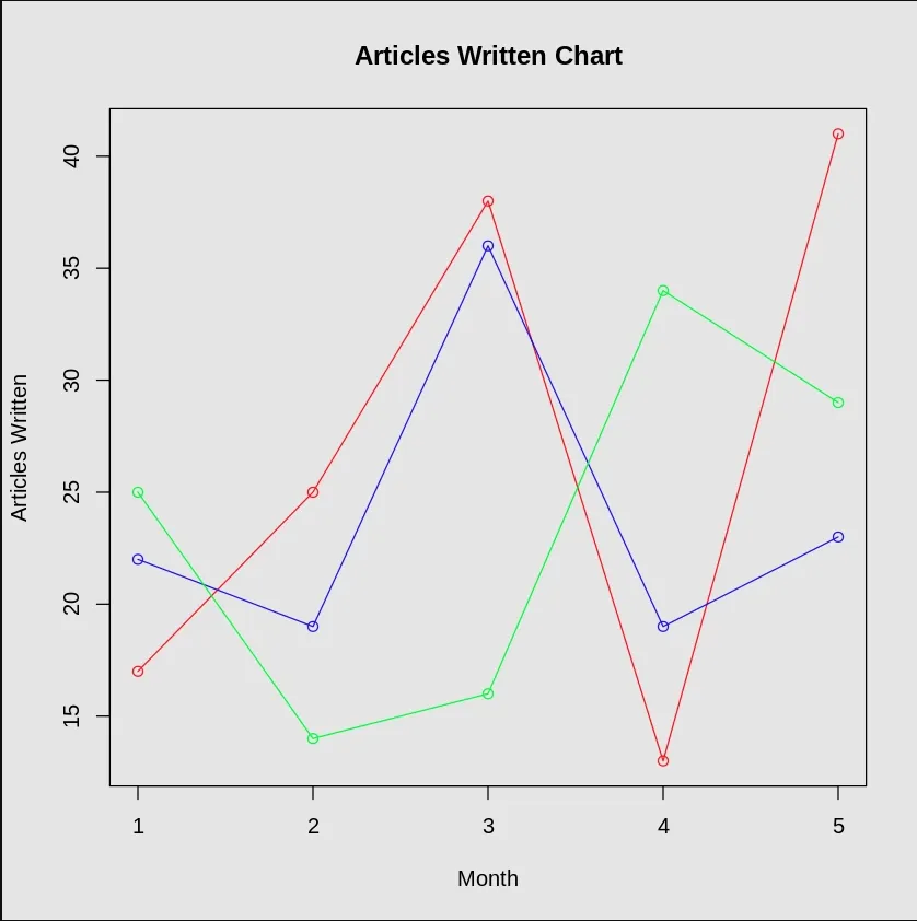
We can also create line graphs that display multiple data series, making it easier to compare trends across different datasets. To do this, we add more lines using the lines() function.
In this example:
Output:
This way, we can compare the trends of all three data series on the same graph.