 |
VOOZH | about |
|
VOOZH | about |
Data visualization is the process of representing data using charts, graphs and maps to make information easier to understand. It helps identify patterns, trends and relationships within large datasets. In R, data visualization is widely used because of its strong statistical foundation and graphical capabilities.
Some of the various types of visualizations offered by R are:
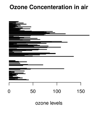
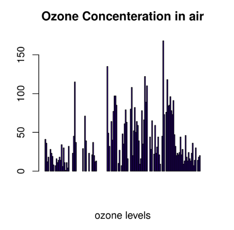
There are two types of bar plots: horizontal and vertical which represent data points as horizontal or vertical bars of certain lengths proportional to the value of the data item. They are generally used for continuous and categorical variable plotting. By setting the horiz parameter to true and false, we can get horizontal and vertical bar plots respectively.
Horizontal Bar Plot
Output:
👁 ImageVertical Bar Plot
Output:
👁 ImageUse Cases:
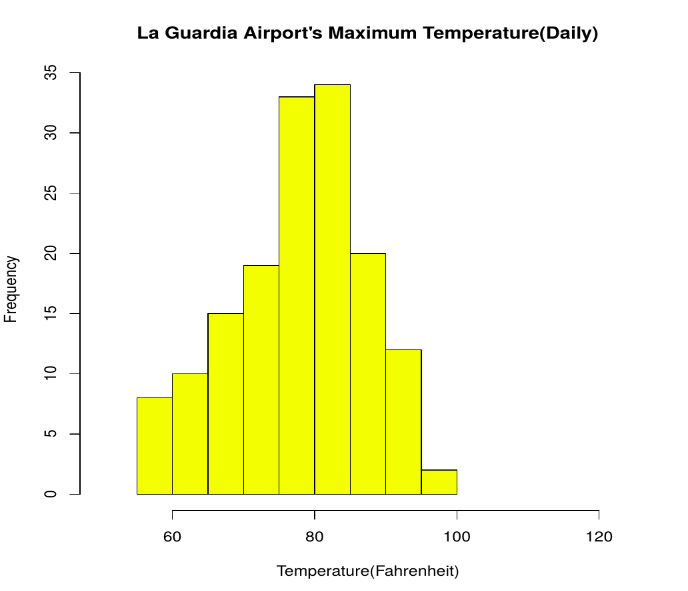
A histogram shows the distribution of continuous data by grouping values into intervals called bins. It helps understand data spread and shape.
Output:
👁 ImageUse Cases:
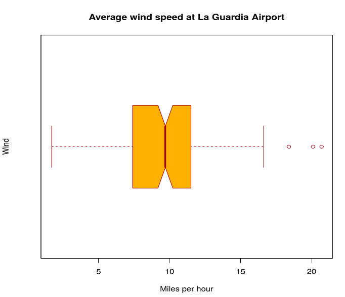
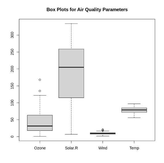
A box plot visually summarizes statistical properties of data, including:
Output:
👁 ImageMultiple Box Plots
Output:
Use Cases:
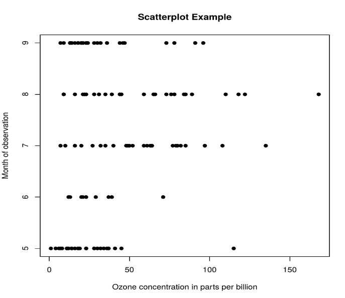
A scatter plot is composed of many points on a Cartesian plane. Each point denotes the value taken by two parameters and helps us easily identify the relationship between them.
Output:
👁 ImageUse Cases:
Heatmap is defined as a graphical representation of data using colors to visualize the value of the matrix. heatmap() function is used to plot heatmap.
Output:
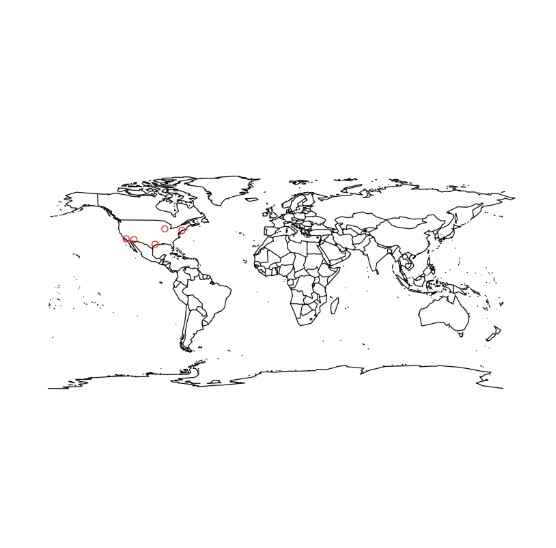
Here we are using maps package to visualize and display geographical maps using an R programming language.
Output:
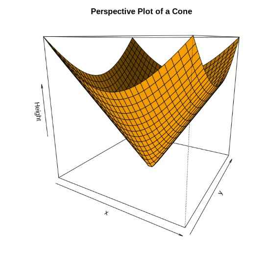
Here we will use preps() function, This function is used to create 3D surfaces in perspective view. This function will draw perspective plots of a surface over the x–y plane.
Output:
You can download the complete code from here.
R has the following advantages over other tools for data visualization: