 |
VOOZH | about |
|
VOOZH | about |
A pie chart is a circular statistical graphic, which is divided into slices to illustrate numerical proportions. It depicts a special chart that uses "pie slices", where each sector shows the relative sizes of data. A circular chart cuts in the form of radius into segments describing relative frequencies or magnitude also known as a circle graph. R Programming Language uses the function pie() to create pie charts. It takes positive numbers as a vector input.
pie(x, labels, radius, main, col, clockwise)
Parameters:
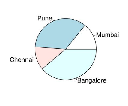
To create a simple R pie chart we can use the above parameters. It can be described by giving simple labels.
Example:
Output:
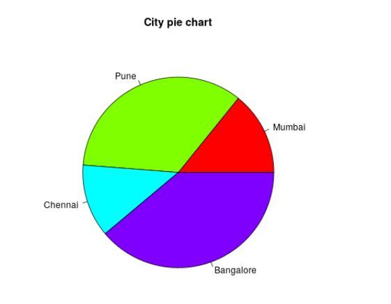
To create a color and title pie chart.
Example:
Output:
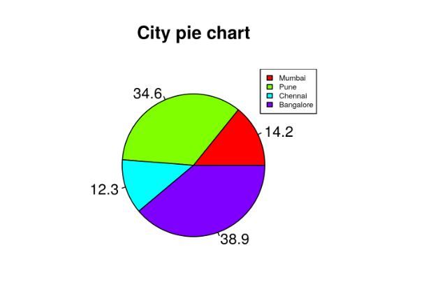
To create chart legend and slice percentage, we can plot by doing the below methods. We can show the chart in the form of percentages as well as add legends.
Example:
Output:
With the help of .pal function of the RColorBrewer package in R, we can add use different color palettes available.
Output:
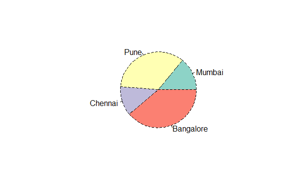
We can make use of the lty argument to modify the line type of the borders
Output:
We can use the density argument to set he shaded lines in our plot.
Output:
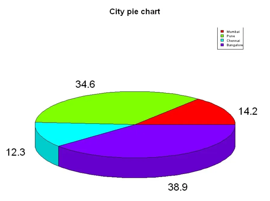
Here we are going to create a 3D Pie chart using plotrix package and then we will use pie3D() function to plot 3D plot.
Output: