 |
VOOZH | about |
|
VOOZH | about |
Bar charts provide an easy method of representing categorical data in the form of bars. The length or height of each bar represents the value of the category it represents. In R, bar charts are created using the function barplot(), and it can be applied both for vertical and horizontal charts.
barplot(H, xlab, ylab, main, names.arg, col)
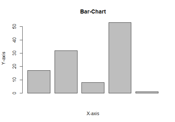
A vector "A" is taken which contains numeral values to be used. This vector A is plot using barplot().
Output:
A simple bar chart showing information in the form of rectangular bars, with the height or length of the bar indicating the value.
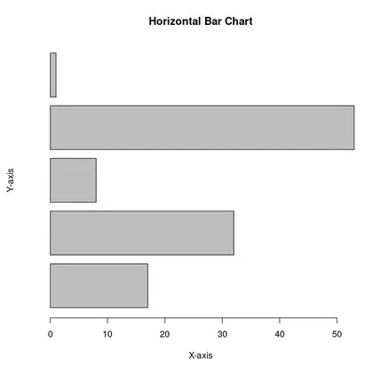
To create a horizontal bar chart, add the horiz = TRUE argument.
Output:
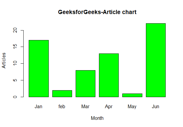
Label, title and colors are some properties in the bar chart which can be added to the bar chart
Output:
You can add the actual values on top of each bar using the text() function.
Output:
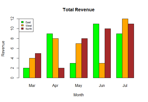
A Grouped Bar Chart displays bars for different categories side by side, allowing for easy comparison between multiple groups, while a Stacked Bar Chart piles bars for different categories on top of one another to show the total value as well as the individual contributions from each category.
A grouped bar chart is useful when you want to compare multiple categories or groups side by side. It displays each category as separate bars grouped together, making it easy to compare the values within each group across different categories.
Output:
A stacked bar chart is ideal when you want to show how different categories contribute to a whole. It stacks the bars on top of one another, allowing you to see both the total value and the breakdown of each segment within the bar.
Output:
Related Articles: